// TODO: Add common description for all guide steps options and implementation of a guide.
Members
# static Options
Common options for configuring a guide step. These options control the behavior and appearance of steps within a guide and applied to all steps.
Individual steps can define additional options on top of these common ones as needed.
The options object contains settings, parameters, and configurations passed from the guide definition, and they are used by the step to determine its behavior, content, and placement.
Properties:
| Name | Type | Attributes | Default | Description |
|---|---|---|---|---|
translatedGuideName |
string
|
The translated name of the interactive guide to which this step belongs. Represents the localized name of the guide currently in progress. |
||
translatedGuideDescription |
string
|
The translated description of the interactive guide to which this step belongs. Represents the localized description of the guide currently in progress. |
||
title |
string
|
A string that will be displayed as the step title in the dialog header. |
||
content |
string
|
The main content displayed in the dialog body. |
||
extraContent |
string
|
A string displayed as additional content below the main content in the dialog body. |
||
elementSelector |
string
|
<optional> |
A CSS selector for the element that should be highlighted when this step is active. |
|
placement |
string
|
<optional> |
'bottom' | A string that defines where the step dialog should be placed relative to the highlighted element:
|
url |
string
|
<optional> |
A string that defines the URL where the step should be active. If the current URL does not match the step URL, the guide will navigate to the step URL before activating the step. |
|
maxWaitTime |
number
|
<optional> |
3 | The maximum time (in seconds) to wait for the element to appear on the screen. |
disablePreviousFlow |
boolean
|
<optional> |
true | A boolean that defines whether the user can go back to the previous step. |
skipPoint |
boolean
|
<optional> |
false | A boolean that defines whether this step can be used as a skip point. When true, a "Skip" button will appear in the dialog, allowing the user to skip the guide from this point. When clicked, the guide will continue at the next step marked as a skip point. If no further skip points are defined, the guide will be finished. |
className |
string
|
<optional> |
A string that defines additional CSS classes to be added to the step dialog. |
|
skipButtonLabel |
Object
|
<optional> |
The bundle object, containing the label for the skip button in different languages. |
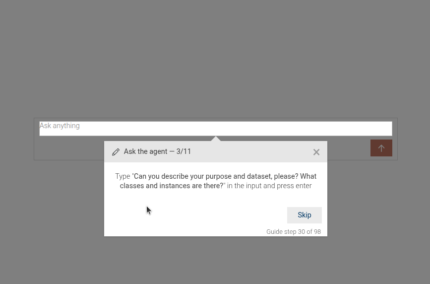
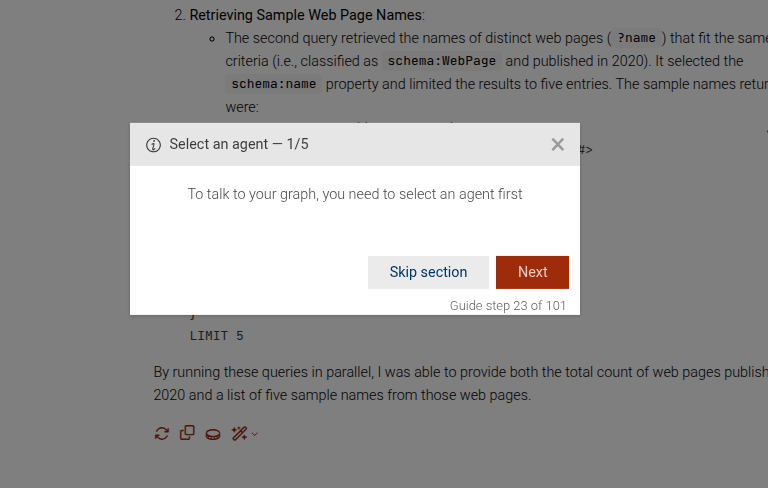
# static ask-ttyg-agent
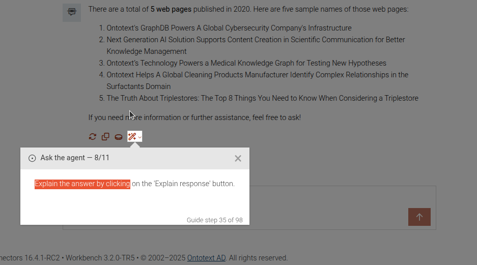
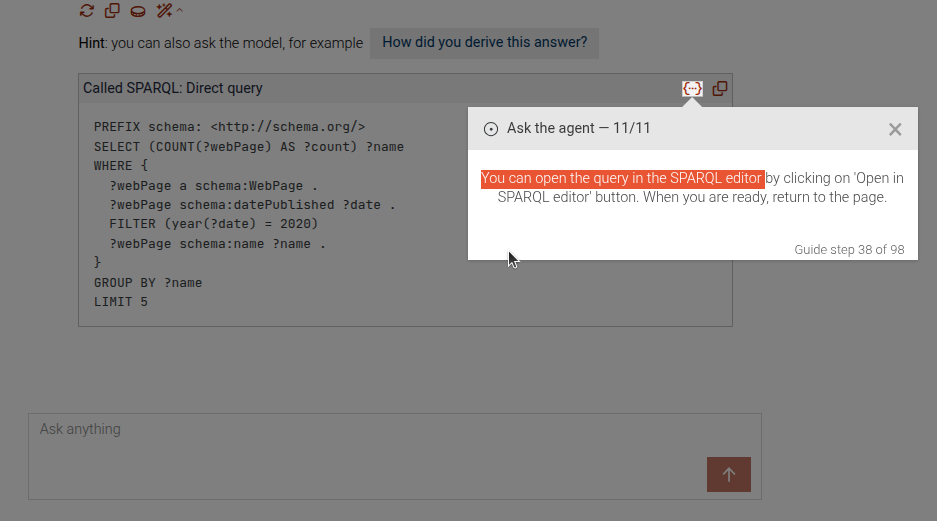
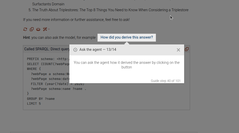
This is a complex step that may show a sequence of steps to guide the user through asking a question to a TTYG agent,
explaining the response, exploring SPARQL queries, and asking for more explanations. The difference between this and
the ttyg-ask-question step is that this step may include explanation and exploring SPARQL queries
Ask an individual question

Wait for the response
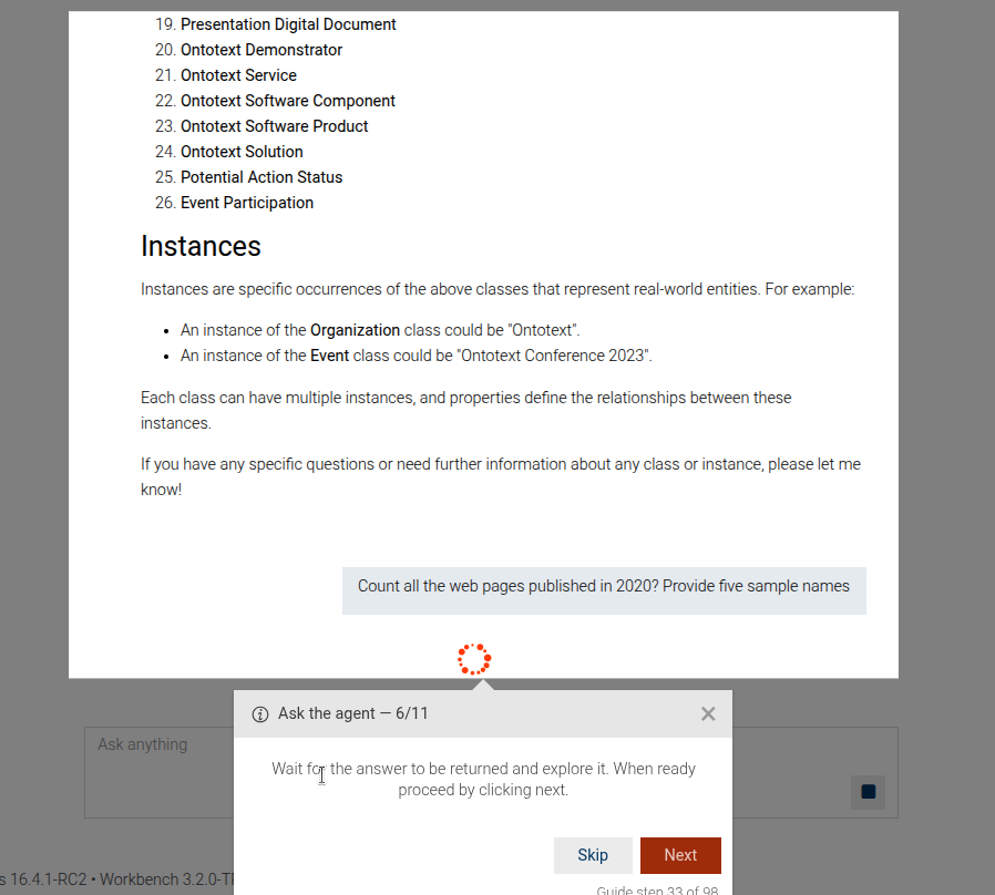
Explain the response
Explore the SPARQL query
Ask for more explanation
The step can be configured using the common options defined in Options.
Properties:
| Name | Type | Attributes | Description |
|---|---|---|---|
options.question |
string
|
<optional> |
The question to be asked to the TTYG agent. This will be displayed in the instructions. |
options.explain |
boolean
|
<optional> |
Whether to include the explanation step after asking the question. |
options.explainMore |
boolean
|
<optional> |
Whether to include the step for asking more explanation after the explanation step. |
options.exploreSparql |
boolean
|
<optional> |
Whether to include the step for exploring the SPARQL query after the explanation step. |
Example
```JSON
{
"guideBlockName": "ask-ttyg-agent",
"options": {
"question": "Count all the web pages published in 2020? Provide five sample names.",
"explain": true,
"explainMore": true,
"exploreSparql": true
}
}
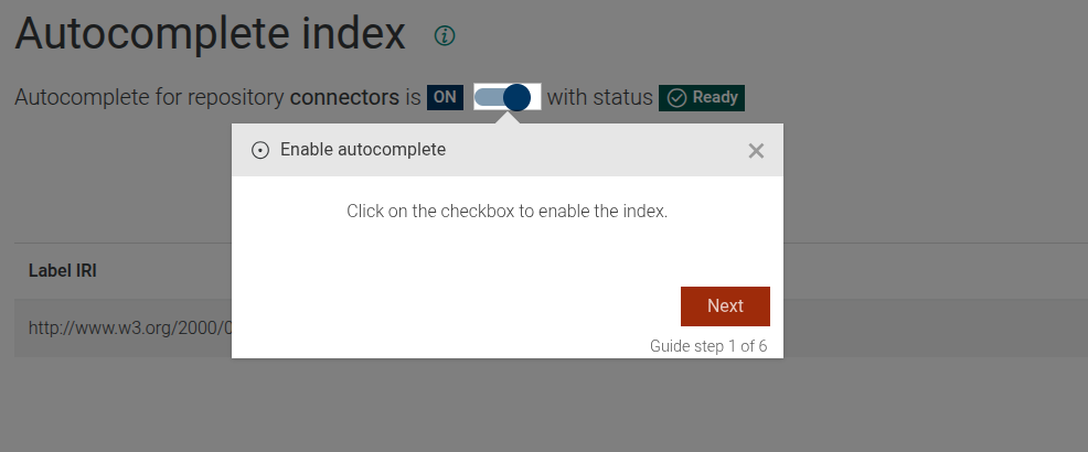
```# static autocomplete-enable-checkbox
The autocomplete-enable-checkbox step shows the user how to enable the autocomplete index in GraphDB.

This step can be configured using the common options defined in Options.
Example
```JSON
{
"guideBlockName": "autocomplete-enable-checkbox"
}
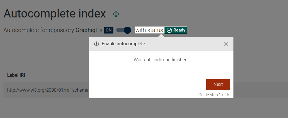
```# static autocomplete-focus-on-indexing-status
The autocomplete-focus-on-indexing-status step produces a step that describes user that have to wait until indexing finished and shows
where they can see the status of autocomplete indexing process.
The autocomplete-focus-on-indexing-status step can be configured using the common options defined in Options.
Example
```JSON
{
  "guideBlockName": "autocomplete-focus-on-indexing-status"
}
```
# static class-hierarchy
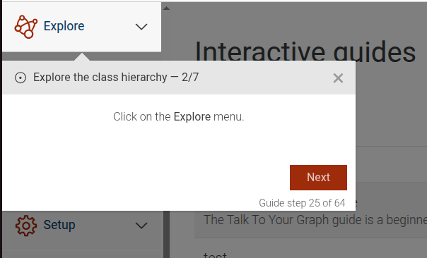
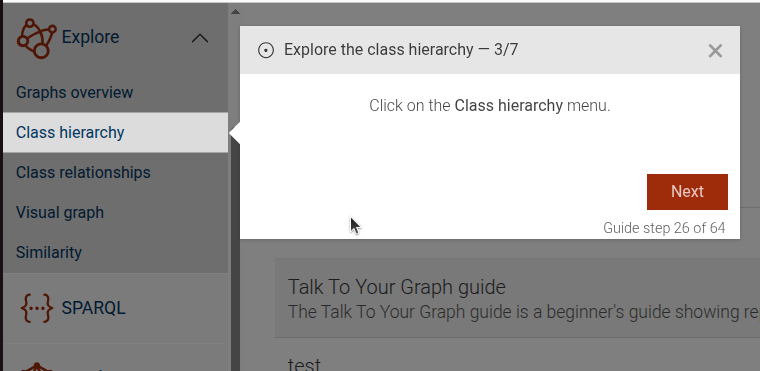
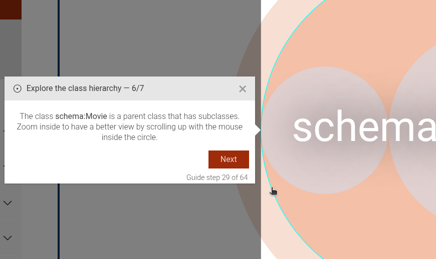
The Class Hierarchy step is a complex step, which provides an interactive guide for users to explore and understand the class hierarchy visualization within the application.
Click on explore menu
Click on class hierarchy submenu
Class hierarchy dataset intro
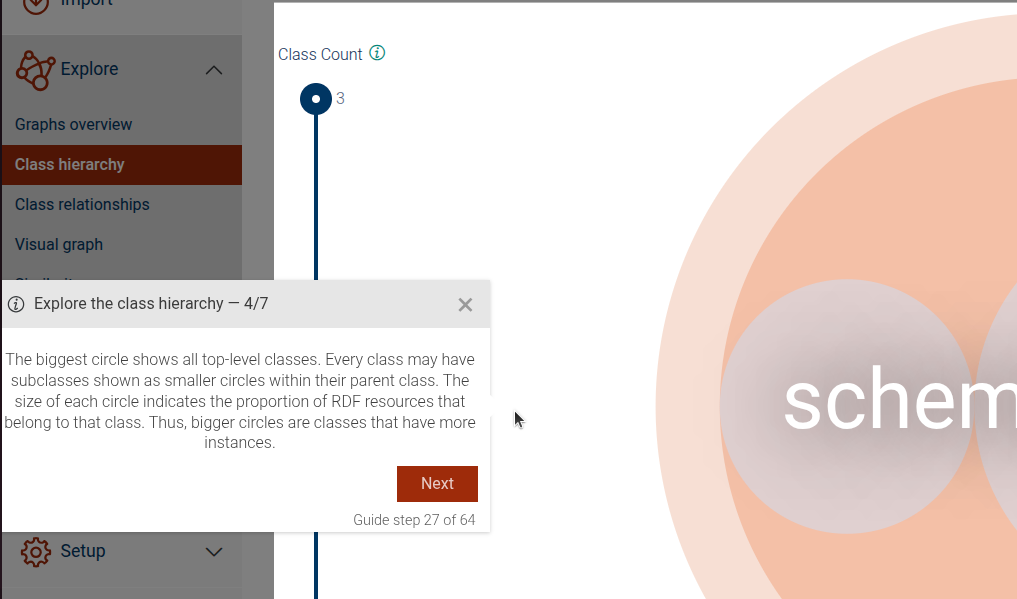
Dataset intro
Zoom on a class
Explain a class
The step can be configured using the common options defined in Options.
Properties:
| Name | Type | Description |
|---|---|---|
introExtraContent |
Object
|
bundle object, which, if provided, will show |
zoomIris |
Array.<Object>
|
array of objects, which should be zoomed in. |
iri |
string
|
IRI of the class to zoom in |
postExtraContent |
Object
|
bundle object, which, if provided, will show |
Example
```JSON
{
"guideBlockName": "class-hierarchy",
"options": {
"introExtraContent": {
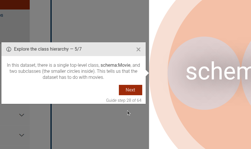
"en": "In this dataset, there is a single top-level class, <b>schema:Movie</b>, and two subclasses (the smaller circles inside). This tells us that the dataset has to do with movies."
},
"zoomIris": [
{
"iri": "schema:Movie",
"postExtraContent": {
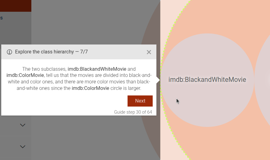
"en": "The two subclasses, <b>imdb:BlackandWhiteMovie</b> and <b>imdb:ColorMovie</b>, tell us that the movies are divided into black-and-white and color ones, and there are more color movies than black-and-white ones since the <b>imdb:ColorMovie</b> circle is larger."
}
}
]
}
}
```# static class-hierarchy-close-rdf-instances-side-panel
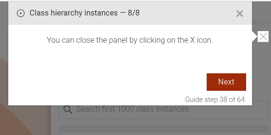
This step guides the user to close the RDF instances side panel by clicking on the close (X) icon.
Example
```JSON
{
  "guideBlockName": "class-hierarchy-close-rdf-instances-side-panel"
}
```
# static class-hierarchy-dataset-intro
Showcases a visualizes the top level of a class dataset and its subclasses.
Example
```JSON
{
  "guideBlockName": "class-hierarchy-dataset-intro"
}
```
# static class-hierarchy-explain-class
This step focuses on explaining a specific class within the class hierarchy visualization. It highlights the selected class and provides detailed information about it
Example
```JSON
{
"guideBlockName": "class-hierarchy-explain-class",
}
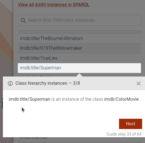
```# static class-hierarchy-explain-rdf-instance
This step focuses on explaining a specific RDF instance within the class hierarchy visualization. It highlights the selected instance and provides detailed information about it.
This step can be configured using the common options defined in Options.
Properties:
| Name | Type | Attributes | Description |
|---|---|---|---|
options.iri |
string
|
The IRI of the class to which the instance belongs. This option is required. |
|
options.instance |
string
|
The label of the RDF instance to be explained. This option is required. |
|
options.extraContent |
Object
|
<optional> |
Bundle object with additional content to display. |
Example
```JSON
{
  "guideBlockName": "class-hierarchy-explain-rdf-instance",
  "options": {
    "iri": "imdb:ColorMovie",
    "instance": "The Godfather",
    "extraContent": {
      "en": "My additional content in English",
      "fr": "Mon contenu additionnel en français"
    }
  }
}
```
# static class-hierarchy-instances
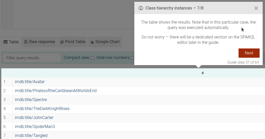
This step is a complex step that includes several sub-steps to guide the user through viewing and understanding RDF instances of a class in the class hierarchy.
Open RDF instances side panel
Side panel introduction
Explain RDF instance
Open all instances in SPARQL
SPARQL editor explanation

SPARQL results explanation
Close RDF instances side panel
This step can be configured using the common options defined in Options. It requires options.iri
Properties:
| Name | Type | Attributes | Description |
|---|---|---|---|
options.iri |
string
|
The IRI of the class whose instances are to be viewed. This option is required. |
|
options.focusInstances |
Array.<(string|Object)>
|
<optional> |
An array of instances to focus on. Each entry can be a string (the instance IRI) |
options.followCountLink |
boolean
|
<optional> |
Whether to follow the count link when the RDF instance count is clicked. |
Example
```JSON
{
  "guideBlockName": "class-hierarchy-instances",
  "options": {
    "iri": "imdb:ColorMovie",
    "focusInstances": [
      "imdb:title/Superman",
      "imdb:title/Mulan"
    ],
    "followCountLink": true
  }
},
```
# static class-hierarchy-intro
The Class Hierarchy Intro step provides an introduction to the class hierarchy visualization, explaining how to interpret the circles representing classes and their subclasses.
Example
```JSON
{
"guideBlockName": "class-hierarchy-intro"
}
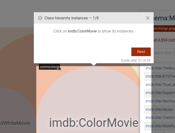
```# static class-hierarchy-open-rdf-instances-side-panel
This step focuses on guiding the user to open the RDF instances side panel in the class hierarchy view.
This step can be configured using the common options defined in Options. It requires options.iri
Properties:
| Name | Type | Description |
|---|---|---|
options.iri |
string
|
The IRI of the class whose instances are to be viewed. This option is required.
|
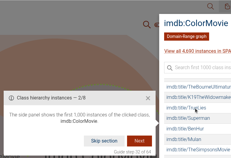
# static class-hierarchy-rdf-instances-side-panel-intro
This step focuses on introducing the RDF instances side panel in the class hierarchy view.
This step can be configured using the common options defined in Options. It requires options.iri
Properties:
| Name | Type | Description |
|---|---|---|
options.iri |
string
|
The IRI of the class whose instances are to be viewed. This option is required. |
Example
```JSON
{
"guideBlockName": "class-hierarchy-rdf-instances-side-panel-intro",
"options": {
"iri": "imdb:ColorMovie"
}
}
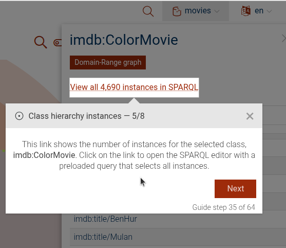
```# static class-hierarchy-rdf-instances-side-panel-open-all-instances-in-sparql
This step focuses on guiding the user to open all RDF instances in SPARQL from the class hierarchy view.
This step can be configured using the common options defined in Options. It requires options.iri
Properties:
| Name | Type | Description |
|---|---|---|
options.iri |
string
|
The IRI of the class whose instances are to be viewed. This option is required. |
View Source guides/class-hierarchy/class-hierarchy-rdf-instances-side-panel-open-all-instances-in-sparql.js, line 4
Example
```JSON
{
"guideBlockName": "class-hierarchy-rdf-instances-side-panel-open-all-instances-in-sparql",
"options": {
"iri": "imdb:ColorMovie"
}
}
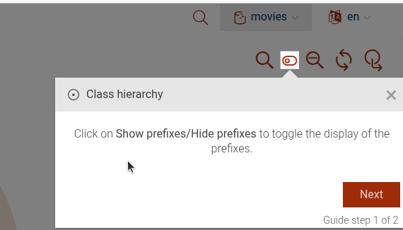
```# static class-hierarchy-toggle-prefixes
This step focuses on the button that toggles the display of prefixes in the class hierarchy view.
- @example
{
  "guideBlockName": "class-hierarchy-toggle-prefixes",
}
# static class-hierarchy-zoom-class
This step focuses on guiding users to zoom into a specific class within the class hierarchy visualization. Scrolling will zoom into the class, visualizing subclasses
This step can be configured using the common options defined in Options.
Properties:
| Name | Type | Description |
|---|---|---|
options.iri |
string
|
The IRI of the class to be zoomed into. This option is required. |
Example
```JSON
{
"guideBlockName": "class-hierarchy-zoom-class",
"options": {
"iri": "imdb:ColorMovie"
}
}
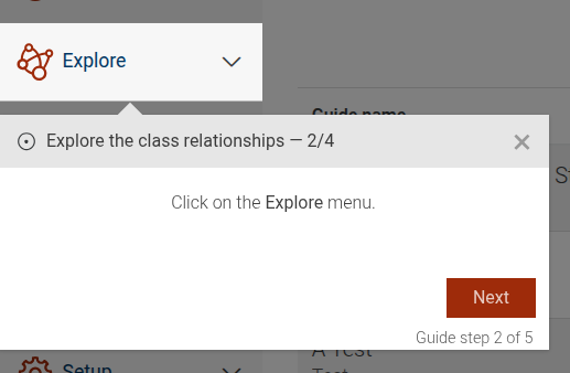
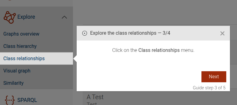
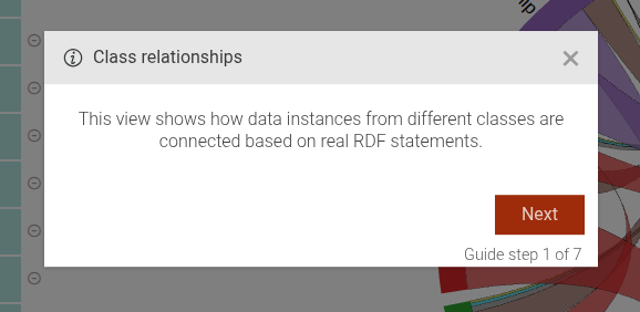
```# static class-relationships
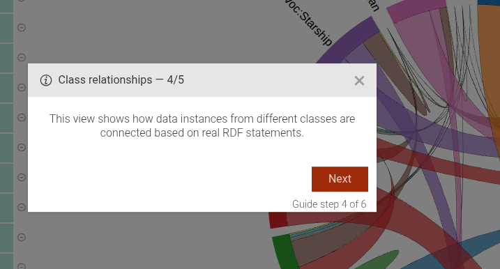
The class-relationships step shows how to reach the Class relationships view of GraphDB Workbench.
The step consists of the following steps:
- An introduction to the Class relationships.
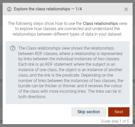
- A step that guides the user to click on the "Explore" main menu.
- A step that guides the user to click on the "Class relationships" sub-menu item.
- Optional step that will be shown only if property
introExtraContentis passed through options
This step can be configured using the common options defined in Options. Additionally, it supports the following options:
Properties:
| Name | Type | Attributes | Description |
|---|---|---|---|
introExtraContent |
Object.<string, string>
|
<optional> |
If this option is present, an additional dialog will be displayed as the last step with the passed content, localized by language. |
Example
```JSON
{
"guideBlockName": "class-relationships",
"options": {
"introExtraContent": {
"en": "The Class relationships is a complicated diagram, which by default shows only the top relationships...",
"fr": "Les relations de classes constituent un diagramme complexe, qui affiche par défaut uniquement les relations principales.."
}
}
}
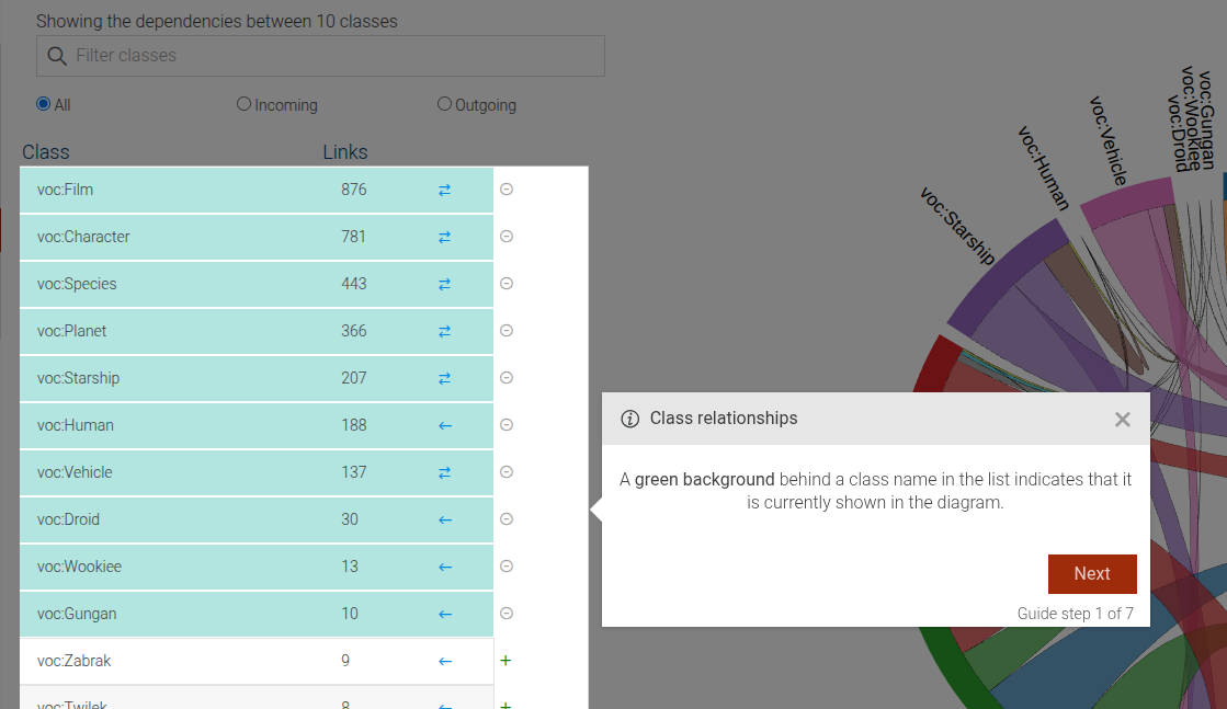
```# static class-relationships-class-list-background-intro
The class-relationships-class-list-background-intro step displays a dialog that explains which classes are highlighted
in the dependency table of the Class Relationships view.
This step can be configured using the common options defined in Options.
Example
```JSON
{
"guideBlockName": "class-relationships-class-list-background-intro"
}
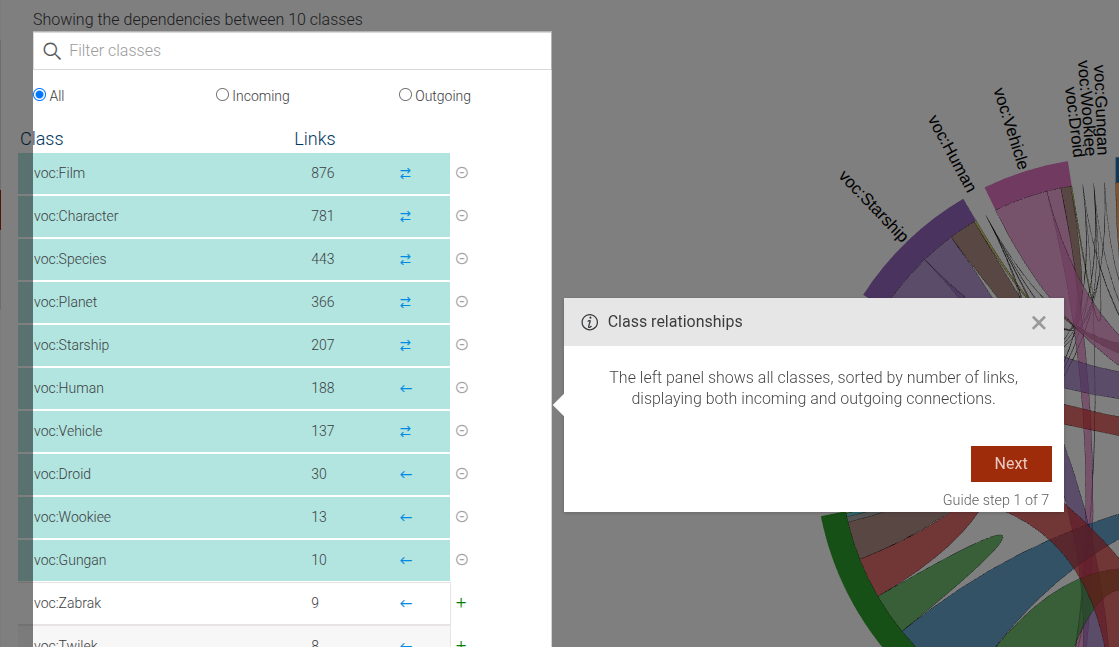
```# static class-relationships-class-list-intro
The class-relationships-class-list-intro step displays a dialog that explains class dependency table in
the Class relationships view.
This step can be configured using the common options defined in Options.
Example
```JSON
{
  "guideBlockName": "class-relationships-class-list-intro"
}
```
# static class-relationships-class-list-selection
The class-relationships-class-list-selection step displays a dialog that explains how users can add or remove classes from the diagram.
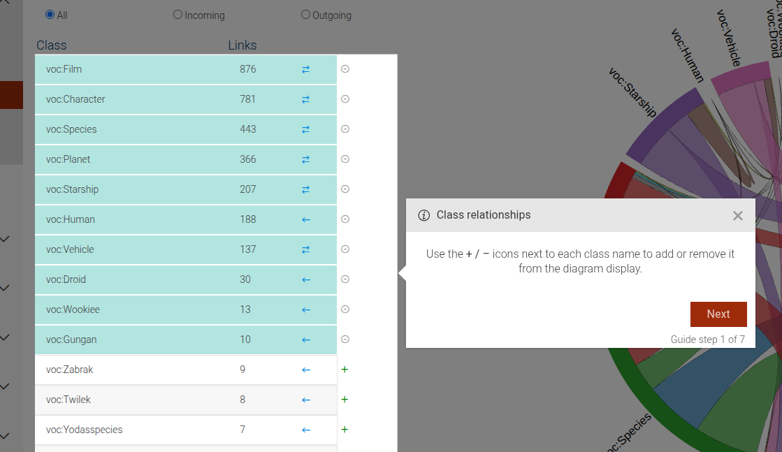
This step can be configured using the common options defined in Options.
Example
```JSON
{
  "guideBlockName": "class-relationships-class-list-selection"
}
```
# static class-relationships-diagram-intro
The class-relationships-diagram-intro step displays a dialog that explains the class diagram in the Class Relationships view.
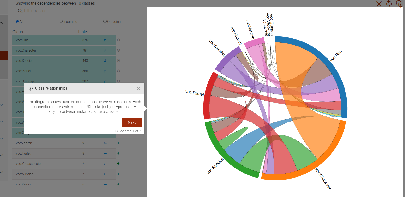
This step can be configured using the common options defined in Options.
Example
```JSON
{
  "guideBlockName": "class-relationships-diagram-intro"
}
```
# static class-relationships-digram-predicates-intro
The class-relationships-digram-predicates-intro step displays a dialog that explains how to explore the relationships between classes
by clicking on a connection line in the diagram to view the top predicates linking them.
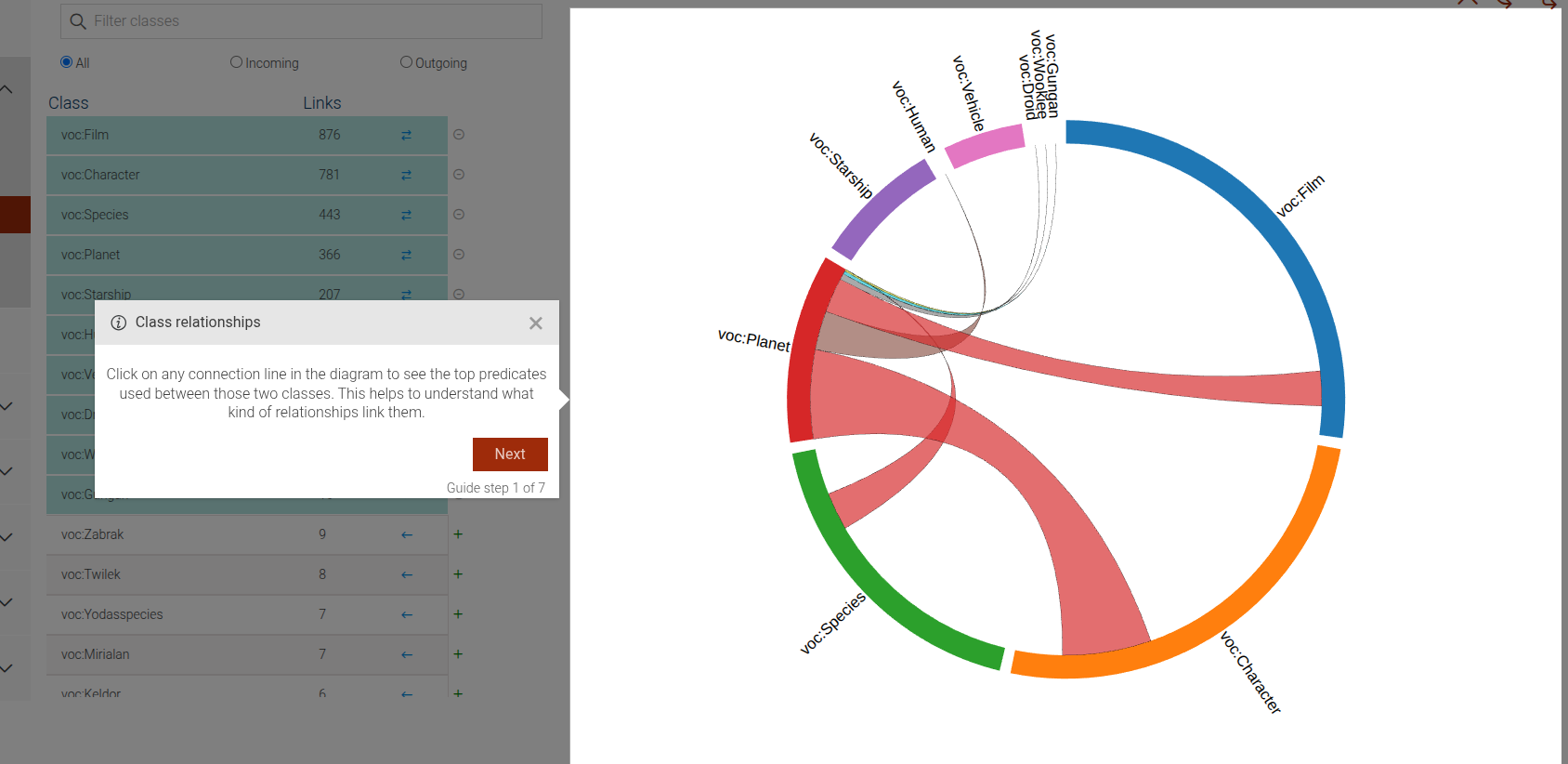
This step can be configured using the common options defined in Options.
Example
```JSON
{
  "guideBlockName": "class-relationships-digram-predicates-intro"
}
```
# static class-relationships-digram-thickness-intro
The class-relationships-digram-thickness-intro step displays a dialog that explains how connection lines in the diagram
encode information through their thickness, color, and direction.
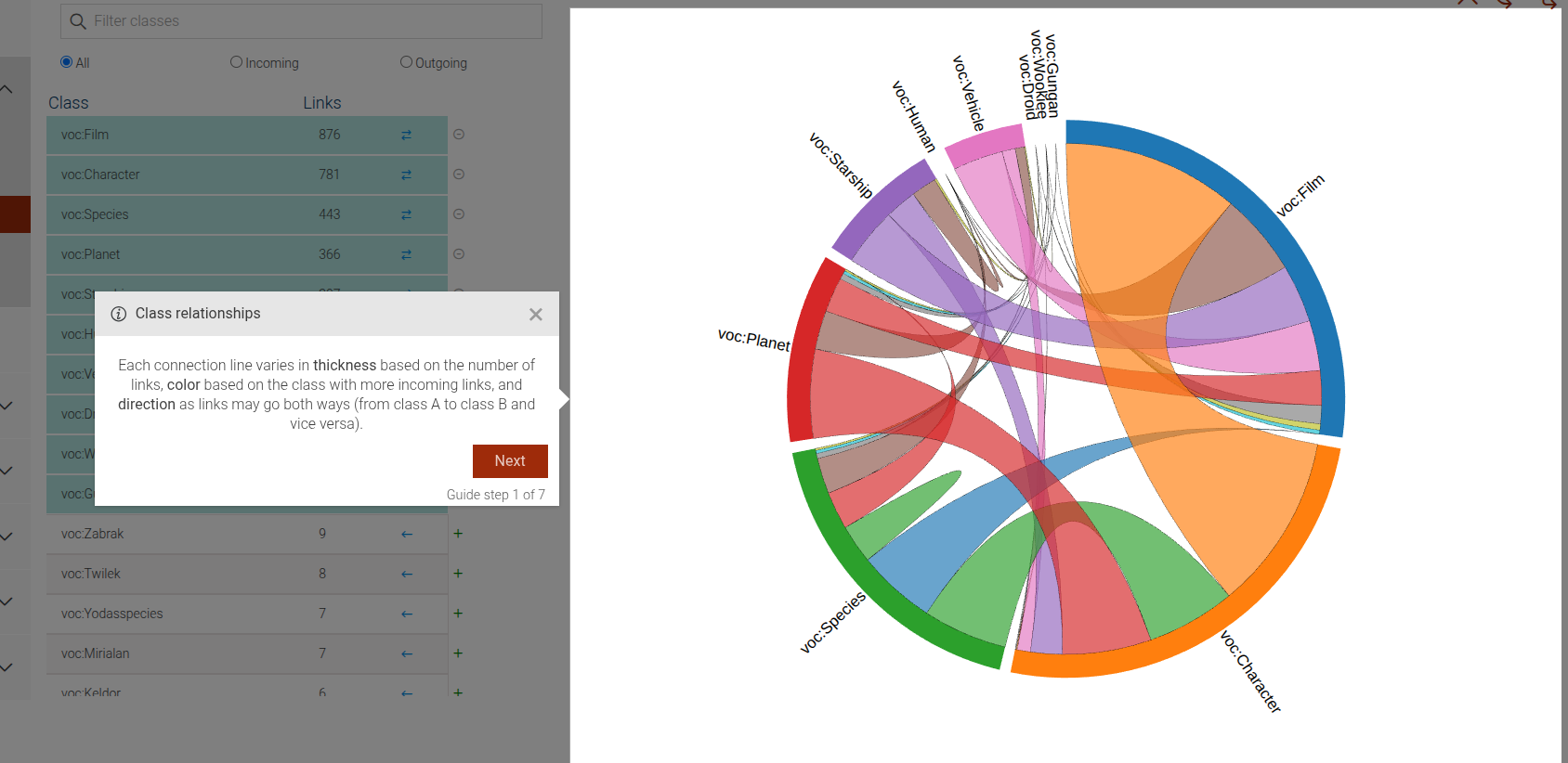
This step can be configured using the common options defined in Options.
Example
```JSON
{
  "guideBlockName": "class-relationships-digram-thickness-intro"
}
```
# static class-relationships-intro
The class-relationships-intro step displays a dialog that introduces the Class relationships view.
This step can be configured using the common options defined in Options.
Example
```JSON
{
  "guideBlockName": "class-relationships-intro"
}
```
# static class-relationships-named-graph-selection
The class-relationships-named-graph-selection step displays a dialog that explains how to filter the Class Relationships view
by selecting a specific named graph from the All graphs dropdown.
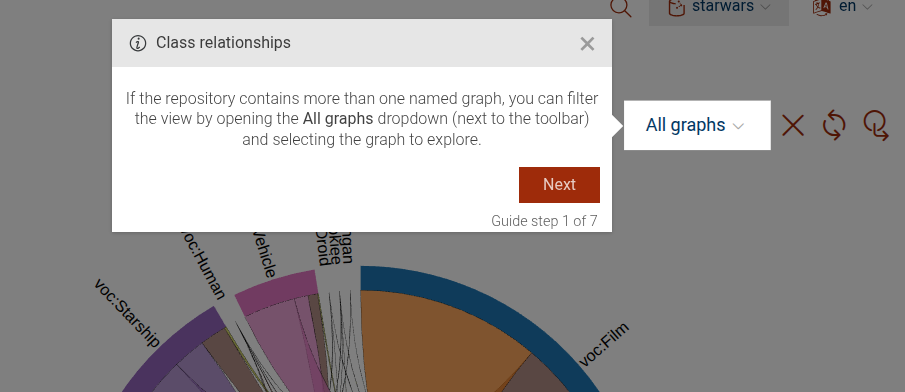
This step can be configured using the common options defined in Options.
Example
```JSON
{
"guideBlockName": "class-relationships-named-graph-selection"
}
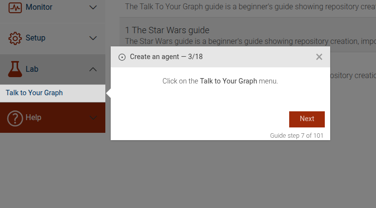
```# static click-main-menu
This guide step is used to guide the user through the main menu.
The guide step is composed of two steps: An optional intro message and 1 or 2 clickable menu elements.
All are calculated dynamically based on the options.menu parameter.
Intro message
Click main menu
Click submenu
This step can be configured using the common options defined in Options. Additionally, it requires:
Properties:
| Name | Type | Attributes | Description |
|---|---|---|---|
options.menu |
string
|
The menu for which to add intro and click-menu steps. |
|
options.mainAction |
string
|
<optional> |
The action to be performed on the main menu. Used to display the correct intro message. |
Example
```JSON
{
  "guideBlockName": "click-main-menu",
  "options": {
   "menu": "repositories",
   "mainAction": "create-repository"
  }
}
# static clickable-element
The Clickable Element step is used to guide users to click on a specific element on the interface. Clicking on the element will automatically advance to the next step.
Clickable element example
This step can be configured using the common options defined in Options. Additionally, it supports:
Properties:
| Name | Type | Attributes | Description |
|---|---|---|---|
options.clickableElementSelector |
string
|
<optional> |
The CSS selector of the element to be clicked. If not provided, |
options.elementSelector |
string
|
<optional> |
The CSS selector of the element to be highlighted. If not provided, the first clickable element will be highlighted. |
options.beforeShowPromise |
function
|
<optional> |
A promise that has to resolve, before the step is shown. If not provided, the step will be shown immediately. |
Example
```JSON
{
"guideBlockName": "clickable-element",
"options": {
"clickableElementSelector": "#submit-button",
"content": "Please click the Submit button to proceed."
}
}
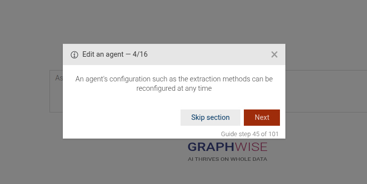
```# static configure-agent
Complex guide step, which takes the user through the process of configuring a TTYG agent. It includes steps to edit the agent name, model, extraction methods, temperature, top-p,
Configure agent name
Configure context size
Configure temperature
Configure top-p
Configure model name
Configure iri discovery search
Configure additional instructions
Properties:
| Name | Type | Attributes | Description |
|---|---|---|---|
editName |
boolean
|
<optional> |
Whether to include steps to edit the agent name. |
model |
string
|
<optional> |
The model name to set for the agent. If provided, steps to configure the model will be included. |
methods |
Array
|
<optional> |
An array of method objects to configure. Each object should contain a |
temperature |
number
|
<optional> |
The temperature value to set for the agent. If provided, steps to configure temperature will be included. |
topP |
number
|
<optional> |
The top-p value to set for the agent. If provided, steps to configure top-p will be included. |
iriDiscoverySearch |
Object
|
<optional> |
Configuration for IRI discovery search. If provided, steps to configure it will be included. |
disable |
boolean
|
<optional> |
Whether to disable IRI discovery search. |
userInstructions |
string
|
<optional> |
Additional user instructions to set for the agent. |
contextSize |
number
|
<optional> |
The context size to set for the agent. If provided, steps to configure the context size will be included. |
Example
```JSON
{
"guideBlockName": "configure-agent",
"options": {
"editName": true,
"model": "gpt-4o-mini",
"methods": [
{
"guideBlockName": "fts-search-method",
"options": {
"disable": true
}
},
{
"guideBlockName": "similarity-search-method"
}
],
"temperature": 0.7,
"topP": 0.9,
"contextSize": 1000,
"iriDiscoverySearch": {
"disable": false
},
"userInstructions": "Please provide concise answers."
}
}
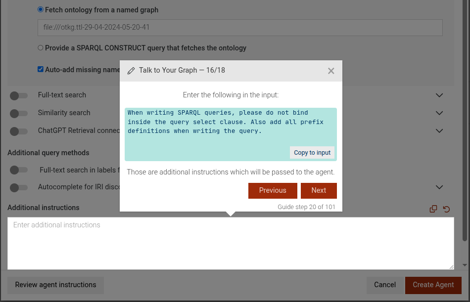
```# static configure-agent-additional-instructions
This step focuses on guiding the user to add additional instructions for the TTYG agent. It highlights the input area where the user can type their instructions and provides a text to copy
- Add additional instructions
This step can be configured using the common options defined in Options. Additionally it supports:
Properties:
| Name | Type | Attributes | Description |
|---|---|---|---|
userInstructions |
string
|
<optional> |
The additional instructions to be passed to the agent. This will be displayed in the instructions. |
Example
```JSON
{
"guideBlockName": "configure-agent-additional-instructions",
"options": {
"userInstructions": "When writing SPARQL queries, please do not bind inside the query select clause. Also add all prefix definitions when writing the query"
}
}
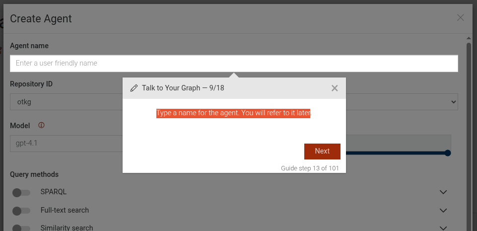
```# static configure-agent-type-agent-name
This step guides the user to input a name for the agent in the TTYG interface. It highlights the input field and provides instructions on how to proceed.
Type a name for the agent
This step can be configured using the common options defined in Options
Example
```JSON
{
 "guideBlockName": "configure-agent-type-agent-name",
}
```
# static configure-agent-type-model-name
This step guides the user to input the name of the OpenAI model to be used for the agent in the TTYG interface. It highlights the input field and provides instructions on how to proceed.
Type the name of the OpenAI model to be used
This step can be configured using the common options defined in Options. Additionally it supports:
Properties:
| Name | Type | Description |
|---|---|---|
options.model |
string
|
The name of the OpenAI model to be used (e.g., "gpt-4o-mini" ). |
Example
```JSON
{
 "guideBlockName": "configure-agent-type-model-name",
 "options": {
   "model": "gpt-4o-mini"
 }
}
```
# static configure-autocomplete-iri-discovery
This step guides the user to enable or disable the autocomplete IRI discovery feature in the TTYG interface. It highlights the toggle element and provides instructions on how to proceed.
Click on the toggle to enable/disable autocomplete for IRI discovery
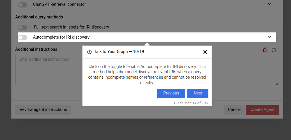
This step can be configured using the common options defined in Options. Additionally, it supports:
Properties:
| Name | Type | Attributes | Description |
|---|---|---|---|
options.disable |
boolean
|
<optional> |
Set to true to guide the user to disable the IRI discovery search, or false to enable it. |
Example
```JSON
{
 "guideBlockName": "configure-autocomplete-iri-discovery",
 "options": {
   "disable": true // or false to enable
 }
}
```
# static configure-iri-discovery-search
This step guides the user to enable or disable the IRI discovery search feature in the TTYG interface. It highlights the toggle element and provides instructions on how to proceed.
Click on the toggle to enable/disable IRI discovery search
This step can be configured using the common options defined in Options. Additionally it supports:
Properties:
| Name | Type | Description |
|---|---|---|
options.disable |
boolean
|
Set to true to guide the user to disable the IRI discovery search, or false to enable it. |
Example
```JSON
{
"guideBlockName": "configure-iri-discovery-search",
"options": {
"disable": true // or false to enable
}
}
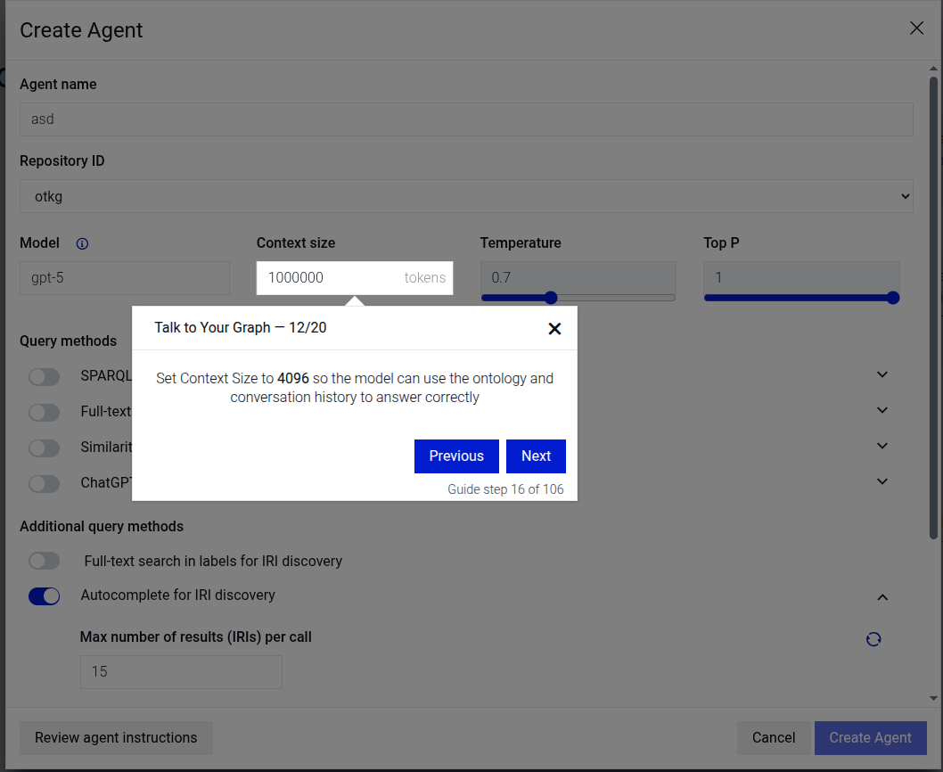
```# static configure-temperature
This step guides the user to configure the sampling temperature setting for the TTYG agent. It highlights the sampling temperature control element and provides instructions on how to set it.
Configure sampling temperature
This step can be configured using the common options defined in Options. Additionally it supports:
Properties:
| Name | Type | Description |
|---|---|---|
options.temperature |
number
|
The temperature value to set, typically between 0 and 2. |
Example
```JSON
{
 "guideBlockName": "configure-temperature",
 "options": {
   "temperature": 0.7
 }
}
```
# static configure-top-p
This step sets the nucleus sampling parameter (top-p) for the TTYG agent. It guides the user to adjust the top-p control to a specified value.
Configure the nucleus sampling (top-p) parameter
This step can be configured using the common options defined in Options. Additionally it supports:
Properties:
| Name | Type | Description |
|---|---|---|
options.topP |
number
|
The target value for the top-p parameter (between 0 and 1). |
Example
```JSON
{
 "guideBlockName": "configure-top-p",
 "options": {
   "topP": 0.9
 }
}
```
# static connectors-array-subparameter-intro
This step is an introductory step for the creation of a subparameter within a parameter of a connector. It explains the purpose and usage of subparameters in defining how a connector instance is created.
Connectors subparameter introduction

This step can be configured using the common options defined in Options. Additionally, it requires:
Properties:
| Name | Type | Description |
|---|---|---|
connectorName |
string
|
the name of the connector for which the subparameter is being defined. |
instanceName |
string
|
the specific instance name of the connector. |
parameterName |
string
|
the specific creation parameter name for |
subparameterName |
string
|
the specific creation subparameter name for |
Example
```JSON
{
 "guideBlockName": "connectors-array-subparameter-intro",
 "options": {
   "connectorName": "Elasticsearch",
   "instanceName": "MyElasticsearchConnector",
   "parameterName": "hosts",
   "subparameterName": "host"
 }
}
```
# static connectors-close-view-sparql-query-dialog
This step prompts the user to close the "View SPARQL Query" dialog.
Close SPARQL Query dialog example
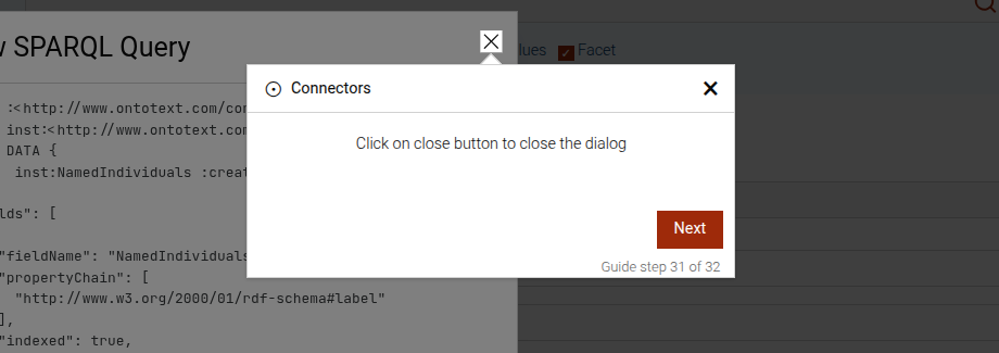
This step can be configured using the common options defined in Options.
Example
```JSON
{
 "guideBlockName": "connectors-close-view-sparql-query-dialog",
}
```
# static connectors-connector-intro
This step is an introductory step for the connectors section of the GraphDB Workbench. It explains the purpose of an individual connector.
Connectors section introduction
This step can be configured using the common options defined in Options. Additionally, it requires:
Properties:
| Name | Type | Description |
|---|---|---|
connectorName |
string
|
the name of the connector for which the section is being defined. |
instanceName |
string
|
the specific instance name of the connector. |
Example
```JSON
{
 "guideBlockName": "connectors-connector-intro",
 "options": {
   "connectorName": "Elasticsearch",
   "instanceName": "MyElasticsearchConnector"
 }
}
```
# static connectors-connectors-intro
This step is an introductory step for the "Connectors" section of the GraphDB Workbench.
Connectors introduction
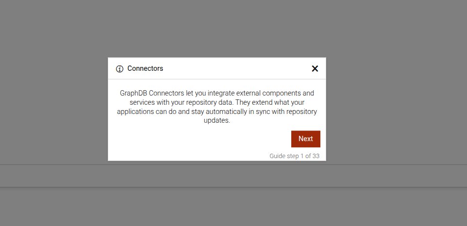
This step can be configured using the common options defined in Options.
Example
```JSON
{
 "guideBlockName": "connectors-intro",
}
```
# static connectors-expand-connector
This step prompts the user to expand the connector details by clicking on its name.
Connectors expand step
This step can be configured using the common options defined in Options. Additionally, it requires:
Properties:
| Name | Type | Description |
|---|---|---|
connectorName |
string
|
the name of the connector for which the section is being defined. |
instanceName |
string
|
the specific instance name of the connector. |
Example
```JSON
{
"guideBlockName": "connectors-expand-connector",
"options": {
"connectorName": "Elasticsearch",
"instanceName": "MyElasticsearchConnector"
}
}
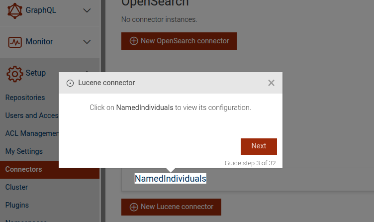
```# static connectors-expand-lucene
This step guides the user to expand a specific Lucene connector instance in GraphDB to view its configuration. It prompts the user to click on the connector's name to access its settings.
Expand Lucene connector

This step can be configured using the common options defined in Options. It requires options.instanceName.
Properties:
| Name | Type | Description |
|---|---|---|
options.instanceName |
string
|
The specific instance name of the Lucene connector. This option is required. |
Example
```JSON
{
"guideBlockName": "connectors-expand-lucene",
"options": {
"instanceName": "MyLuceneConnector"
}
}
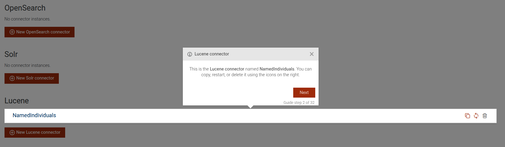
```# static connectors-lucene
This step provides an overview of a specific Lucene connector instance in GraphDB. It highlights the connector's name and offers options to manage it, such as copying, restarting, or deleting.
Lucene connector overview

This step can be configured using the common options defined in Options. It requires options.instanceName.
Properties:
| Name | Type | Description |
|---|---|---|
options.instanceName |
string
|
The specific instance name of the Lucene connector. This option is required. |
Example
```JSON
{
 "guideBlockName": "connectors-lucene",
 "options": {
   "instanceName": "MyLuceneConnector"
  }
}
```
# static connectors-lucene-analyzer-intro
This step is an introductory step for the "Analyzer" parameter of the Lucene connector in GraphDB. It explains the purpose and usage of the "Analyzer" parameter in defining a custom Lucene Analyzer.
Lucene connector analyzer introduction
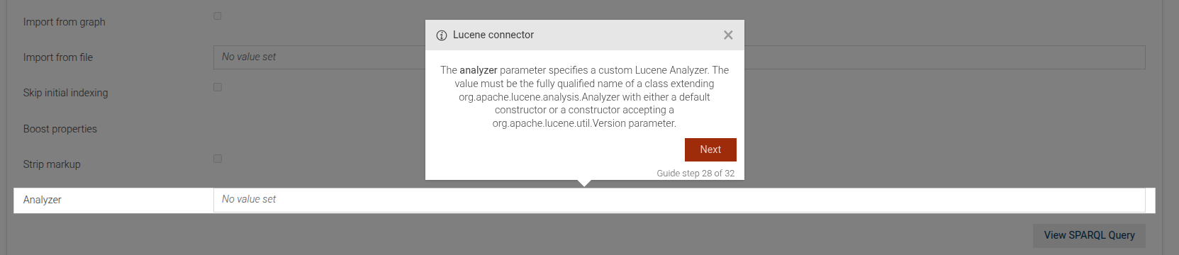
This step can be configured using the common options defined in Options.
Example
```JSON
{
 "guideBlockName": "connectors-lucene-analyzer-intro",
}
```
# static connectors-lucene-boost-properties-intro
This step is an introductory step for the "boostProperties" parameter of the Lucene connector in GraphDB. It explains the purpose and usage of the "boostProperties" in specifying document-specific boost properties.
Lucene connector boost properties introduction
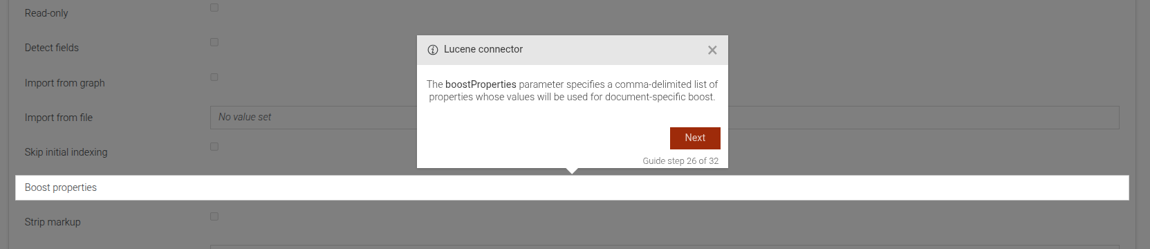
This step can be configured using the common options defined in Options.
Example
```JSON
{
 "guideBlockName": "connectors-lucene-boost-properties-intro",
}
```
# static connectors-lucene-detect-fields-intro
This step is an introductory step for the "detectFields" parameter of the Lucene connector in GraphDB. It explains the purpose and usage of the "detectFields" parameter in enabling automatic field detection.
Lucene connector detect fields introduction
This step can be configured using the common options defined in Options.
Example
```JSON
{
 "guideBlockName": "connectors-lucene-detect-fields-intro",
}
```
# static connectors-lucene-document-filter-intro
This step is an introductory step for the "Document filter" parameter of the Lucene connector in GraphDB. It explains the purpose and usage of the "Document filter" in defining a top-level document filter for documents.
Lucene connector document filter introduction
This step can be configured using the common options defined in Options.
Example
```JSON
{
 "guideBlockName": "connectors-lucene-document-filter-intro",
}
```
# static connectors-lucene-fields-analyzed-intro
This step is an introductory step for the "Analyzed" sub-parameter within the fields configuration of the Lucene connector in GraphDB. It explains the purpose and usage of the "Analyzed" option in determining whether literal fields are processed by the analyzer when indexed.
Lucene connector analyzed introduction
This step can be configured using the common options defined in Options.
Example
```JSON
{
 "guideBlockName": "connectors-lucene-fields-analyzed-intro",
}
```
# static connectors-lucene-fields-datatype-intro
This step is an introductory step for the "Datatype" sub-parameter within the fields configuration of the Lucene connector in GraphDB. It explains the purpose and usage of the "Datatype" in mapping data between GraphDB and Lucene.
Lucene connector datatype introduction
This step can be configured using the common options defined in Options.
Example
```JSON
{
 "guideBlockName": "connectors-lucene-fields-datatype-intro",
}
```
# static connectors-lucene-fields-default-value-intro
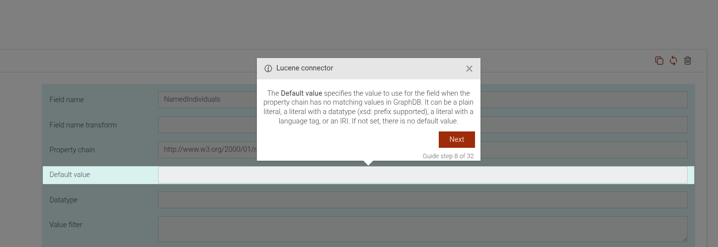
This step is an introductory step for the "Default value" sub-parameter within the fields configuration of the Lucene connector in GraphDB. It explains the purpose and usage of the "Default value" in mapping data between GraphDB and Lucene.
Lucene connector default value introduction
This step can be configured using the common options defined in Options.
Example
```JSON
{
"guideBlockName": "connectors-lucene-fields-default-value-intro",
}
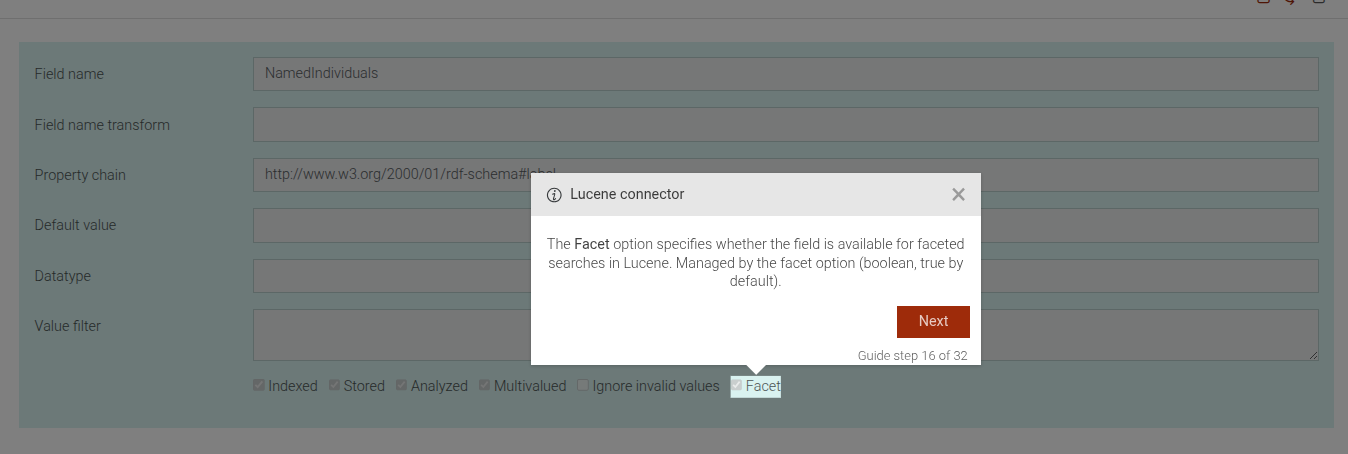
```# static connectors-lucene-fields-facet-intro
This step is an introductory step for the "Facet" sub-parameter within the fields configuration of the Lucene connector in GraphDB. It explains the purpose and usage of the "Facet" option in determining whether a field is available for faceted searches in Lucene.
Lucene connector facet introduction
This step can be configured using the common options defined in Options.
Example
```JSON
{
"guideBlockName": "connectors-lucene-fields-facet-intro",
}
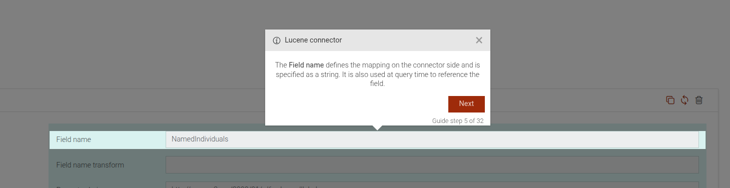
```# static connectors-lucene-fields-field-name-intro
This step is an introductory step for the "Field name" sub-parameter within the fields configuration of the Lucene connector in GraphDB. It explains the purpose and usage of the "Field name" in mapping data between GraphDB and Lucene.
Lucene connector field name introduction
This step can be configured using the common options defined in Options.
Example
```JSON
{
"guideBlockName": "connectors-lucene-fields-field-name-intro",
}
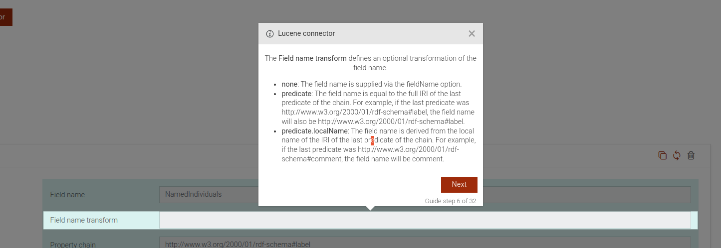
```# static connectors-lucene-fields-field-name-transform-intro
This step is an introductory step for the "Field name transform" sub-parameter within the fields configuration of the Lucene connector in GraphDB. It explains the purpose and usage of the "Field name transform" in mapping data between GraphDB and Lucene.
Lucene connector field name transform introduction
This step can be configured using the common options defined in Options.
Example
```JSON
{
 "guideBlockName": "connectors-lucene-fields-field-name-transform-intro",
}
```
# static connectors-lucene-fields-ignore-invalid-values-intro
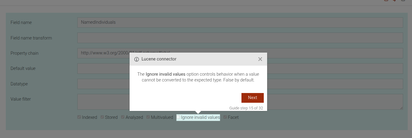
This step is an introductory step for the "Ignore Invalid Values" sub-parameter within the fields configuration of the Lucene connector in GraphDB. It explains the purpose and usage of the "Ignore Invalid Values" option in handling data type conversion issues.
Lucene connector ignore invalid values introduction
This step can be configured using the common options defined in Options.
View Source guides/connectors/lucene/connectors-lucene-fields-ignore-invalid-values-intro.js, line 5
Example
```JSON
{
 "guideBlockName": "connectors-lucene-fields-ignore-invalid-values-intro",
}
```
# static connectors-lucene-fields-indexed-intro
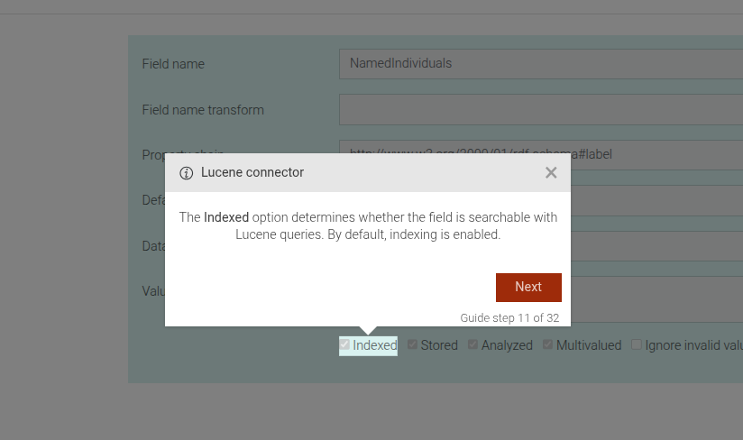
This step is an introductory step for the "Indexed" sub-parameter within the fields configuration of the Lucene connector in GraphDB. It explains the purpose and usage of the "Indexed" option in determining whether a field is searchable with Lucene queries.
Lucene connector indexed introduction
This step can be configured using the common options defined in Options.
Example
```JSON
{
"guideBlockName": "connectors-lucene-fields-indexed-intro",
}
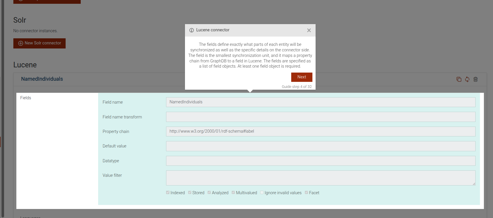
```# static connectors-lucene-fields-intro
This step is an introductory step for the fields configuration of the Lucene connector in GraphDB. It provides an overview of how fields define the synchronization units between GraphDB and Lucene.
Lucene connector fields introduction
This step can be configured using the common options defined in Options.
Example
```JSON
{
 "guideBlockName": "connectors-lucene-fields-intro",
}
```
# static connectors-lucene-fields-multivalued-intro
This step is an introductory step for the "Multivalued" sub-parameter within the fields configuration of the Lucene connector in GraphDB. It explains the purpose and usage of the "Multivalued" option in determining whether multiple values for RDF properties are synchronized to Lucene.
Lucene connector multivalued introduction
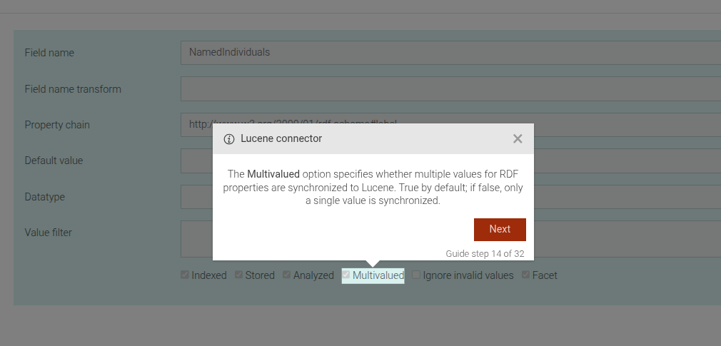
This step can be configured using the common options defined in Options.
Example
```JSON
{
 "guideBlockName": "connectors-lucene-fields-multivalued-intro",
}
```
# static connectors-lucene-fields-property-chain-intro
This step is an introductory step for the "Property chain" sub-parameter within the fields configuration of the Lucene connector in GraphDB. It explains the purpose and usage of the "Property chain" in mapping data between GraphDB and Lucene.
Lucene connector property chain introduction
This step can be configured using the common options defined in Options.
Example
```JSON
{
 "guideBlockName": "connectors-lucene-fields-property-chain-intro",
}
```
# static connectors-lucene-fields-remaining-fields-intro
This step showcases the remaining fields of a Lucene connector instance. We might have more than one field mapping for a Lucene connector instance.
Lucene connector remaining fields
This step can be configured using the common options defined in Options.
Example
```JSON
{
 "guideBlockName": "connectors-lucene-fields-remaining-fields-intro",
}
```
# static connectors-lucene-fields-stored-intro
This step is an introductory step for the "Stored" sub-parameter within the fields configuration of the Lucene connector in GraphDB. It explains the purpose and usage of the "Stored" option in determining whether a field's values are stored in Lucene.
Lucene connector stored introduction
This step can be configured using the common options defined in Options.
Example
```JSON
{
 "guideBlockName": "connectors-lucene-fields-stored-intro",
}
```
# static connectors-lucene-fields-value-filter-intro
This step is an introductory step for the "Value Filter" sub-parameter within the fields configuration of the Lucene connector in GraphDB. It explains the purpose and usage of the "Value Filter" in mapping data between GraphDB and Lucene.
Lucene connector value filter introduction
This step can be configured using the common options defined in Options.
Example
```JSON
{
"guideBlockName": "connectors-lucene-fields-value-filter-intro",
}
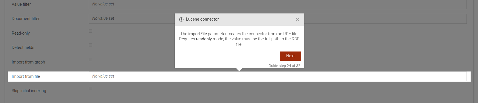
```# static connectors-lucene-import-file-intro
This step is an introductory step for the "importFile" parameter of the Lucene connector in GraphDB. It explains the purpose and usage of the "importFile" parameter, which allows creating a connector from an RDF file.
Lucene connector importFile introduction
This step can be configured using the common options defined in Options.
Example
```JSON
{
"guideBlockName": "connectors-lucene-import-file-intro",
}
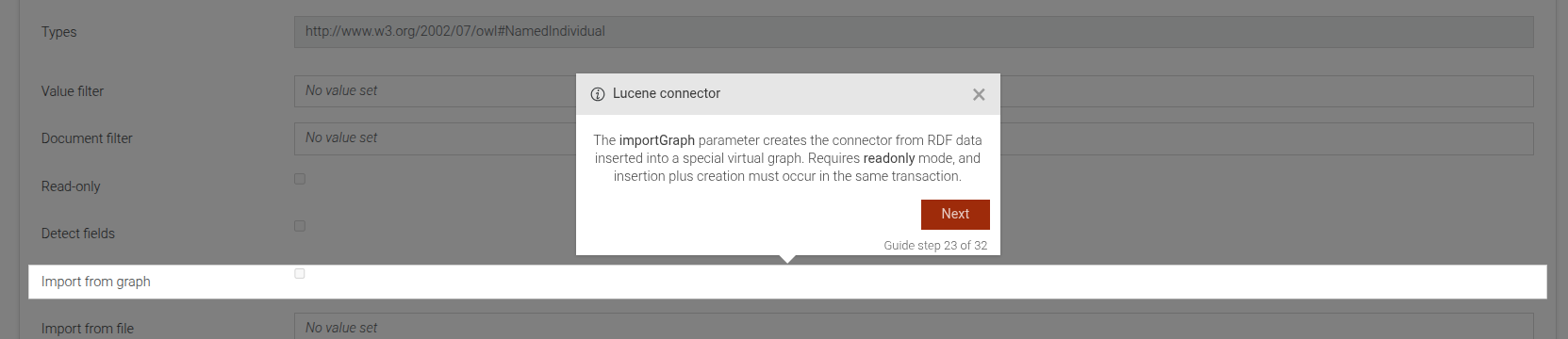
```# static connectors-lucene-import-graph-intro
This step is an introductory step for the "importGraph" parameter of the Lucene connector in GraphDB. It explains the purpose and usage of the "importGraph" parameter in creating a connector from RDF data inserted into a special virtual graph.
Lucene connector importGraph introduction
This step can be configured using the common options defined in Options.
Example
```JSON
{
"guideBlockName": "connectors-lucene-import-graph-intro",
}
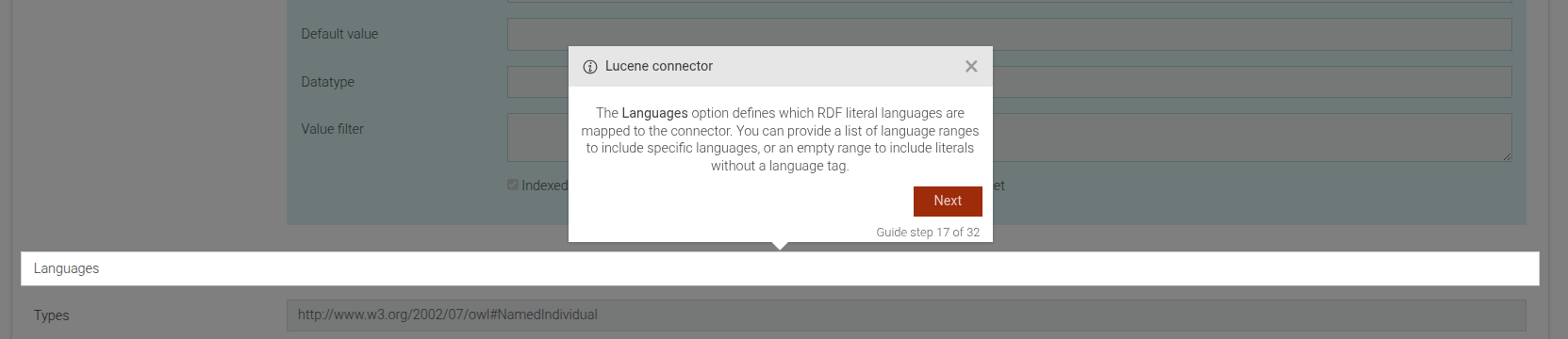
```# static connectors-lucene-languages-intro
This step is an introductory step for the "Languages" parameter within the Lucene connector configuration in GraphDB. It explains the purpose and usage of the "Languages" option in mapping RDF literal languages to the connector.
Lucene connector languages introduction
This step can be configured using the common options defined in Options.
Example
```JSON
{
"guideBlockName": "connectors-lucene-languages-intro",
}
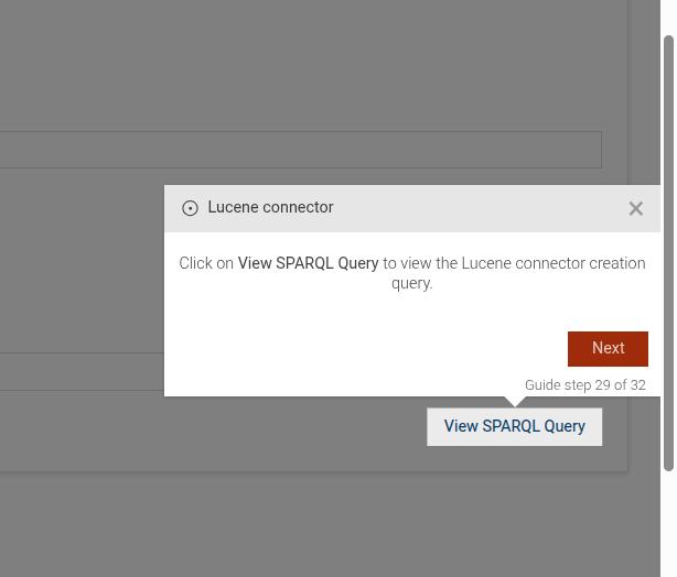
```# static connectors-lucene-open-view-sparql-query-dialog
This step guides the user to open the SPARQL query dialog for a specific Lucene connector instance in GraphDB. It prompts the user to click on "View SPARQL Query" to see the query used to create the Lucene connector.
Open Lucene connector SPARQL query dialog
This step can be configured using the common options defined in Options.
Example
```JSON
{
 "guideBlockName": "connectors-lucene-open-view-sparql-query-dialog",
}
```
# static connectors-lucene-readonly-intro
This step is an introductory step for the "Readonly" parameter of the Lucene connector in GraphDB. It explains the purpose and usage of the "Readonly" option in setting the connector to read-only mode.
Lucene connector readonly introduction
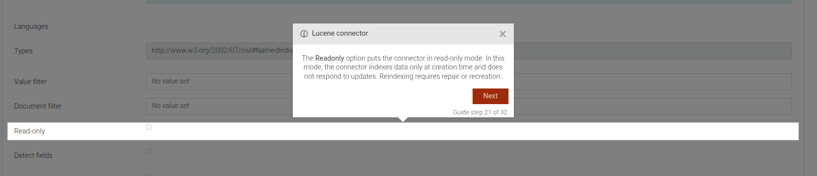
This step can be configured using the common options defined in Options.
Example
```JSON
{
 "guideBlockName": "connectors-lucene-readonly-intro",
}
```
# static connectors-lucene-skip-initial-indexing-intro
This step is an introductory step for the "skipInitialIndexing" parameter of the Lucene connector in GraphDB. It explains the purpose and usage of the "skipInitialIndexing" parameter in controlling the initial indexing behavior.
Lucene connector skipInitialIndexing introduction
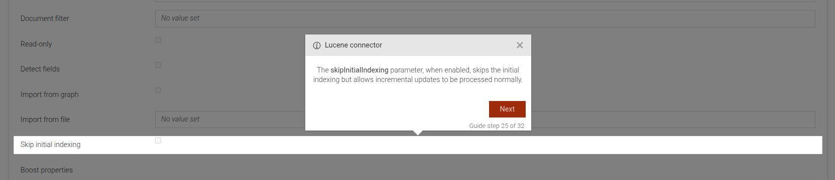
This step can be configured using the common options defined in Options.
Example
```JSON
{
 "guideBlockName": "connectors-lucene-skip-initial-indexing-intro",
}
```
# static connectors-lucene-strip-markup-intro
This step is an introductory step for the "stripMarkup" parameter of the Lucene connector in GraphDB. It explains the purpose and usage of the "stripMarkup" parameter in mapping data between GraphDB and Lucene.
Lucene connector stripMarkup introduction
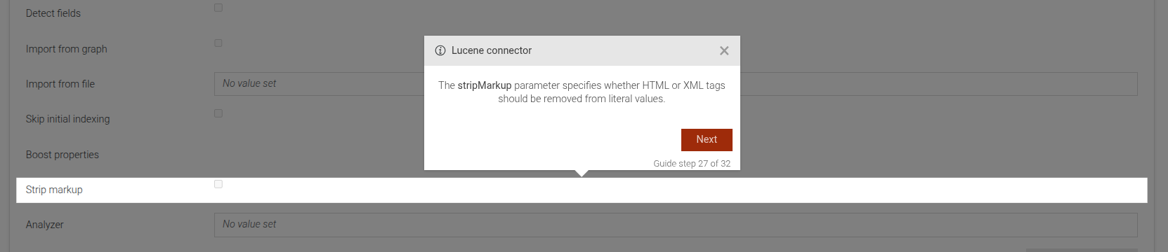
This step can be configured using the common options defined in Options.
Example
```JSON
{
 "guideBlockName": "connectors-lucene-strip-markup-intro",
}
```
# static connectors-lucene-type-intro
This step is an introductory step for the Lucene connector in GraphDB. It provides an overview of the connector's capabilities and its integration with the repository data.
Lucene connector introduction
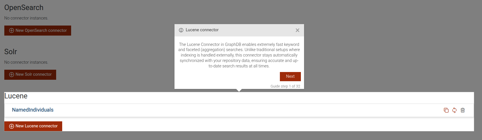
This step can be configured using the common options defined in Options.
Example
```JSON
{
 "guideBlockName": "connectors-lucene-type-intro",
}
```
# static connectors-lucene-types-intro
This step is an introductory step for the "Types" parameter within the Lucene connector configuration in GraphDB. It explains the purpose and usage of the "Types" option in specifying RDF types of entities to synchronize.
Lucene connector types introduction
This step can be configured using the common options defined in Options.
Example
```JSON
{
 "guideBlockName": "connectors-lucene-types-intro",
}
```
# static connectors-lucene-value-filter-intro
This step is an introductory step for the "Value filter" parameter of the Lucene connector in GraphDB. It explains the purpose and usage of the "Value filter" in defining a top-level value filter for documents.
Lucene connector value filter introduction
This step can be configured using the common options defined in Options.
Example
```JSON
{
 "guideBlockName": "connectors-lucene-value-filter-intro",
}
```
# static connectors-lucene-view-sparql-dialog-intro
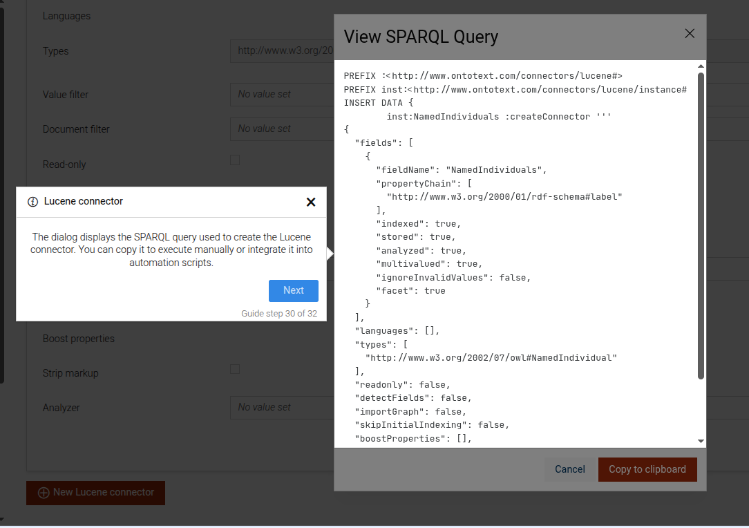
This step is an introductory step for the "View SPARQL Query" dialog of the Lucene connector in GraphDB. It explains the purpose of the dialog and how users can utilize the SPARQL query displayed within it.
Lucene connector View SPARQL Query dialog introduction
This step can be configured using the common options defined in Options.
Example
```JSON
{
 "guideBlockName": "connectors-lucene-view-sparql-dialog-intro",
}
```
# static connectors-open-view-sparql-query-dialog
This step prompts the user to open the "View SPARQL Query" dialog.
View SPARQL Query dialog example

This step can be configured using the common options defined in Options. Additionally, it requires:
Properties:
| Name | Type | Description |
|---|---|---|
connectorName |
string
|
the name of the connector for which the section is being defined. |
instanceName |
string
|
the specific instance name of the connector. |
Example
```JSON
{
 "guideBlockName": "connectors-open-view-sparql-query-dialog",
 "options": {
   "connectorName": "Elasticsearch",
   "instanceName": "MyElasticsearchConnector"
 }
}
```
# static connectors-parameter-fields-remaining-fields-intro
This step showcases the remaining fields of a connector instance. We might have more than one field mapping for a connector instance. In that case this step shows the remaining field mappings.
Remaining fields

This step can be configured using the common options defined in Options. Additionally, it requires:
Properties:
| Name | Type | Description |
|---|---|---|
connectorName |
string
|
the name of the connector for which the parameter is being defined. |
instanceName |
string
|
the specific instance name of the connector. |
parameterName |
string
|
the specific creation parameters name for |
Example
```JSON
{
 "guideBlockName": "connectors-parameter-fields-remaining-fields-intro",
 "options": {
   "connectorName": "Elasticsearch",
   "instanceName": "MyElasticsearchConnector",
   "parameterName": "hosts"
 }
}
```
# static connectors-parameter-intro
This step showcases a parameter of a connector instance.
Connectors parameter introduction

This step can be configured using the common options defined in Options. Additionally, it requires:
Properties:
| Name | Type | Description |
|---|---|---|
connectorName |
string
|
the name of the connector for which the parameter is being defined. |
instanceName |
string
|
the specific instance name of the connector. |
parameterName |
string
|
the specific creation parameters name for |
Example
```JSON
{
 "guideBlockName": "connectors-parameter-intro",
 "options": {
   "connectorName": "Elasticsearch",
   "instanceName": "MyElasticsearchConnector",
   "parameterName": "hosts"
 }
}
```
# static connectors-type-intro
This step shows the type of connector.
Connectors type introduction

This step can be configured using the common options defined in Options. Additionally, it requires:
Properties:
| Name | Type | Description |
|---|---|---|
connectorName |
string
|
the name of the connector for which the section is being defined. |
Example
```JSON
{
 "guideBlockName": "connectors-type-intro",
 "options": {
   "connectorName": "Elasticsearch"
 }
}
```
# static connectors-view-sparql-dialog-intro
This step is an introductory step for the "View SPARQL Query" dialog of the connectors section of the GraphDB Workbench. It explains the purpose of the dialog and how users can utilize the SPARQL query displayed within it.
Connectors "View SPARQL Query" dialog introduction

This step can be configured using the common options defined in Options.
Example
```JSON
{
"guideBlockName": "connectors-view-sparql-dialog-intro",
}
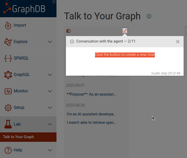
```# static conversation-with-ttyg-agent
This step guides the user through a conversation with a TTYG agent. It includes an optional info message, steps to start a new conversation
Conversation info message
Create new chat
Properties:
| Name | Type | Attributes | Description |
|---|---|---|---|
startNewConversation |
boolean
|
<optional> |
Whether to include steps to start a new conversation. |
showInfo |
boolean
|
<optional> |
Whether to show an informational message at the start of the conversation. |
questions |
Array
|
An array of question objects to ask the TTYG agent. Each object should |
Example
```JSON
{
 "guideBlockName": "conversation-with-ttyg-agent",
 "options": {
   "startNewConversation": true,
   "showInfo": true,
   "questions": [{
       "question": "What is the capital of France?"
   }]
 }
}
```
# static copy-text-element
Step that shows an input-like step with a code block containing provided text and a button to copy that
text into a target input (specified by options.elementSelector). It internally uses input-element to render the
step and manages attaching/removing the copy click listener when the step is shown/hidden.
Copy text element example
This step can be configured using the common options defined in Options. Additionally, it supports:
Properties:
| Name | Type | Description |
|---|---|---|
options.text |
string
|
The text content to display and copy into the target input. |
options.elementSelector |
string
|
CSS selector of the target input where text will be inserted on copy. |
Example
```JSON
{
  "guideBlockName": "copy-text-element",
  "options": {
    "elementSelector": "#query-input",
    "text": "SELECT * WHERE { ?s ?p ?o }"
  }
}
```
# static create-repository
Complex step, guiding the user through the creation of a new repository. The step consists of the following steps:
Click on the "Create repository" button.
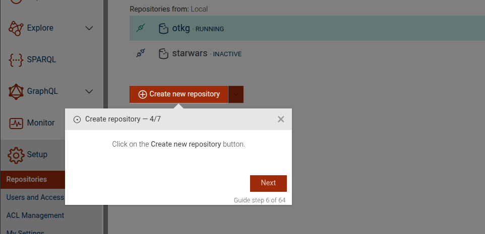
Create GraphDB repository.
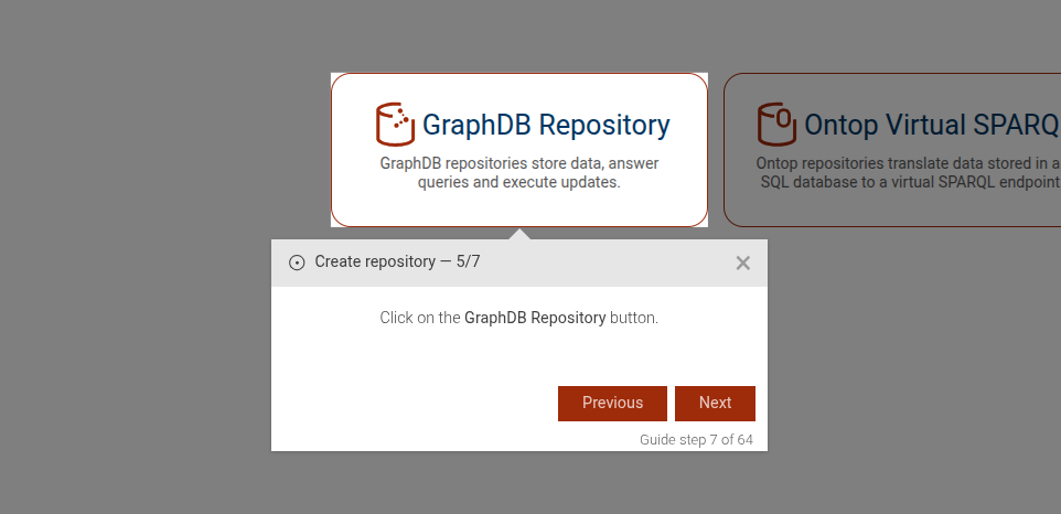
Enter a repository ID.
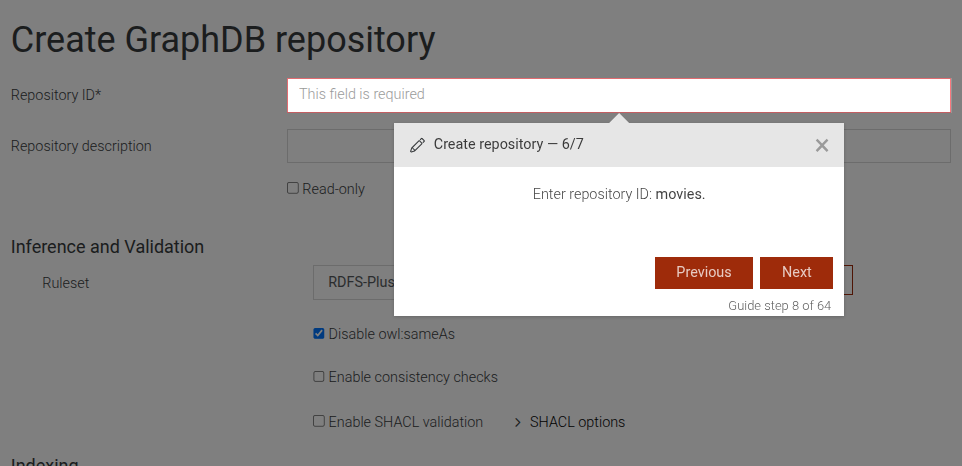
(Optional) Select a ruleset.
(Optional) Enable full-text search.
Save the repository.
This step can be configured using the common options defined in Options. Additionally, it supports the following options:
Properties:
| Name | Type | Attributes | Description |
|---|---|---|---|
rulesetName |
string
|
<optional> |
If this option is present, a dropdown will be displayed to select a ruleset. |
fts |
boolean
|
<optional> |
If this option is present, a checkbox will be displayed to enable full-text search. |
Example
```JSON
{
"guideBlockName": "create-repository",
"options": {
"rulesetName": "my-ruleset",
"fts": true
}
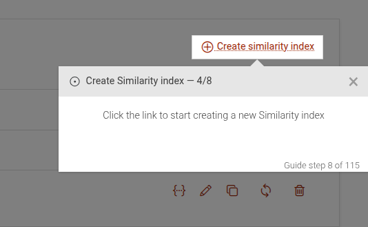
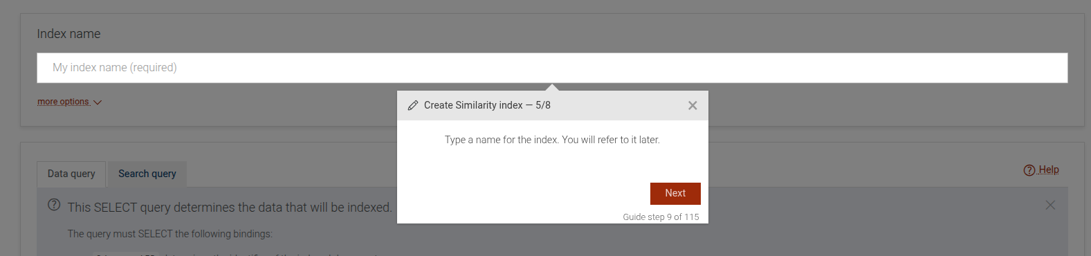
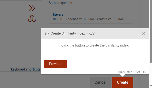
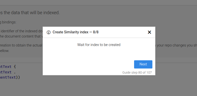
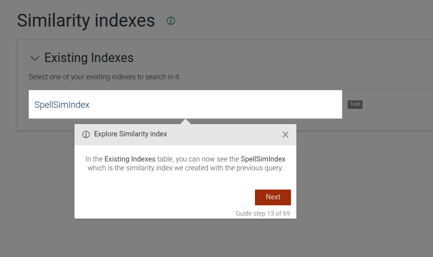
}# static create-similarity-index
Complex step, which includes all steps needed to create a similarity index.
Similarity click link
Similarity type index name
Similarity click to create
Similarity hold and wait until shown
This step can be configured using the common options defined in Options.
Example
```JSON
{
"guideBlockName": "create-similarity-index"
}
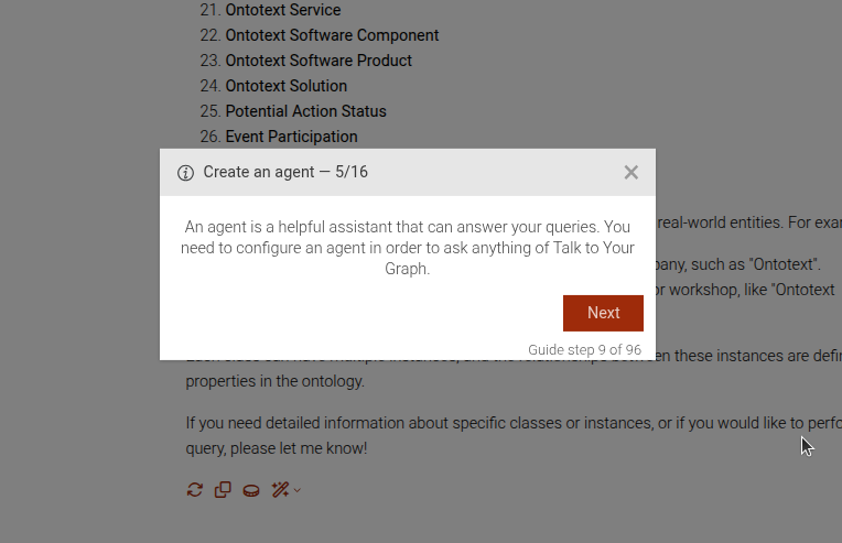
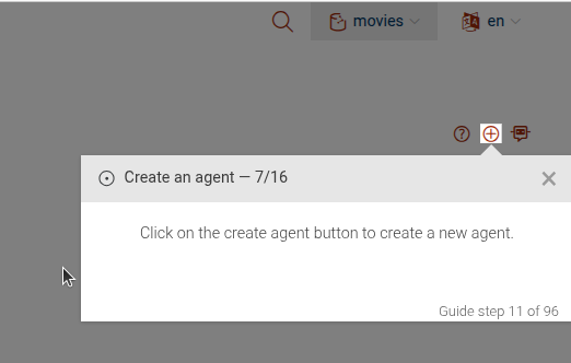
```# static create-ttyg-agent
This step guides the user through the process of creating a new TTYG agent. It includes steps to navigate to the TTYG section, open the agent creation modal, fill in the necessary details, and save the new agent.
Click the Lab main menu
Click on TTYG in the sub-menu
End guide if API key error is present
Create agent intro message
Click on "Create new agent" button
Click on "Save" button to create the agent
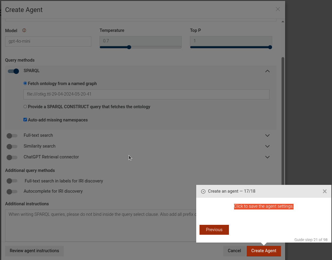
The configure-agent step is configurable complex step. See configure-agent for more details.
Example
```JSON
{
 "guideBlockName": "create-ttyg-agent",
}
```
# static download-guide-resource
This step guides the user to download a resource file required for the guide.
Download guide resource step
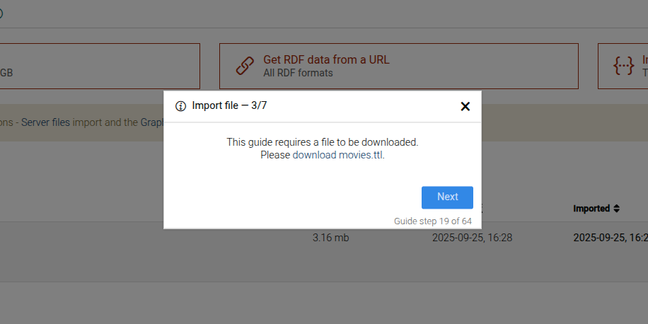
This step can be configured using the common options defined in Options. Additionally, it requires:
Properties:
| Name | Type | Description |
|---|---|---|
options.resourcePath |
string
|
The path to the resource file. |
options.resourceFile |
string
|
The name of the resource file. |
Example
```JSON
{
  "guideBlockName": "download-guide-resource",
  "options": {
    "resourcePath": "movies",
    "resourceFile": "movies.ttl"
  }
}
```
# static edit-ttyg-agent
Complex guide step, which takes the user through the process of editing a TTYG agent.
Click the Lab main menu
Click on TTYG in the sub-menu
End guide if API key error is present
Edit agent intro message
Click on edit agent button
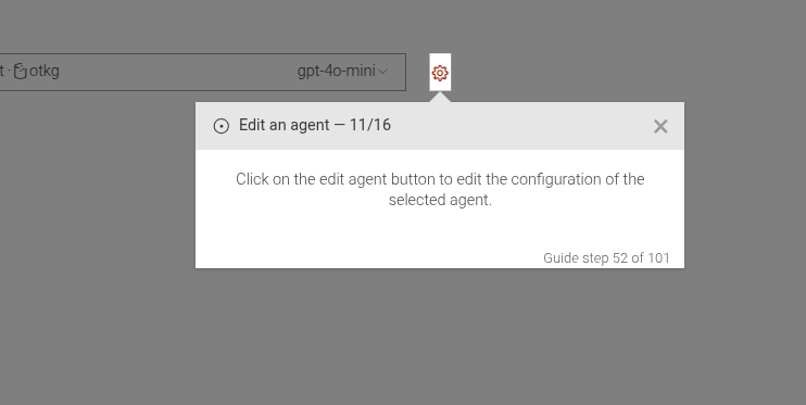
Click on save to save the edited agent
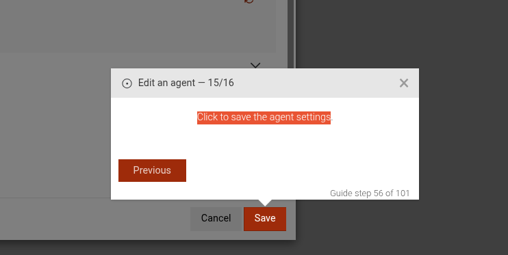
The configure-agent step is configurable complex step. See configure-agent for more details.
Example
```JSON
{
 "guideBlockName": "edit-ttyg-agent",
}
```
# static enable-autocomplete
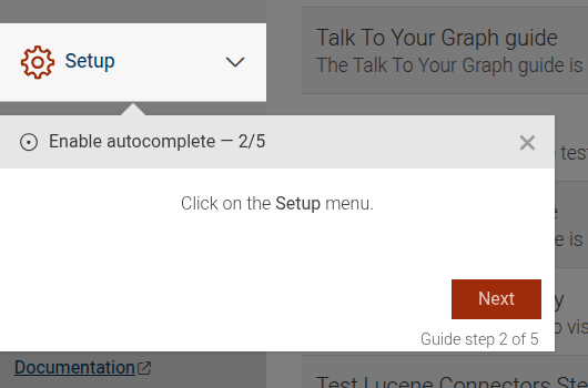
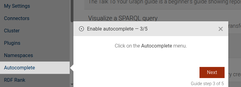
The enable-autocomplete guide shows how to use the Autocomplete index view to enable the autocomplete index.
The guide consists of the following steps:
- An introduction to the guide.
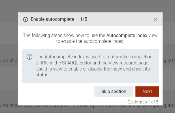
- A step that guides the user to click on the "Setup" main menu.
- A step that guides the user to click on the "Autocomplete" sub-menu item.
- A step that shows the user how to enable the autocomplete index by clicking a checkbox.
- A step that explains the status of the autocomplete index after it has been enabled.
This guide can be configured using the common options defined in Options.
Example
```JSON
{
"guideBlockName": "enable-autocomplete"
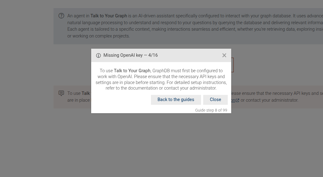
}# static end-on-api-key-error
This step checks for an API key error message and ends the guide if the error is present.
Missing OpenAI key error message
This step can be configured using the common options defined in Options.
Example
```JSON
{
"guideBlockName": "end-on-api-key-error",
}
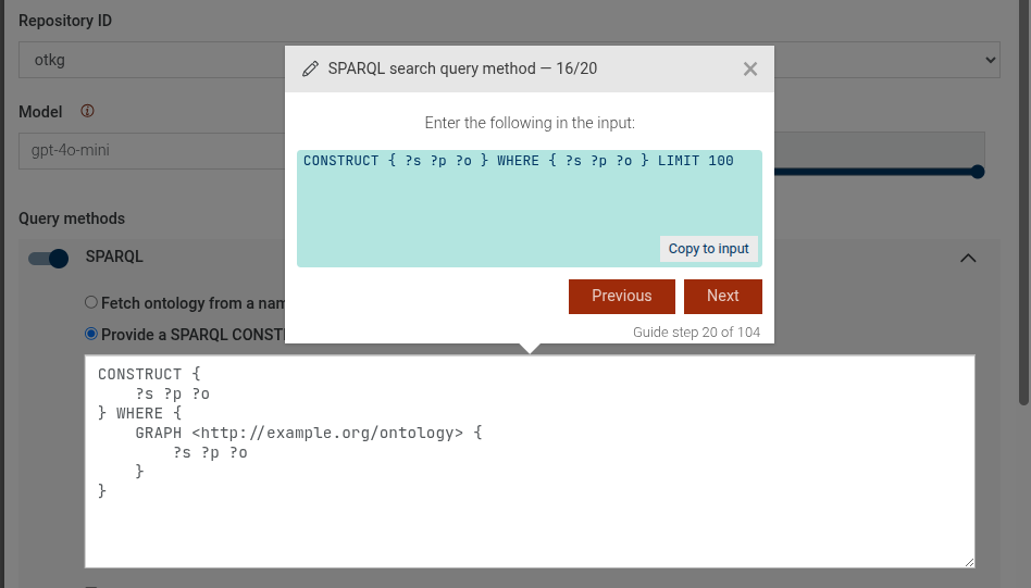
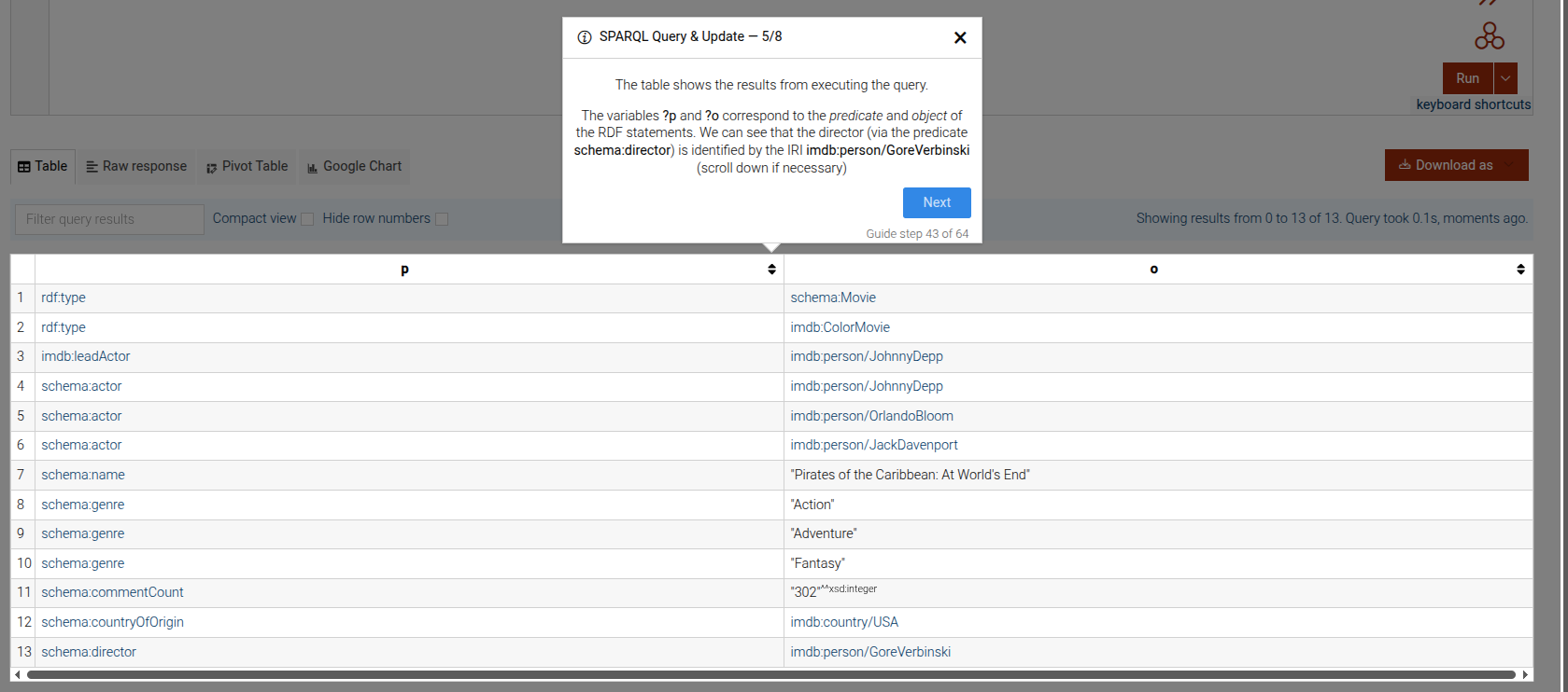
```# static execute-sparql-query
Composite step that executes a SPARQL query and displays the results. Included steps are:
Copy to editor
Click run button
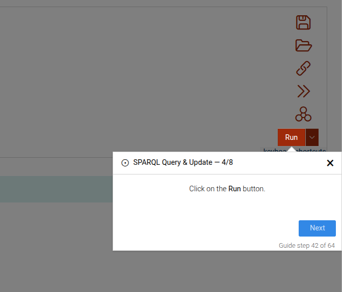
Explain results
This step can be configured using the common options defined in Options. Additionally, it requires:
Properties:
| Name | Type | Description |
|---|---|---|
queries |
Array
|
An array of objects containing the query and the additional content to display in the results. |
Example
```JSON
{
 "guideBlockName": "execute-sparql-query",
 "options": {
   "queries": [
     {
       "query": "SELECT ?s WHERE { ?s ?p ?o } LIMIT 10",
       "queryExtraContent": {
         "en": "This is the first query extra content."
       },
       "resultExtraContent": {
         "en": "This is the first result extra content."
       }
     },
     {
       "query": "SELECT ?o WHERE { <http://example.org/subject> ?p ?o } LIMIT 5",
       "queryExtraContent": {
         "en": "This is the second query extra content."
       },
       "resultExtraContent": {
         "en": "This is the second result extra content."
       }
     }
   ]
  }
}
```
# static focus-element
The Focus Element step is used to guide users to see a specific element on the interface.
Focus element example
This step can be configured using the common options defined in Options. Additionally, it supports:
Properties:
| Name | Type | Attributes | Description |
|---|---|---|---|
options.beforeShowPromise |
function
|
<optional> |
A promise that has to resolve, before the step is shown. If not provided, the step will be shown immediately. |
Example
```JSON
{
  "guideBlockName": "focus-element",
  "options": {
    "elementSelector": "#important-info",
    "content": "Please take a look at this important information."
  }
}
```
# static fts-search-method
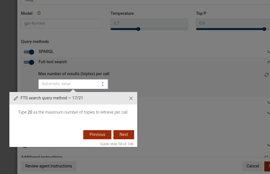
This is a complex step that guides the user through enabling or disabling the FTS search query method in the TTYG interface. It includes steps to provide information about the FTS search method, enable it if it's disabled, or disable it if it's enabled. If enabling, it can also include an optional step to set the maximum number of triples per call.
Disable FTS search method
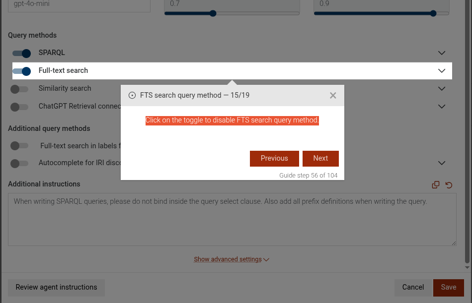
Enable FTS search method
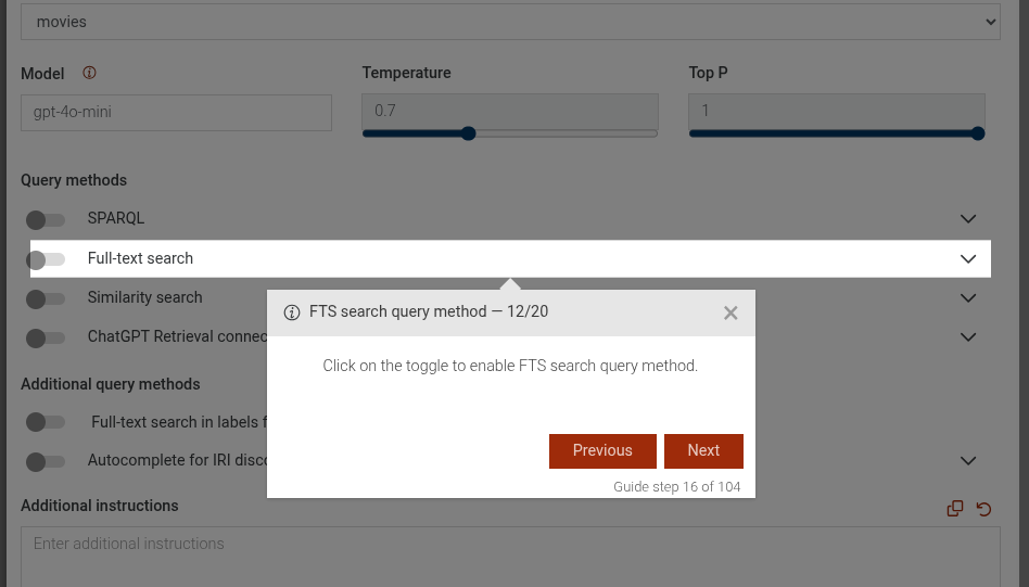
Set max triples per call
This step can be configured using the common options defined in Options. Additionally, it supports the following specific options:
Properties:
| Name | Type | Attributes | Description |
|---|---|---|---|
options.disable |
boolean
|
<optional> |
If true, the step will guide the user to disable the FTS search method. If false or not provided, it will guide to enable it. |
options.maxTriplesPerCall |
number
|
<optional> |
If provided and enabling the FTS search method, an additional step will be included to set the maximum number of triples per call to this value. |
Example
```JSON
{
  "guideBlockName": "fts-search-method",
  "options": {
    "disable": false,
    "maxTriplesPerCall": 1000
  }
}
```
# static guide-end
Final step indicating the guide has ended.
Final step example
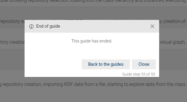
This step can be configured using the common options defined in Options. Additionally, it supports:
Properties:
| Name | Type | Attributes | Description |
|---|---|---|---|
options.title |
string
|
<optional> |
A custom title for the final step. |
options.content |
string
|
<optional> |
A custom content/message for the final step. |
Example
```JSON
{
  "guideBlockName": "guide-end",
  "options": {
    "title": "All done!",
    "content": "You have completed the guide."
  }
}
```
# static hold-and-wait-until-hidden
Holds the current step and waits until a specific element becomes hidden before allowing the user to proceed. While waiting, scroll events are allowed on the targeted element.
Hold and wait until hidden example
This step can be configured using the common options defined in Options. Additionally, it supports:
Properties:
| Name | Type | Attributes | Description |
|---|---|---|---|
options.elementSelectorToWait |
string
|
CSS selector of the element whose visibility is being monitored to become hidden. |
|
options.elementSelector |
string
|
<optional> |
CSS selector of the element on which scroll events are allowed while waiting. |
Example
```JSON
{
  "guideBlockName": "hold-and-wait-until-hidden",
  "options": {
    "elementSelectorToWait": "#loading",
    "elementSelector": "#scrollable"
  }
}
```
# static hold-and-wait-until-shown
Holds the current step and waits until a specific element becomes visible before allowing the user to proceed.
Hold and wait until shown example

This step can be configured using the common options defined in Options. Additionally, it supports:
Properties:
| Name | Type | Description |
|---|---|---|
options.elementSelectorToWait |
string
|
CSS selector of the element whose visibility is being monitored to become visible. |
Example
```JSON
{
"guideBlockName": "hold-and-wait-until-shown",
"options": {
"elementSelectorToWait": "#loaded-panel"
}
}
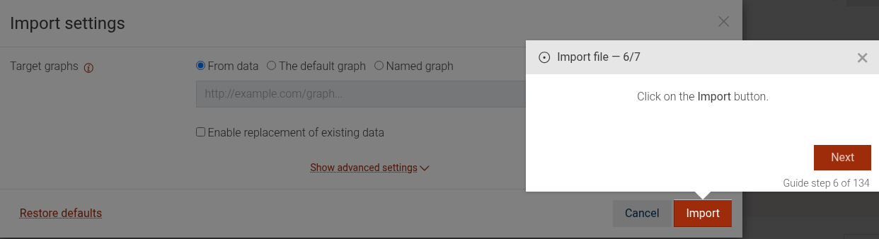
```# static import-click-on-import-button
The import-click-on-import-button step guides the user to click the import button in the import settings dialog of GraphDB.
This step can be configured using the common options defined in Options.
Example
```JSON
{
"guideBlockName": "import-click-on-import-button"
}
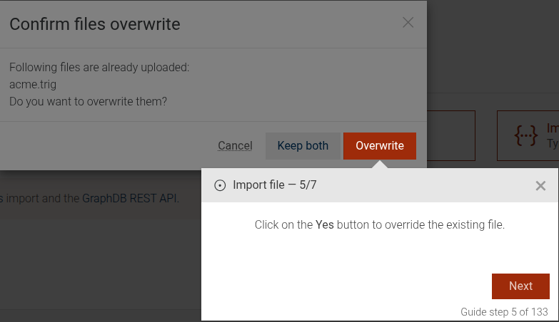
```# static import-confirm-duplicate-files
The import-confirm-duplicate-files step guides the user to confirm overwriting duplicate files in the import dialog of GraphDB.
This step can be configured using the common options defined in Options.
Example
```JSON
{
  "guideBlockName": "import-confirm-duplicate-files"
}
```
# static import-rdf-file
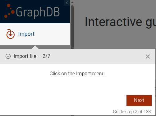
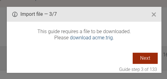
The import-rdf-file guide shows how to import an RDF file into GraphDB.
The guide consists of the following steps:
- A step that guides the user to click on the "Import" main menu.
- A step that downloads a guide resource if specified.
- A step that guides the user to upload an RDF file.
- (Optional) A step that shows an info dialog if the file is already uploaded.
- A step that guides the user to click the import button.
- A step that shows the import progress.
This guide can be configured using the common options defined in Options. Additionally, it supports the following options:
Properties:
| Name | Type | Description |
|---|---|---|
resourcesPath |
string
|
The path to the resource that should be downloaded in the step. |
resourceFile |
string
|
The name of the resource file that should be downloaded in the step. |
Example
```JSON
{
"guideBlockName": "import-rdf-file",
"options": {
"resourcePath": "/path/to/example.rdf",
"resourceFile": "example.rdf",
}
}
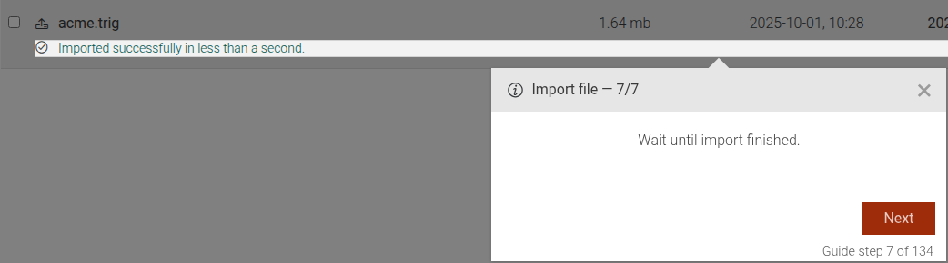
```# static import-show-progress
The import-show-progress step guides the user to monitor the progress of an import operation in the import dialog of GraphDB.
This step can be configured using the common options defined in Options. Additionally, it supports the following options:
Properties:
| Name | Type | Description |
|---|---|---|
resourceFile |
string
|
The name of the resource file that should be downloaded in the step. |
Example
```JSON
{
"guideBlockName": "import-show-progress",
"options": {
"resourceFile": "example.rdf"
}
}
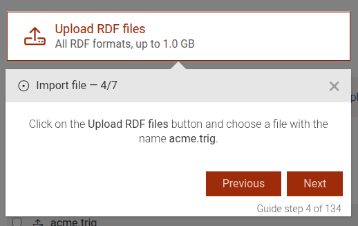
```# static import-upload-rdf-file
The import-upload-rdf-file step guides the user to click the button to upload an RDF file in GraphDB.
This step can be configured using the common options defined in Options. Additionally, it supports the following options:
Properties:
| Name | Type | Description |
|---|---|---|
resourceFile |
string
|
The name of the resource file that should be downloaded in the step. |
Example
```JSON
{
  "guideBlockName": "import-upload-rdf-file",
  "options": {
       "resourceFile": "example.rdf"
  }
}
```
# static info-message
Displays a read-only informational message to the user. Interaction is not required to proceed unless configured via common options.
Info message example
This step can be configured using the common options defined in Options.
Example
```JSON
{
  "guideBlockName": "info-message",
  "options": {
    "title": "Heads up",
    "content": "Please read this information."
  }
}
```
# static input-element
Focuses a specific input element and allows the user to type into it.
Input element example

This step can be configured using the common options defined in Options.
Example
```JSON
{
  "guideBlockName": "input-element",
  "options": {
    "elementSelector": "#query-input",
    "content": "Type your query here."
  }
}
```
# static rdf-rank-compute-fill
This step prompts the user to click on the "Compute Full" button to start the RDF Rank computation.
Click Compute Full
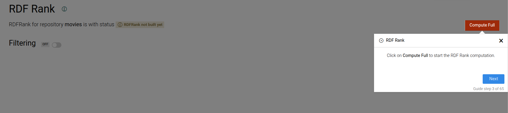
This step can be configured using the common options defined in Options.
Example
```JSON
{
 "guideBlockName": "rdf-rank-compute-fill"
}
```
# static read-only-element
The Read-Only Element step is used to guide users to see a specific element on the interface, but not interact with it.
Read-only element example

This step can be configured using the common options defined in Options. Additionally, it supports:
Properties:
| Name | Type | Attributes | Description |
|---|---|---|---|
options.beforeShowPromise |
function
|
<optional> |
A promise that has to resolve, before the step is shown. If not provided, the step will be shown immediately. |
Example
```JSON
{
  "guideBlockName": "read-only-element",
  "options": {
    "elementSelector": "#important-info",
    "content": "Please take a look at this important information, but do not interact with it."
  }
}
```
# static repositories-create-graphdb
This step explains how to create a GraphDB repository.
Create GraphDB repository step
This step can be configured using the common options defined in Options.
Example
```JSON
{
 "guideBlockName": "repositories-create-graphdb"
}
```
# static repositories-create-repository
This step explains how to create a repository.
Create repository step
This step can be configured using the common options defined in Options.
Example
```JSON
{
"guideBlockName": "repositories-create-repository"
}
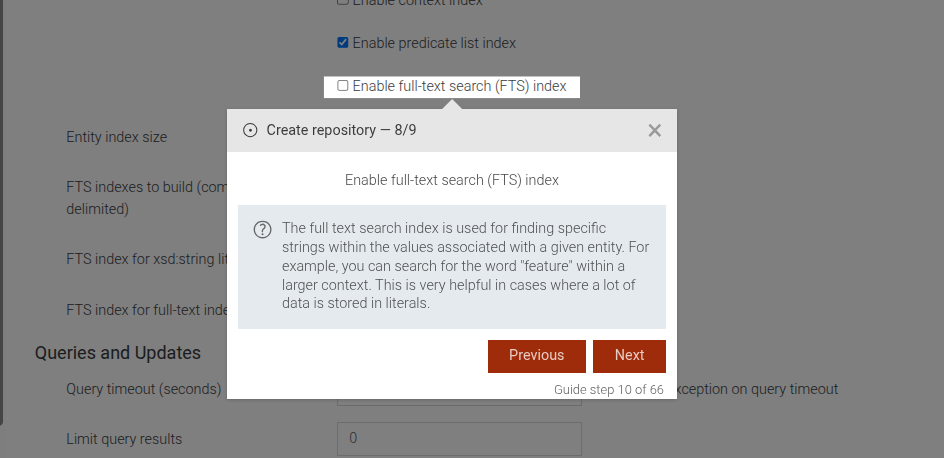
```# static repositories-enable-fts
This step guides the user to enable full-text search (FTS) index for a repository.
Enable full-text search step
This step can be configured using the common options defined in Options.
Example
```JSON
{
 "guideBlockName": "repositories-enable-fts"
}
```
# static repositories-id-input
This step guides the user to enter a repository ID.
Repository ID input step
This step can be configured using the common options defined in Options. Takes repositoryId from repositoryIdBase + index if needed
Example
```JSON
{
"guideBlockName": "repositories-id-input"
}
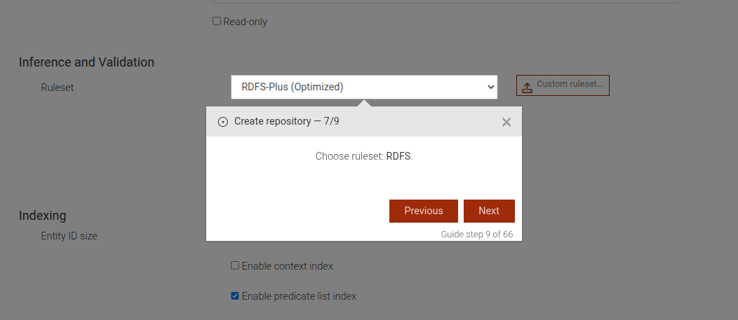
```# static repositories-ruleset-dropdown
This step guides the user to select a ruleset for a repository.
Ruleset dropdown step
This step can be configured using the common options defined in Options. Additionally, it requires:
Properties:
| Name | Type | Description |
|---|---|---|
rulesetName |
string
|
The name of the ruleset to be selected. |
Example
```JSON
{
"guideBlockName": "repositories-ruleset-dropdown",
"options": {
"rulesetName": "OWL2-RL"
}
}
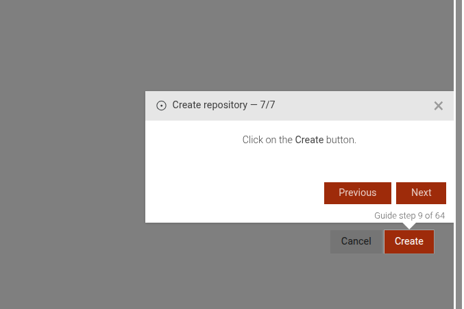
```# static repositories-save
This step guides the user to save the repository creation.
Save repository step
This step can be configured using the common options defined in Options.
Example
```JSON
{
"guideBlockName": "repositories-save"
}
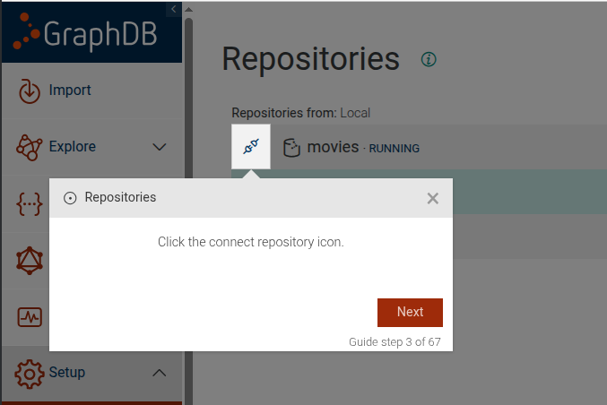
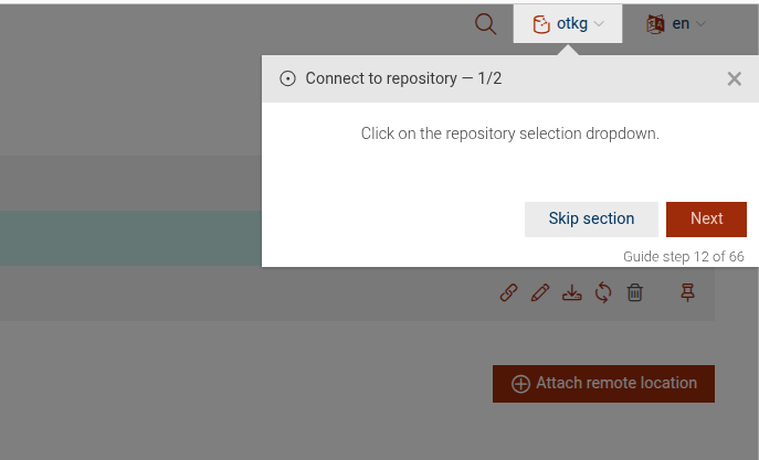
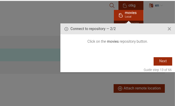
```# static repositories-select-repository
This step guides the user to connect to a repository.
Connect to a repository
This step can be configured using the common options defined in Options. Additionally, it supports:
Properties:
| Name | Type | Description |
|---|---|---|
repositoryIdToSelect |
string
|
The id of the repository to connect to. |
Example
```JSON
{
  "guideBlockName": "repositories-select-repository",
  "options": {
    "repositoryIdToSelect": "my-repo"
  }
}
```
# static resource-click-on-role
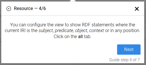
The resource-click-on-role
guide step guides the user to click on a specific role tab
(such as subject, predicate, object, context, or all) in the resource view
to filter and display RDF statements based on the IRI's position.
This step can be configured using the common options defined in Options. Additionally, the following specific options are available:
Options:
Properties:
| Name | Type | Description |
|---|---|---|
options.role |
string
|
The role used to select the appropriate translation content (e.g., 'subject', 'predicate', 'object', 'context', 'all'). |
options.showRole |
string
|
The role used to build the element selector for the clickable tab. |
Example
```json
{
"guideBlockName": "resource-click-on-role",
"options": {
"role": "subject",
"showRole": "subject",
"skipUrl": false
}
}
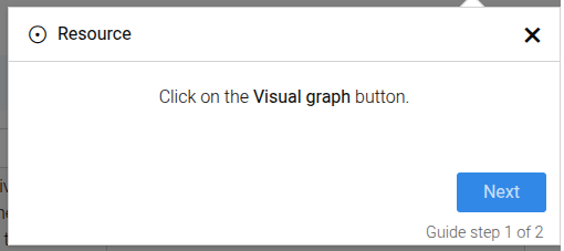
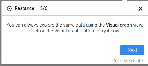
```# static resource-click-on-visual-graph-button
The resource-click-on-visual-graph-button guide step guides the user to click on the Visual Graph button
in the resource view.
This step can be configured using the common options defined in Options.
Example
```json
{
"guideBlockName": "resource-click-on-visual-graph-button",
"options": {
"skipUrl": false
}
}
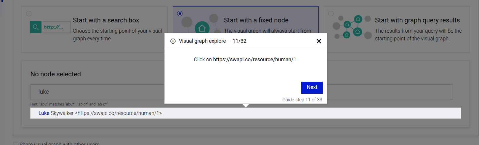
```# static resource-results-click-on-iri
The resource-results-click-on-iri guide step guides the user to click on an IRI in the resource results table
to explore the data using the Visual Graph view.
This step can be configured using the common options defined in Options. Additionally, the following specific options are available:
Options:
Properties:
| Name | Type | Description |
|---|---|---|
options.iri |
string
|
The IRI used to build the element selector for the clickable element. |
Example
```json
{
  "guideBlockName": "resource-results-click-on-iri",
  "options": {
    "iri": "http://example.org/resource",
    "skipUrl": false
  }
}
```
# static resource-results-explain
The resource-results-explain guide step that explains the resource results table,
providing an easy way to view triples in which a given IRI is the subject, predicate, or object.
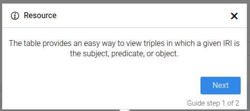
This step can be configured using the common options defined in Options. Additionally, the following specific option is available:
Options:
Properties:
| Name | Type | Attributes | Description |
|---|---|---|---|
options.iri |
string
|
<optional> |
The IRI of the resource, used to build the URL if not skipped. |
Example
```json
{
"guideBlockName": "resource-results-explain",
"options": {
"iri": "http://example.org/resource"
}
}
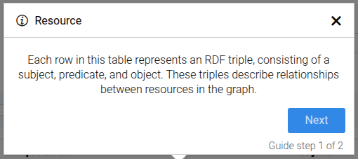
```# static resource-results-row-explain
The resource-results-row-explain guide step that explains a row in the resource results table,
highlighting that each row represents an RDF triple consisting of a subject, predicate, and object.
This step can be configured using the common options defined in Options. Additionally, the following specific options are available:
Options:
Properties:
| Name | Type | Description |
|---|---|---|
options.row |
string
|
number
|
The row identifier used to build the element selector for the row to explain. |
Example
```json
{
  "guideBlockName": "resource-results-row-explain",
  "options": {
    "row": "1"
  }
}
```
# static resource-search-autocomplete-item
The resource-search-autocomplete-item step selects the autocomplete item for a discovered RDF resource in the search input.
This is a reusable step that can be used everywhere an autocomplete dropdown with RDF resources is present.
This step can be configured using the common options defined in Options. Additionally, the following specific option is required:
Properties:
| Name | Type | Attributes | Description |
|---|---|---|---|
options.iri |
string
|
<optional> |
The IRI displayed in the autocomplete item. |
Example
```json
{
"guideBlockName": "resource-search-autocomplete-item",
"options": {
"iri": "http://example.org/resource"
}
}
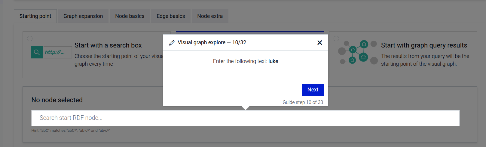
```# static resource-search-rdf
The resource-search-rdf guide step prompts the user to enter node search term in the search field.
This is a reusable step that can be used everywhere a rdf-search input is present
Resource search input example:
This step can be configured using the common options defined in Options. Additionally, the following specific option is required:
Properties:
| Name | Type | Attributes | Description |
|---|---|---|---|
options.searchTerm |
string
|
<optional> |
The search term to be entered by the user. |
Example
```json
{
  "guideBlockName": "resource-search-rdf",
  "options": {
    "searchTerm": "http://example.org/resource"
  }
}
```
# static scroll-only-element
Focuses a specific element while allowing only scroll-related interactions on it. Other interactions are disabled for the duration of the step. Useful when users need to scroll within a container to find content without clicking or typing.
Scroll only element example
This step can be configured using the common options defined in Options. Additionally, it supports:
Properties:
| Name | Type | Description |
|---|---|---|
options.elementSelector |
string
|
CSS selector of the scrollable element to focus. |
Example
```JSON
{
  "guideBlockName": "scroll-only-element",
  "options": {
    "elementSelector": "#results-pane"
  }
}
```
# static select-repository-dropdown
Composite step, guiding the user to select a repository from the dropdown. It prompts the user to click the dropdown button and select a repository from the list.
Click on the dropdown button example
Select a repository from the dropdown example
This step can be configured using the common options defined in Options.
Example
```JSON
{
  "guideBlockName": "select-repository-dropdown"
}
```
# static select-ttyg-agent
Complex step, which takes the user through the process of selecting a TTYG agent. It includes steps to open the dropdown, select an agent, and handle missing repository scenarios.
Select an agent info message

Open the agent selection dropdown
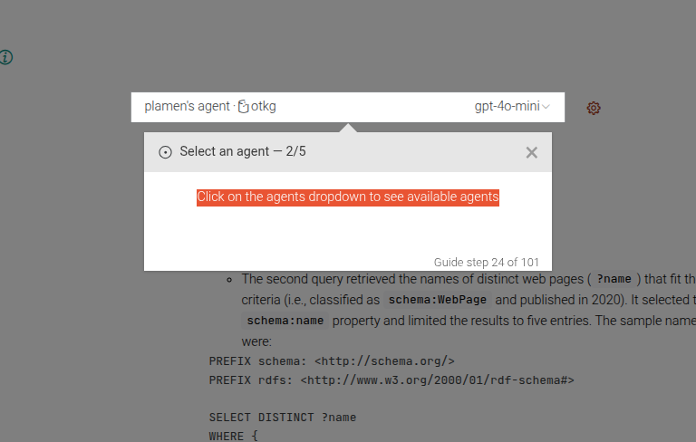
Select an agent from the dropdown
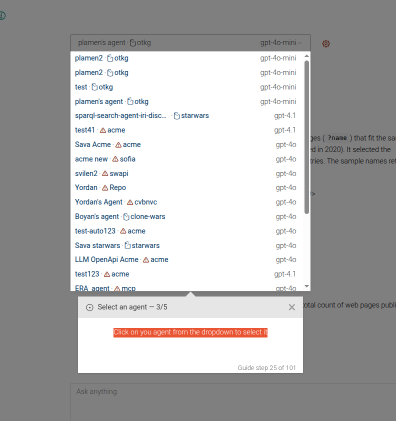
Check for missing repository
Example
```JSON
{
 "guideBlockName": "select-ttyg-agent",
}
```
# static set-context-window-size
This step sets the context window size for the TTYG agent. It guides the user to set the context size input to a specified value.
Set context window size
This step can be configured using the common options defined in Options. Additionally, it requires:
Properties:
| Name | Type | Description |
|---|---|---|
options.contextSize |
number
|
The target value for the context window size. |
Example
```JSON
{
 "guideBlockName": "set-context-window-size",
 "options": {
   "contextSize": 4096
 }
}
```
# static set-max-iris-per-call
This step guides the user to set the maximum number of IRIs to retrieve per call in the TTYG agent configuration. It highlights the input field and provides instructions on how to proceed.
Set maximum IRIs per call
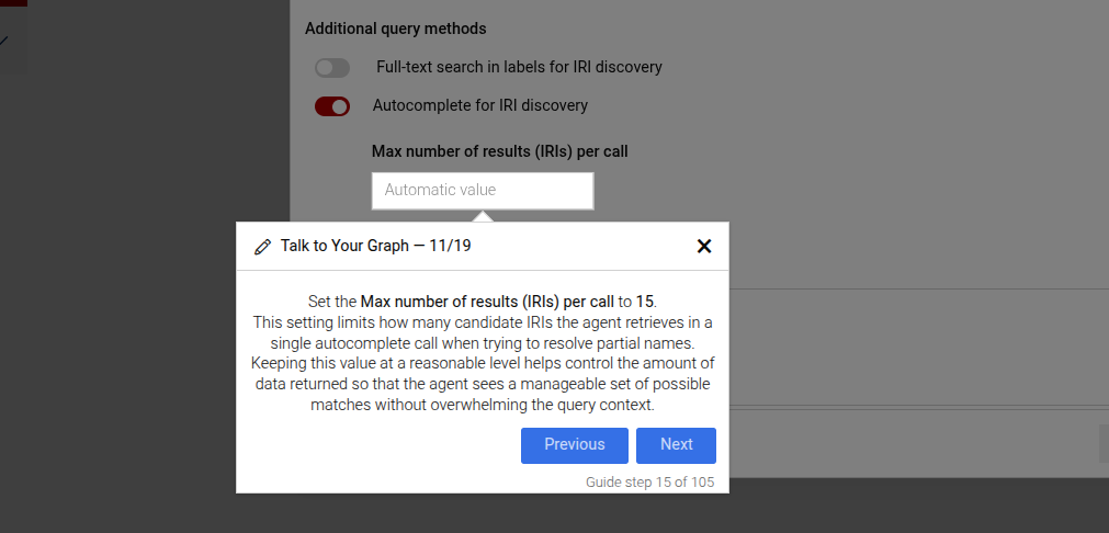
This step can be configured using the common options defined in Options. Additionally, it supports:
Properties:
| Name | Type | Description |
|---|---|---|
options.maxIrisPerCall |
number
|
The maximum number of IRIs per call. This will be displayed in the instructions and used for validation. |
Example
```JSON
{
 "guideBlockName": "set-max-iris-per-call",
 "options": {
   "maxIrisPerCall": 20
 }
}
```
# static set-max-triples-per-call
This step guides the user to set the maximum number of triples to retrieve per call in the FTS search method configuration. It highlights the input field and provides instructions on how to proceed.
Set maximum triples per call
This step can be configured using the common options defined in Options. Additionally it supports:
Properties:
| Name | Type | Description |
|---|---|---|
options.maxTriplesPerCall |
number
|
The maximum number of triples to retrieve per call. This will be displayed in the instructions and used for validation. |
Example
```JSON
{
 "guideBlockName": "set-max-triples-per-call",
 "options": {
   "maxTriplesPerCall": 100
 }
}
```
# static show-documentation-link
This step provides a link to the complete documentation of a certain subject. It accepts documentationPath as an option and uses it to construct a general message, leading to that specific documentation page. Note that although not required, it is highly recommended to provide the specific page url, where the step is used. For example, if the dialog is shown in the connectors page, there should be options.url = 'connectors' provided. Otherwise, there might be unwanted navigation or reloading of the page.
Link to documentation
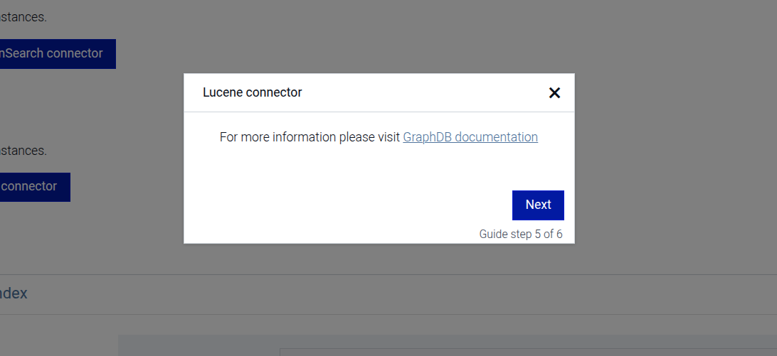
This step can be configured using the common options defined in Options. Additionally, it supports:
Properties:
| Name | Type | Description |
|---|---|---|
options.documentationPath |
string
|
The URL of the GraphDB documentation page for the documentation e.g. lucene-graphdb-connector.html |
# static similarity-click-link
This step highlights the "Create Similarity index" link and prompts the user to click it.
Click the link to start creating a new Similarity index
This step can be configured using the common options defined in Options.
Example
```JSON
{
 "guideBlockName": "similarity-click-link"
}
```
# static similarity-click-to-create
This step highlights the "Create Similarity index" button and prompts the user to click it.
Click the button to create a new Similarity index
This step can be configured using the common options defined in Options.
Example
```JSON
{
 "guideBlockName": "similarity-click-to-create"
}
```
# static similarity-hold-and-wait-until-shown
This step instructs the user to wait until the new similarity index is created
This step can be configured using the common options defined in Options.
Example
```JSON
{
 "guideBlockName": "similarity-hold-and-wait-until-shown"
}
```
# static similarity-search-method
This is a complex step that guides the user through enabling or disabling the Similarity search query method in the TTYG interface. It includes steps to provide information about the Similarity search method, enable it if it's disabled, or disable it if it's enabled. If disabled, it will show only the step to disable it. If not disabled, it will show the steps to enable it and select the index to use.
Disable Similarity search method

Show information about Similarity search method
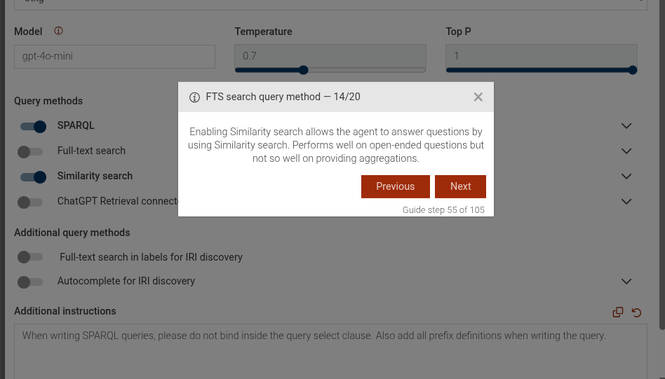
Enable Similarity search method
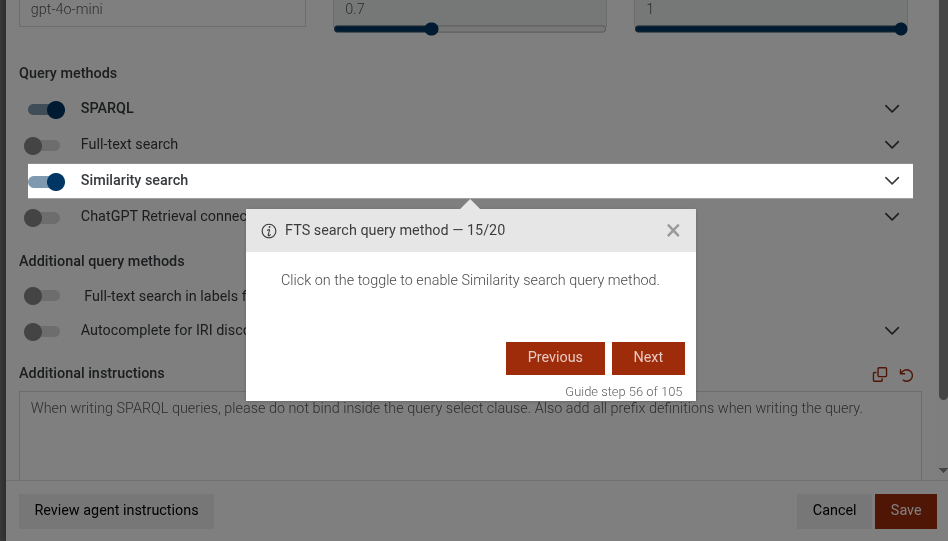
Select index for Similarity search method
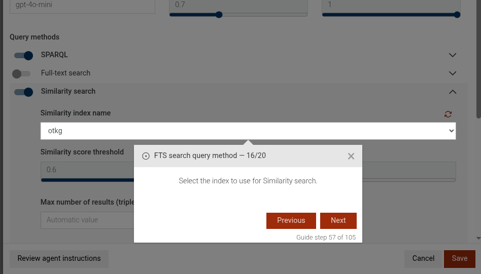
This step can be configured using the common options defined in Options. Additionally, it supports the following specific options:
Properties:
| Name | Type | Attributes | Description |
|---|---|---|---|
options.disable |
boolean
|
<optional> |
If true, the step will guide the user to disable the Similarity search method. If false or not provided, it will guide to enable it. |
Example
```JSON
{
  "guideBlockName": "similarity-search-method",
  "options": {
    "disable": false
  }
}
```
# static similarity-type-index-name
This step prompts the user to type a name for the similarity index.
Type a name for the similarity index
This step can be configured using the common options defined in Options.
Example
```JSON
{
 "guideBlockName": "similarity-type-index-name"
}
```
# static similarity-view-created-index
This step highlights the newly created similarity index in the Existing Indexes table. The default index to highlight
is the first index, unless options.rowIndex is specified. If options.indexName is specified,
the step will highlight the index with the specified name.
View the newly created similarity index

This step can be configured using the common options defined in Options. Additionally, it supports:
Properties:
| Name | Type | Attributes | Description |
|---|---|---|---|
options.content |
string
|
<optional> |
The content of the dialog. |
options.title |
string
|
<optional> |
The title of the dialog. |
options.rowIndex |
number
|
<optional> |
The index of the row to focus on. |
options.indexName |
string
|
<optional> |
The name of the index to focus on. |
Example
```JSON
{
  "guideBlockName": "similarity-view-created-index",
  "options": {
    "title": {
      "en": "Explore Similarity index"
    },
    "content": "In the <b>Existing Indexes</b> table, you can now see the <b>SpellSimIndex</b> which is the similarity index we created with the previous query.",
    "rowIndex": 1
  }
}
# static sparql-editor
This step prompts the user to copy a SPARQL query to the SPARQL editor.
Copy to editor
This step can be configured using the common options defined in Options. Additionally, it requires:
Properties:
| Name | Type | Description |
|---|---|---|
query |
string
|
The SPARQL query to be copied to the editor. |
queryExtraContent |
string
|
Object
|
Additional content to display in the editor. |
Example
```JSON
{
 "guideBlockName": "sparql-editor",
 "options": {
   "query": "SELECT ?s WHERE { ?s ?p ?o } LIMIT 10",
   "queryExtraContent": {
      "en": "The query selects RDF statements whose <i>subject</i> is the movie <b>Pirates of the Caribbean At World's End</b> (identified by the IRI <b>imdb:title/PiratesoftheCaribbeanAtWorldsEnd</b>). Note that we need to escape the / in the shortened IRI."
    }
  }
}
```
# static sparql-editor-expand-results-over-owl
This step focuses on the "Expand results over owl:sameAs" toggle in the SPARQL editor.
Expand results over owl:sameAs toggle
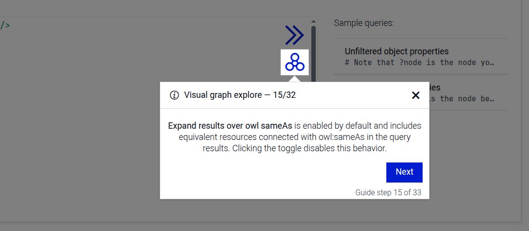
This step can be configured using the common options defined in Options.
Example
```JSON
{
  "guideBlockName": "sparql-editor-expand-results-over-owl"
}
```
# static sparql-editor-include-inferred-data
This step focuses on the "Include inferred data in results" toggle in the SPARQL editor.
Include inferred data toggle
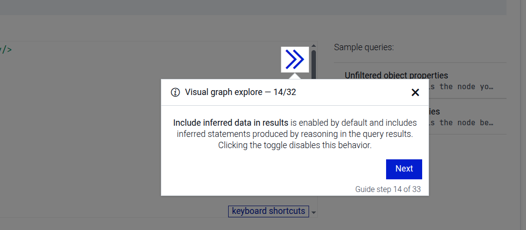
This step can be configured using the common options defined in Options.
Example
```JSON
{
  "guideBlockName": "sparql-editor-include-inferred-data"
}
```
# static sparql-editor-run-button
This prompts the user to click on the SPARQL run button to execute the query.
Clicking on the button
This step can be configured using the common options defined in Options.
Example
```JSON
{
 "guideBlockName": "sparql-editor-run-button"
}
```
# static sparql-explain-editor
This step provides an additional explanation for the SPARQL query editor.
Additional explanation
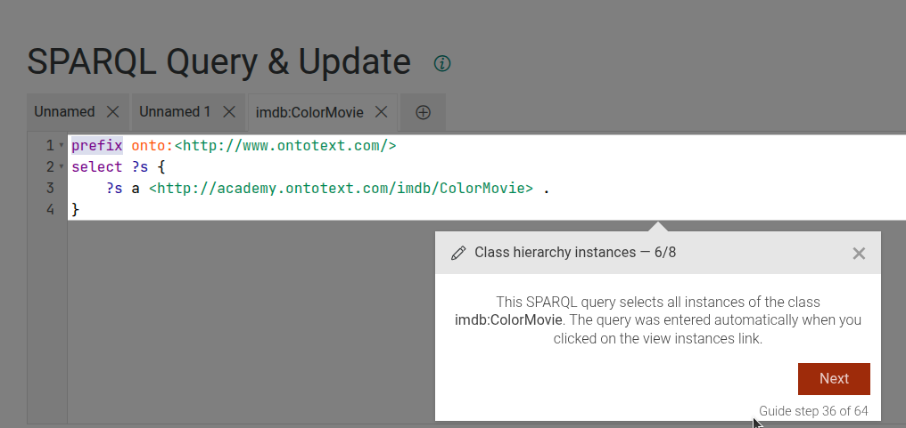
This step can be configured using the common options defined in Options. Additionally, it requires:
Properties:
| Name | Type | Description |
|---|---|---|
extraContent |
string
|
The additional content to display in the editor. |
Example
```JSON
{
 "guideBlockName": "sparql-explain-editor",
 "options": {
   "extraContent": "This is an additional explanation for the SPARQL editor."
  }
}
```
# static sparql-results-click-on-iri
This step prompts the user to click on an IRI in the SPARQL results table to explore it.
Clicking on the IRI
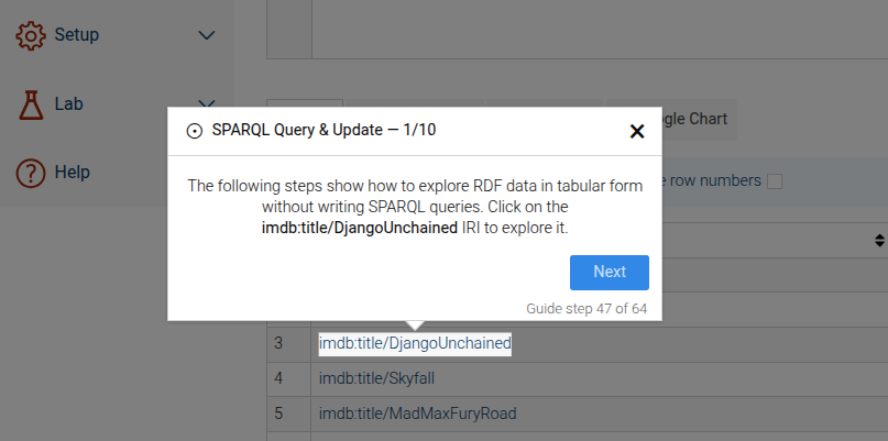
This step can be configured using the common options defined in Options. Additionally, it requires:
Properties:
| Name | Type | Description |
|---|---|---|
iri |
string
|
The IRI to click on. |
iriLabel |
string
|
The label to display for the IRI. |
Example
```JSON
{
 "guideBlockName": "sparql-results-click-on-iri",
 "options": {
   "iri": "http://example.org/resource/Item1"
   "iriLabel": "Item1"
  }
}
```
# static sparql-results-explain
This step focuses on the table that shows the results of a SPARQL query.
Visualize results table
This step can be configured using the common options defined in Options.
Example
```JSON
{
 "guideBlockName": "sparql-results-explain"
}
```
# static sparql-results-visual-button
This step focuses on the button that allows users to visualize the results of a SPARQL query.
Clicking on the button
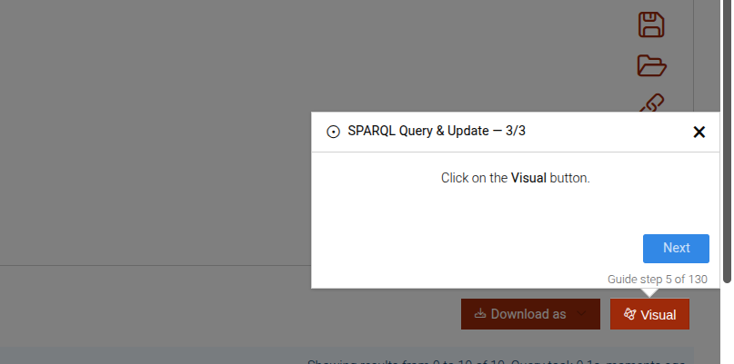
This step can be configured using the common options defined in Options.
Example
```JSON
{
 "guideBlockName": "sparql-results-visual-button"
}
```
# static sparql-search-method
This is a complex step that guides the user through enabling or disabling the SPARQL search query method in the TTYG interface. It includes steps to provide information about the SPARQL search method, enable it if it's disabled, or disable it if it's enabled. If enabling, it can also include an optional step to set the ontology source, either via a named graph or a SPARQL CONSTRUCT query.
Disable SPARQL search method
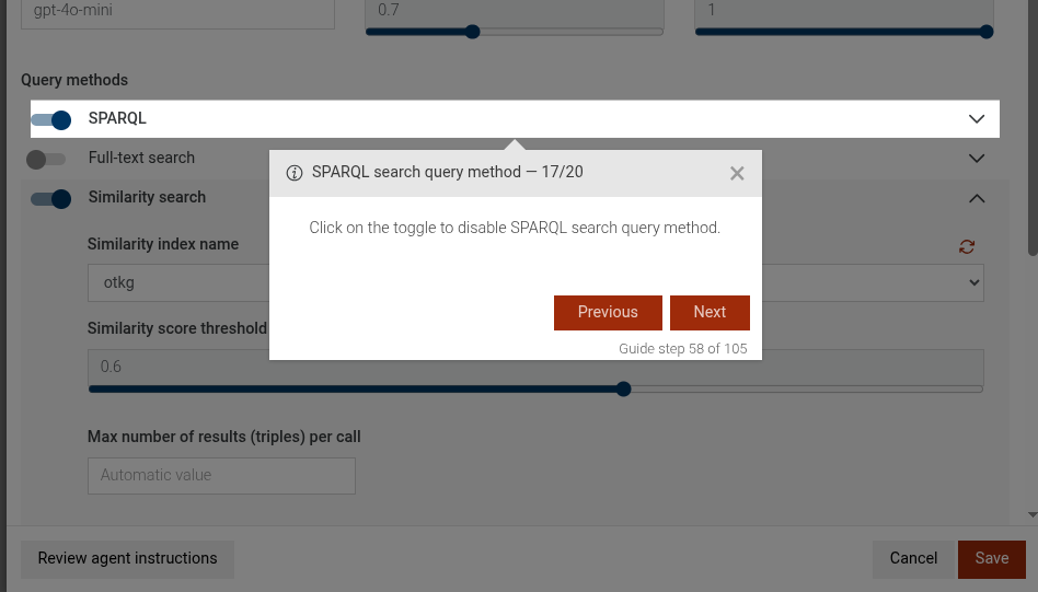
Enable SPARQL info message
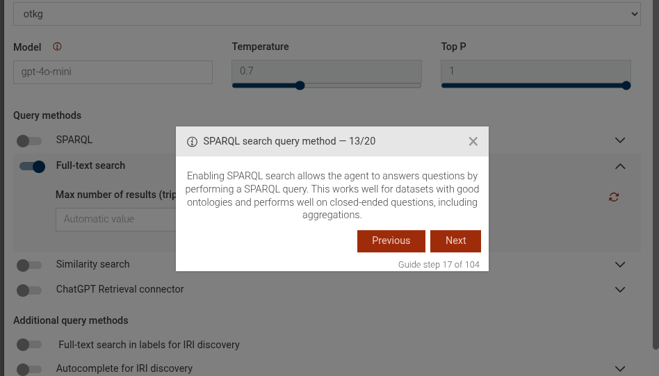
Enable SPARQL search method
The sparql-search-method-enable-ontology-graph step is a configurable complex step. See sparql-search-method-enable-ontology-graph for more details.
The sparql-search-method-enable-sparql-query step is a configurable complex step, See sparql-search-method-enable-sparql-query for more details.
This step can be configured using the common options defined in Options. Additionally, it supports:
Properties:
| Name | Type | Attributes | Description |
|---|---|---|---|
options.disable |
boolean
|
<optional> |
If true, the step will guide the user to disable the SPARQL search method. If false or not provided, it will guide to enable it. |
options.ontologyGraph |
string
|
<optional> |
If provided and enabling the SPARQL search method, an additional step will be included to set the ontology source via a named graph with this value. |
options.sparqlQuery |
string
|
<optional> |
If provided and enabling the SPARQL search method, an additional step will be included to set the ontology source via a SPARQL CONSTRUCT query with this value. Note: Only one of |
Example
```JSON
{
  "guideBlockName": "sparql-search-method",
  "options": {
    "disable": false,
    "ontologyGraph": "http://example.org/graph/ontology"
  }
}
```

```JSON
{
  "guideBlockName": "sparql-search-method",
  "options": {
    "disable": false,
    "sparqlQuery": "CONSTRUCT { ?s ?p ?o } WHERE { ?s ?p ?o } LIMIT 100"
  }
}
```
# static sparql-search-method-enable-ontology-graph
This is a complex step that guides the user through enabling the option to provide an ontology in a named graph for the SPARQL search method in the TTYG interface. It includes steps to enable the option and type the name of the named graph that contains the ontology.
Ontology select
Type graph name
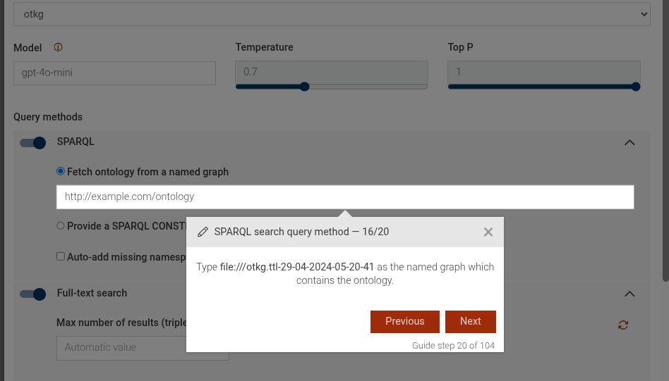
Add missing namespaces
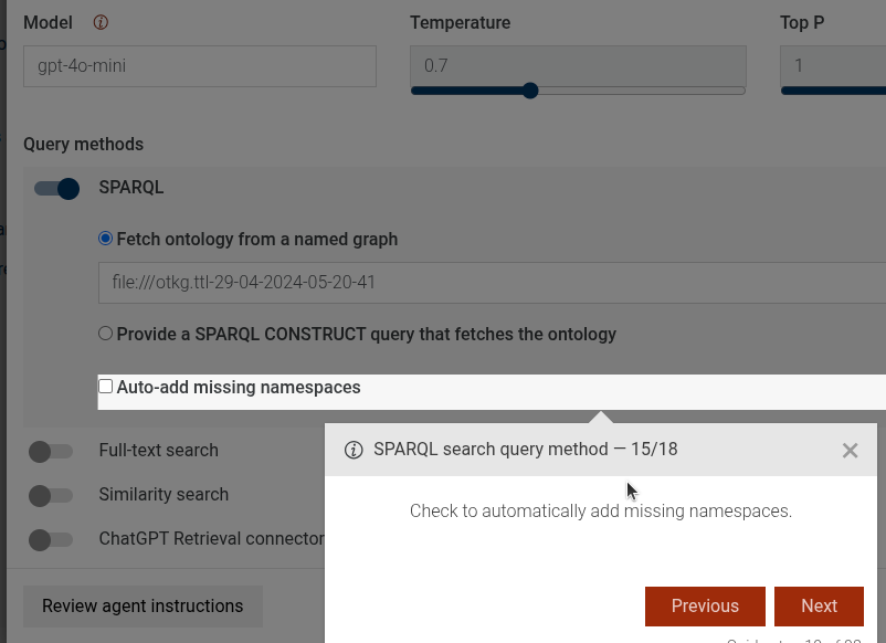
This step can be configured using the common options defined in Options. Additionally, it supports:
Properties:
| Name | Type | Attributes | Description |
|---|---|---|---|
options.addMissingNamespaces |
boolean
|
<optional> |
If true, an additional step will be included to click on the "Add missing namespaces" after typing the graph name. |
Example
```JSON
{
  "guideBlockName": "sparql-search-method-enable-ontology-graph",
  "options": {
    "addMissingNamespaces": true
  }
}
```
# static sparql-search-method-enable-sparql-query
This is a complex step that guides the user through enabling the option to provide a SPARQL CONSTRUCT query that fetches the ontology for the SPARQL search method in the TTYG interface. It includes steps to enable the option, select the SPARQL query option, copy the example query text, and optionally add missing namespaces.
SPARQL query select
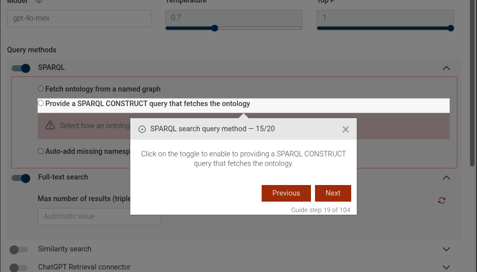
Copy query text

Add missing namespaces
This step can be configured using the common options defined in Options. Additionally, it supports:
Properties:
| Name | Type | Attributes | Description |
|---|---|---|---|
options.addMissingNamespaces |
boolean
|
<optional> |
If true, an additional step will be included to click on the "Add missing namespaces" after copying the query text. |
Example
```JSON
{
  "guideBlockName": "sparql-search-method-enable-sparql-query",
  "options": {
    "addMissingNamespaces": true
  }
}
```
# static sparql-search-method-type-graph-name
This step guides the user to type the name of the named graph that contains the ontology for the SPARQL search method in the TTYG interface. It highlights the input element and provides instructions on how to proceed.
Type the name of the named graph that contains the ontology
This step can be configured using the common options defined in Options. Additionally, the following specific option is available:
Properties:
| Name | Type | Attributes | Description |
|---|---|---|---|
options.ontologyGraph |
string
|
<optional> |
The name of the named graph that contains the ontology. Default is 'http://example.org/ontology'. |
Example
```JSON
{
 "guideBlockName": "sparql-search-method-type-graph-name",
 "options": {
   "ontologyGraph": "http://example.org/ontology"
 }
}
```
# static table-graph-explore
The table-graph-explore guide combines a sequence of steps to explore RDF data
in tabular form and optionally switch to the Visual Graph view.
It can show how to navigate to IRIs, change roles, and open the Visual Graph for the selected resource.
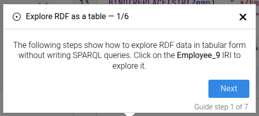
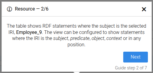
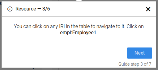
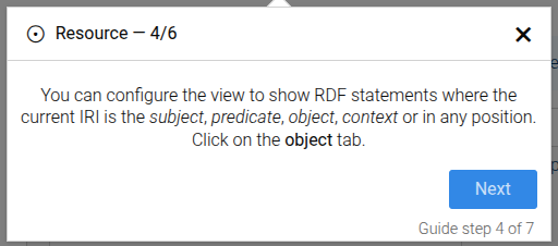
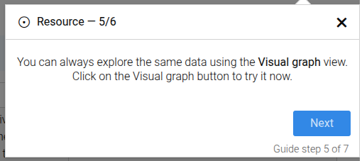
Common guide options apply. Additionally, the following options are used:
Properties:
| Name | Type | Attributes | Description |
|---|---|---|---|
options.iri |
string
|
<optional> |
The IRI to explore. |
options.iriLabel |
string
|
<optional> |
Display label for the IRI. |
Example
```json
{
  "guideBlockName": "table-graph-explore",
  "options": {
    "iri": "http://example.com/employees/Employee1",
    "iriLabel": "Employee1",
    "subSteps": [
          {"type": "link", "iri": "http://example.com/employees/Employee1", "iriLabel": "empl:Employee1"},
          {"type": "role", "role": "all"},
          {"type": "visual", "extraContentVisualIntro": "<p>You can pan and zoom the graph.</p>"}
        ]
  }
}
```
# static toggle-element
The Toggleable Element step is used to guide users to enable a specific toggleable element (like a switch or checkbox) on the interface. The step ensures that a user cannot go back to this step and deselect the toggleable element.
Toggleable element example
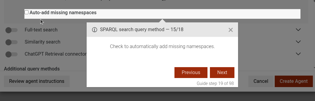
This step can be configured using the common options defined in Options. Additionally it supports:
Properties:
| Name | Type | Description |
|---|---|---|
options.disable |
boolean
|
Set to true to guide the user to disable the element, or false(or missing) to enable it. |
Example
```JSON
{
 "guideBlockName": "toggle-element",
 "options": {
   "disable": true, // or false to enable
 }
}
```
# static ttyg-ask-agent-explore-sparql
This step focuses on guiding the user to explore the SPARQL query generated by the TTYG agent. It highlights the "Open in SPARQL editor" button and provides instructions on how to proceed.
Click on explore SPARQL button
Example
```JSON
{
 "guideBlockName": "ttyg-ask-agent-explore-sparql",
}
```
# static ttyg-ask-explain-answer-more
This step focuses on guiding the user to ask for more explanation about the response received from the TTYG agent.
Click on explain more button
Example
```JSON
{
 "guideBlockName": "ttyg-ask-explain-answer-more",
}
```
# static ttyg-ask-question
This step focuses on guiding the user to ask a question to the TTYG agent. It highlights the input area where the user can type their question and provides instructions on how to proceed.
Ask the agent
Properties:
| Name | Type | Attributes | Description |
|---|---|---|---|
question |
Object
|
<optional> |
The question to be asked to the TTYG agent. This will be displayed in the instructions. |
Example
```JSON
{
  "guideBlockName": "ttyg-ask-question",
  "options": {
    "question": "Can you describe your purpose and dataset, please? What classes and instances are there?"
  }
}
```
# static ttyg-click-to-create-new-chat
This step focuses on guiding the user to click on the "Create Chat" button in the Talk to Your Graph. It highlights the button and provides instructions on how to start a new conversation with the agent.
Create a new chat
Example
```JSON
{
 "guideBlockName": "ttyg-click-to-create-new-chat",
}
```
# static ttyg-click-to-edit-selected-agent
This step guides the user to click on the edit button to modify the configuration of the selected TTYG agent.
Click on edit agent button
This step can be configured using the common options defined in Options.
Example
```JSON
{
 "guideBlockName": "ttyg-click-to-edit-selected-agent",
}
```
# static ttyg-conversation-info-message
This step provides an informational message about the Talk To Your Graph (TTYG) feature. It explains the purpose of the TTYG view and how users can interact with it using natural language queries.
TTYG conversation info message
Example
```JSON
{
 "guideBlockName": "ttyg-conversation-info-message",
}
```
# static ttyg-create-agent-click
This step focuses on guiding the user to click on the "Create Agent" button in the Talk to Your Graph (TTYG) plugin. It highlights the button and provides instructions on how to proceed with creating a new agent.
Click on create agent button
Example
```JSON
{
 "guideBlockName": "ttyg-create-agent-click",
}
```
# static ttyg-create-agent-intro-message
This step provides an introductory message about creating an agent in the Talk to Your Graph (TTYG) plugin. It explains what an agent is and why it is necessary to configure one before using TTYG.
Create an agent
Example
```JSON
{
 "guideBlockName": "ttyg-create-agent-intro-message",
}
```
# static ttyg-create-agent-save
This step focuses on guiding the user to click on the "Save" button after configuring an agent in the Talk to Your Graph (TTYG) plugin. It highlights the button and provides instructions on how to save the agent settings.
Click on save button
Example
```JSON
{
 "guideBlockName": "ttyg-create-agent-save",
}
```
# static ttyg-edit-agent-click-to-save
This step guides the user to click the save button after editing a TTYG agent.
Click on save to save the edited agent
This step can be configured using the common options defined in Options.
Example
```JSON
{
 "guideBlockName": "ttyg-edit-agent-click-to-save",
}
```
# static ttyg-edit-agent-intro-message
This step provides an introductory message when editing a TTYG agent. It informs the user that an agent's configuration can be reconfigured at any time.
Edit agent intro message
This step can be configured using the common options defined in Options.
Example
```JSON
{
 "guideBlockName": "ttyg-edit-agent-intro-message",
}
```
# static ttyg-enabling-sparql-info-message
This step provides an informational message about enabling the SPARQL search query method in the TTYG interface. It explains the benefits of using SPARQL search for datasets with good ontologies and closed-ended questions.
Enabling SPARQL in info message
This step can be configured using the common options defined in Options.
Example
```JSON
{
  "guideBlockName": "ttyg-enabling-sparql-info-message",
}
```
# static ttyg-explain-response
This step focuses on guiding the user to explain the response received from the TTYG agent.
Click on explain button
Example
```JSON
{
 "guideBlockName": "ttyg-explain-response",
}
```
# static ttyg-fts-method-disable
This step guides the user to disable the FTS search query method in the TTYG interface. It highlights the toggle element and provides instructions on how to proceed.
Click on the toggle to disable FTS search query method
This step can be configured using the common options defined in Options.
Example
```JSON
{
 "guideBlockName": "ttyg-fts-method-disable",
}
```
# static ttyg-fts-method-enable
This step guides the user to enable the FTS search query method in the TTYG interface. It highlights the toggle element and provides instructions on how to proceed.
Click on the toggle to enable FTS search query method
This step can be configured using the common options defined in Options.
Example
```JSON
{
 "guideBlockName": "ttyg-fts-method-enable",
}
```
# static ttyg-fts-method-info
This step provides information about the FTS search query method in the TTYG interface. It highlights an info message block and provides details about the FTS search functionality.
FTS search query method
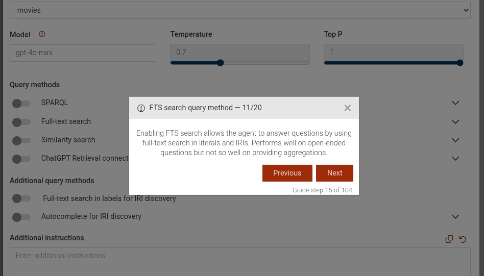
This step can be configured using the common options defined in Options.
Example
```JSON
{
 "guideBlockName": "ttyg-fts-method-info",
}
```
# static ttyg-select-agent-check-for-missing-repository-cancel
This step displays, that a repository is missing for the selected agent
Missing repository for selected agent
This step can be configured using the common options defined in Options.
Example
```JSON
{
 "guideBlockName": "ttyg-select-agent-check-for-missing-repository-cancel",
}
```
# static ttyg-select-agent-dropdown-open
This step guides the user to open the agent selection dropdown in the TTYG interface. It highlights the dropdown element and provides instructions on how to proceed.
Click on the agents dropdown
This step can be configured using the common options defined in Options.
Example
```JSON
{
 "guideBlockName": "ttyg-select-agent-dropdown-open",
}
```
# static ttyg-select-agent-from-dropdown
This step guides the user to select an agent from a dropdown menu in the TTYG interface. It highlights the dropdown element and provides instructions on how to proceed.
Select an agent from the dropdown
This step can be configured using the common options defined in Options.
Example
```JSON
{
 "guideBlockName": "ttyg-select-agent-from-dropdown",
}
```
# static ttyg-select-agent-info-message
This step provides an informational message when selecting a TTYG agent. It informs the user that they need to select an agent before interacting with their graph.
Select an agent to edit
This step can be configured using the common options defined in Options.
Example
```JSON
{
 "guideBlockName": "ttyg-select-agent-info-message",
}
```
# static ttyg-similarity-info-message
This step provides an informational message about the Similarity search query method in the TTYG interface. It explains the benefits and use cases of enabling Similarity search.
Similarity info message
This step can be configured using the common options defined in Options.
Example
```JSON
{
 "guideBlockName": "ttyg-similarity-info-message",
}
```
# static ttyg-similarity-select-index
This step guides the user to select the index to use for Similarity search in the TTYG interface. It highlights the dropdown element and provides instructions on how to proceed.
Select the index to use for Similarity search
This step can be configured using the common options defined in Options.
Example
```JSON
{
 "guideBlockName": "ttyg-similarity-select-index",
}
```
# static ttyg-similarity-toggle-off
This step guides the user to disable the Similarity search query method in the TTYG interface. It highlights the toggle element and provides instructions on how to proceed.
Click on the toggle to disable Similarity search query method
This step can be configured using the common options defined in Options.
Example
```JSON
{
 "guideBlockName": "ttyg-similarity-toggle-off",
}
```
# static ttyg-similarity-toggle-on
This step guides the user to enable the Similarity search query method in the TTYG interface. It highlights the toggle element and provides instructions on how to proceed.
Click on the toggle to enable Similarity search query method
This step can be configured using the common options defined in Options.
Example
```JSON
{
 "guideBlockName": "ttyg-similarity-toggle-on",
}
```
# static ttyg-sparql-click-add-namespaces
This step is used to guide users to enable the "Add missing namespaces" option in the TTYG agent SPARQL query settings. It is a toggle step, which means that the user can enable the switch, but disabling will not be allowed.
TTYG SPARQL add missing namespaces option
Example
```JSON
{
  guideBlockName: 'ttyg-sparql-click-add-namespaces',
}
```
# static ttyg-sparql-copy-query-text
This step guides the user to copy a provided SPARQL query into the SPARQL query input field in the TTYG interface. It highlights the input field and provides instructions on how to proceed.
Copy the following SPARQL query into the input field:
This step can be configured using the common options defined in Options. Additionally, the following specific option is available:
Properties:
| Name | Type | Attributes | Description |
|---|---|---|---|
options.sparqlQuery |
string
|
<optional> |
The SPARQL query to be copied into the input field. |
Example
```JSON
{
  "guideBlockName": "ttyg-sparql-copy-query-text",
  "options": {
    "sparqlQuery": "CONSTRUCT { ?s ?p ?o } WHERE { ?s ?p ?o } LIMIT 100"
  }
}
```
# static ttyg-sparql-method-disable
This step is used to disable the SPARQL search method in the TTYG plugin. It is a clickable step, which means that the user can disable the switch, but enabling will not be allowed.
Disable SPARQL query search method
This step can be configured using the common options defined in Options.
Example
```JSON
{
  guideBlockName: 'ttyg-sparql-method-disable',
}
```
# static ttyg-sparql-method-enable
This step is used to enable the SPARQL search method in the TTYG plugin. It is a toggle step, which means that the user can enable the switch, but disabling will not be allowed.
Enable SPARQL query search method
Example
```JSON
{
  guideBlockName: 'ttyg-sparql-method-enable',
}
```
# static ttyg-sparql-method-ontology-select
This step guides the user to enable providing an ontology in a named graph for the SPARQL search method in the TTYG interface. It highlights the checkbox element and provides instructions on how to proceed.
Click on the toggle to enable providing an ontology in a named graph.
This step can be configured using the common options defined in Options.
Example
```JSON
{
 "guideBlockName": "ttyg-sparql-method-ontology-select",
}
```
# static ttyg-sparql-method-sparql-query-select
This step guides the user to enable providing a SPARQL CONSTRUCT query that fetches the ontology for the SPARQL search method in the TTYG interface. It highlights the checkbox element and provides instructions on how to proceed.
Click on the toggle to enable providing a SPARQL CONSTRUCT query that fetches the ontology.
This step can be configured using the common options defined in Options.
Example
```JSON
{
 "guideBlockName": "ttyg-sparql-method-sparql-query-select",
}
```
# static visual-graph
The visual-graph guide demonstrates how to use the Visual Graph features in GraphDB.
The guide consists of the following steps:
- Click on the "Visual graph" main menu.
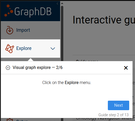
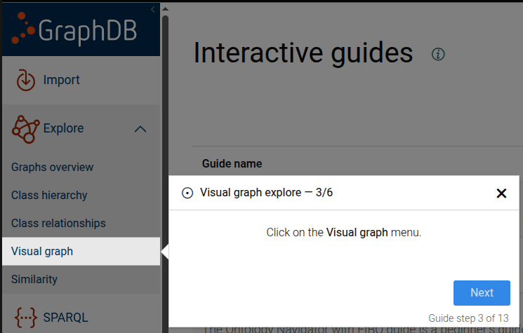
- Use the RDF resources search input to enter an IRI.
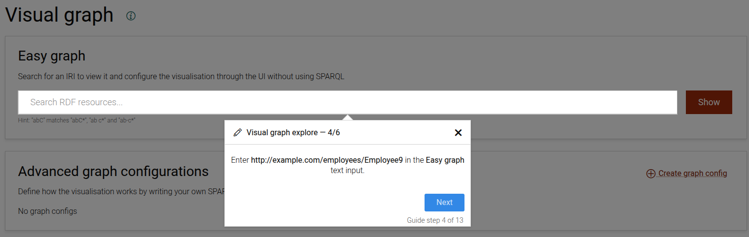
- Choose a resource from the autocomplete list.
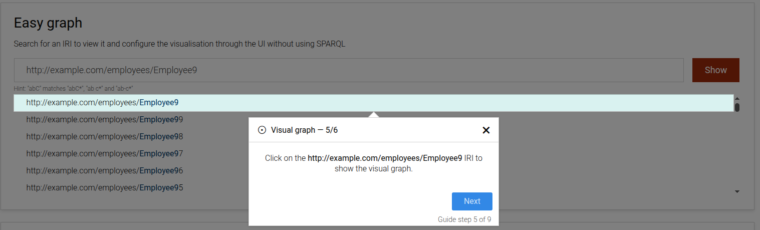
- Inspect and interact with the visual graph (expand nodes, view properties, focus links).
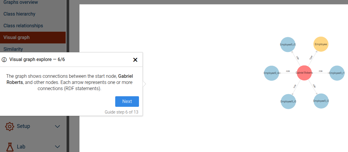
This guide can be configured using the common options defined in Options.
Properties:
| Name | Type | Attributes | Description |
|---|---|---|---|
options.easyGraphInputText |
string
|
<optional> |
The text to enter into the Easy graph input. |
options.iri |
string
|
<optional> |
The IRI used to target nodes in the visual graph. |
options.iriLabel |
string
|
<optional> |
The label of the IRI link shown in the visualization. |
options.fromIri |
string
|
<optional> |
Source IRI for link-focused steps. |
options.toIri |
string
|
<optional> |
Target IRI for link-focused steps. |
options.focusProperties |
string
|
<optional> |
Array describing focus properties displayed in properties steps. |
Example
```JSON
{
  "guideBlockName": "visual-graph",
  "options": {
    "iri": "http://example.org/resource",
    "iriLabel": "hasRole",
    "easyGraphInputText": "http://example.org/resource",
    "focusProperties": ["ontl:roleStartDate"]
  }
}
```
# static visual-graph-config-click-tab
This step guides the user to click on a specific tab in the Visual Graph configuration page.
The step will be skipped if the tab is already active.
Click on a config tab step
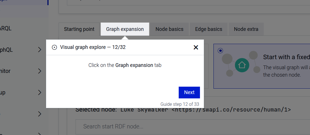
This step can be configured using the common options defined in Options. Additionally, the following specific option is required:
Properties:
| Name | Type | Description |
|---|---|---|
options.tabName |
string
|
The name of the tab to click. Must be one of |
Example
```JSON
{
  "guideBlockName": "visual-graph-config-click-tab",
  "options": {
    "tabName": "startingPoint"
  }
}
```
# static visual-graph-config-create
This is a complex step that guides the user through the full process of creating a new visual graph configuration. It includes navigating to the visual graph page, creating and naming the configuration, optionally adding a description and hint, configuring tabs with starting points, SPARQL queries, or resource IRIs, and saving the configuration.
The step sequence is dynamic and depends on the provided options. Some steps are always included, while others appear only when certain options are provided.
Always included steps:
Navigate to the visual graph page via the Explore main menu
Click the button to create a new configuration
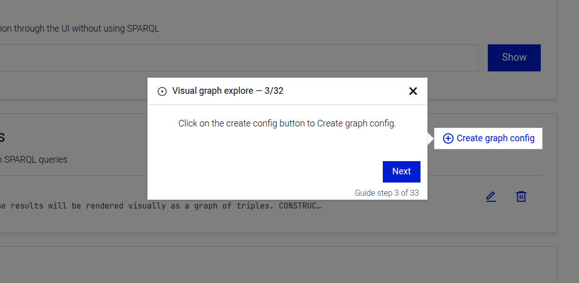
Enter a name for the configuration
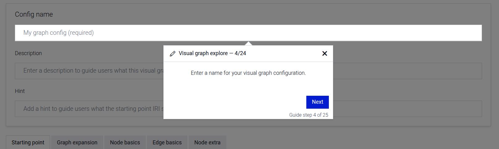
Introduction to the starting point configuration
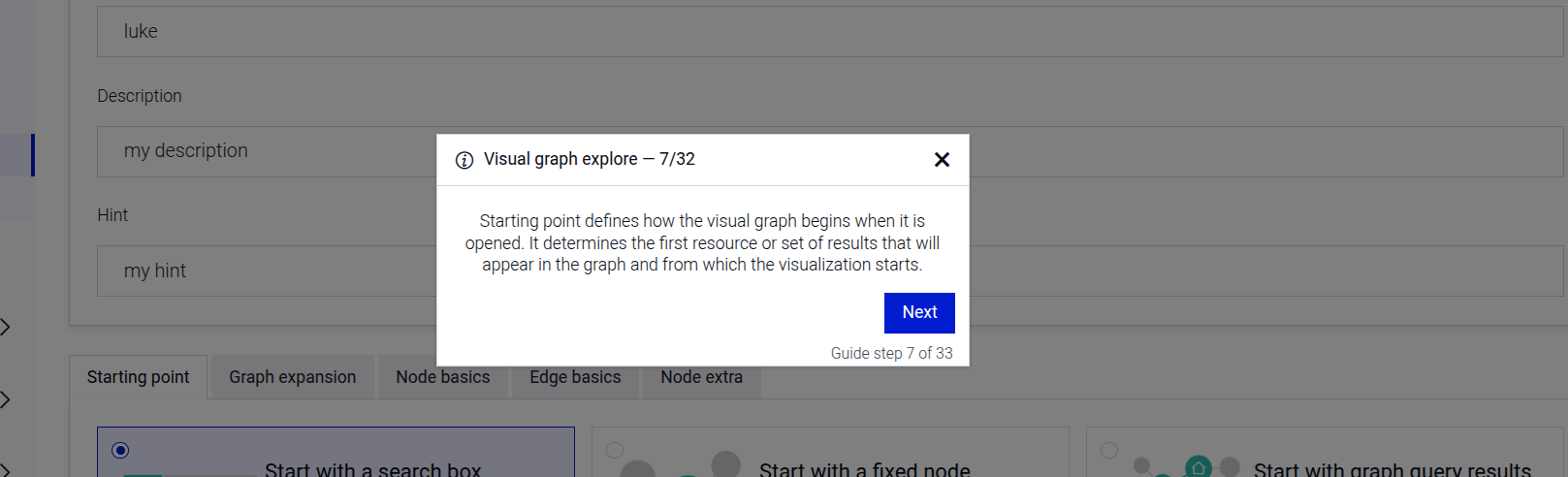
Optional steps (based on options):
Enter a description for the configuration (when options.configDescription is provided)
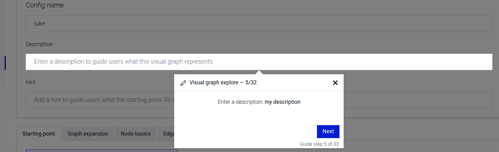
Enter a hint IRI for the configuration (when options.configHint is provided)
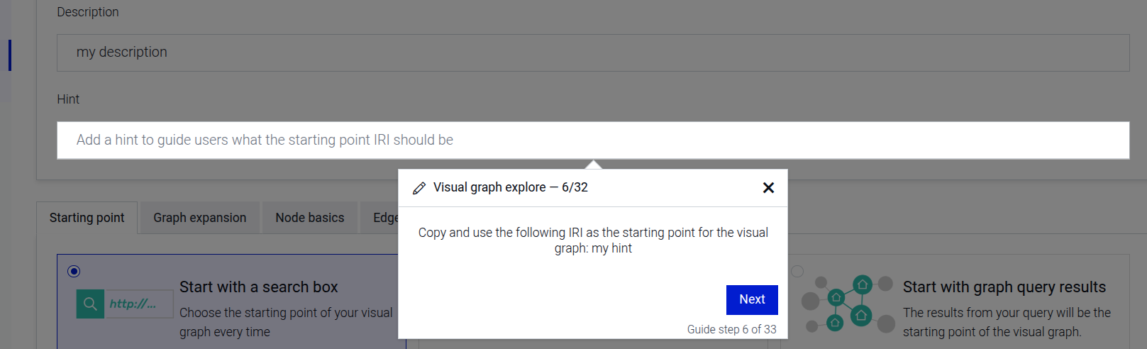
Tab configuration steps (based on options.tabConfig):
If options.tabConfig is not provided or is empty, the step sequence ends after the starting point intro.
Otherwise, for each entry in the tabConfig array, the following steps are added:
Click on a configuration tab (skipped if the tab is already active)
Select a starting point type (when tabConfig.startingPoint is provided)
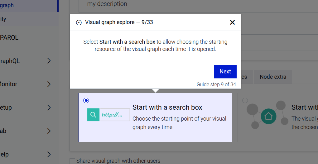
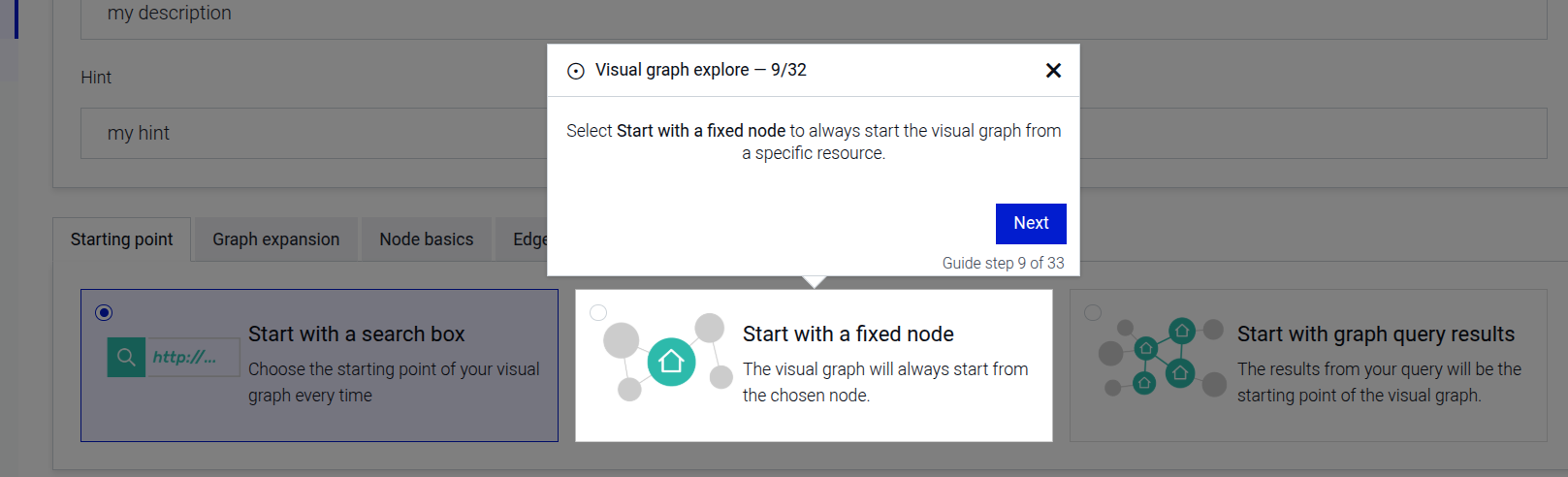
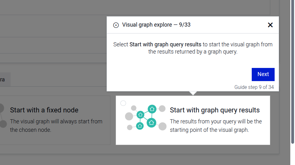
Search for a resource IRI (when tabConfig.iri and tabConfig.searchTerm are provided).
Cannot be combined with tabConfig.query — only one of iri/searchTerm or query should be set per tab config entry.
Select the resource from autocomplete results
Enter a SPARQL query (when tabConfig.query is provided).
Cannot be combined with tabConfig.iri/tabConfig.searchTerm — only one of query or iri/searchTerm should be set per tab config entry.
Toggle include inferred data (when tabConfig.includeInferredData is provided)
Toggle expand results over owl:sameAs (when tabConfig.expandResultsOverOwl is provided)
View sample queries (when tabConfig.sampleQueryContent is provided)
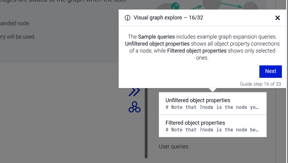
Post-configuration steps (only when options.tabConfig is provided):
Share the configuration with other users (when options.shareConfig is true)
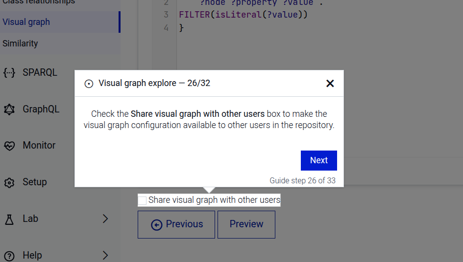
Save the configuration
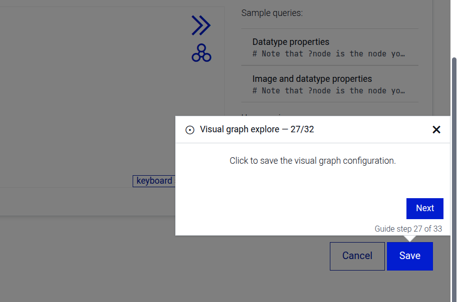
Select the newly created configuration
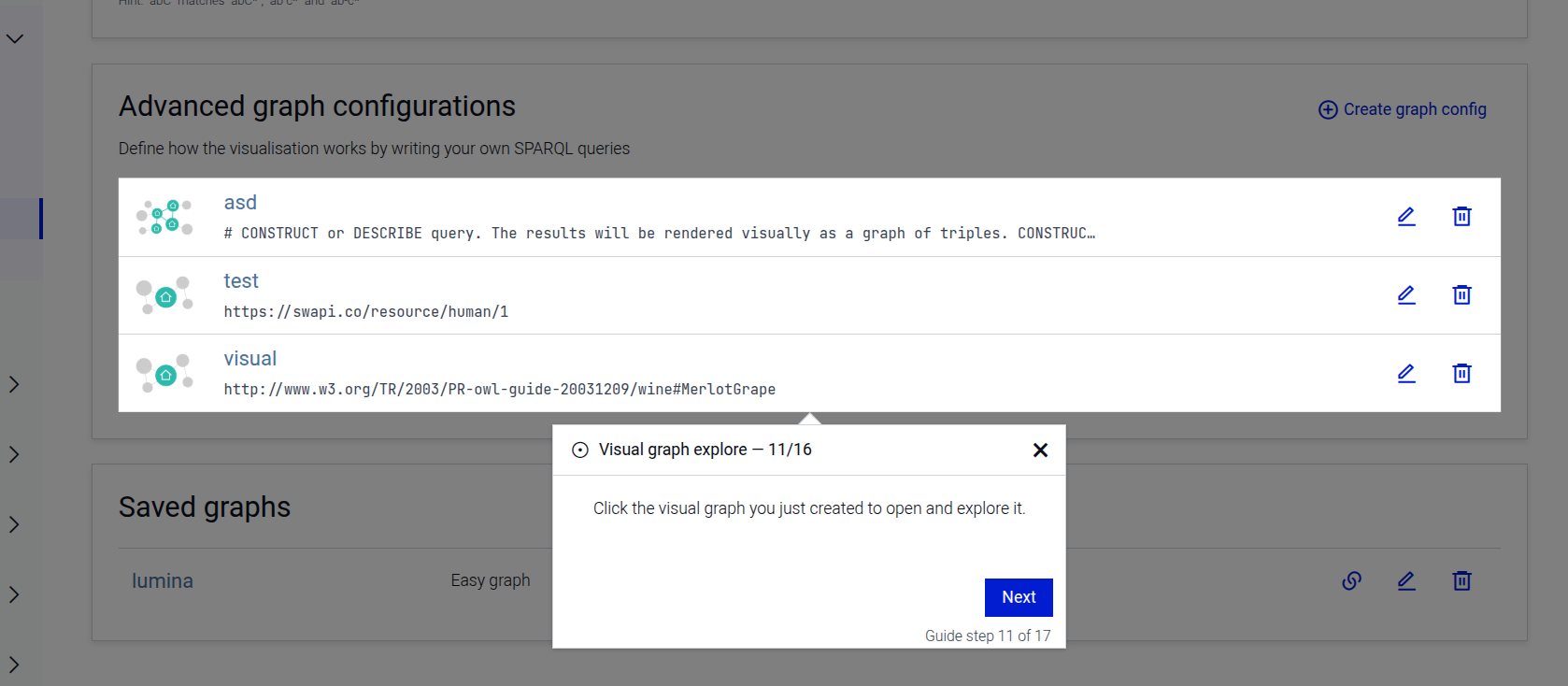
Open graph settings
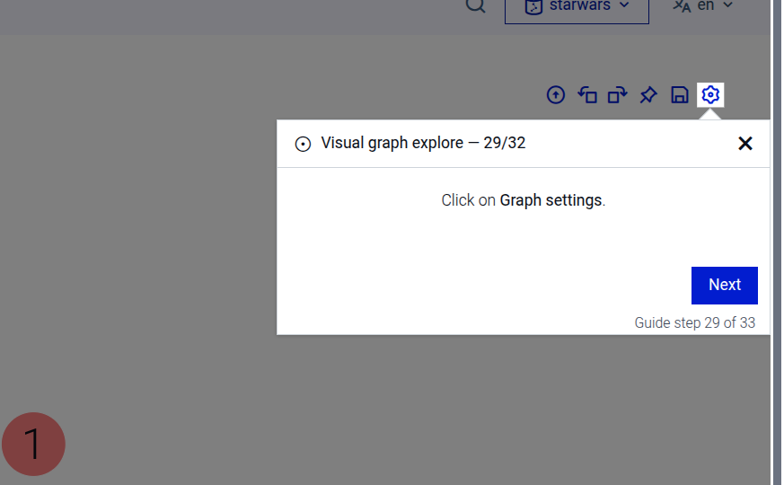
Set the maximum number of links
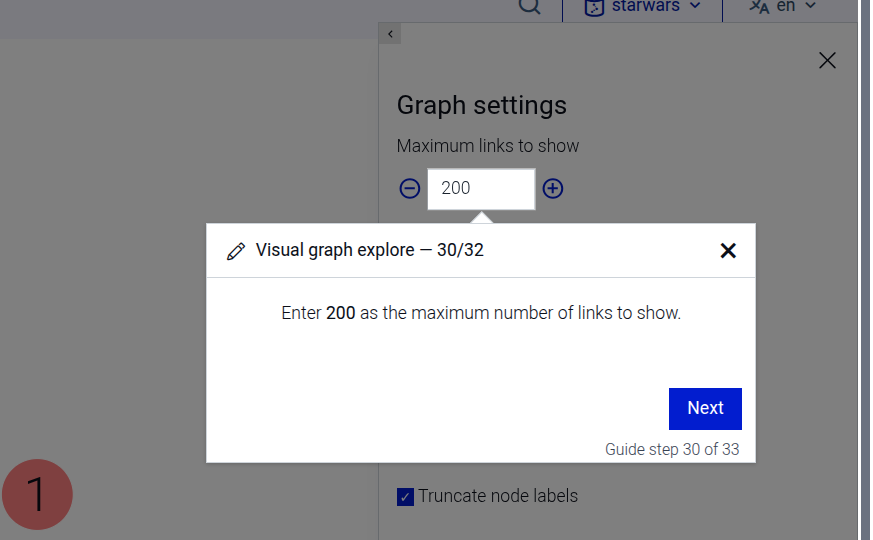
Save the graph settings
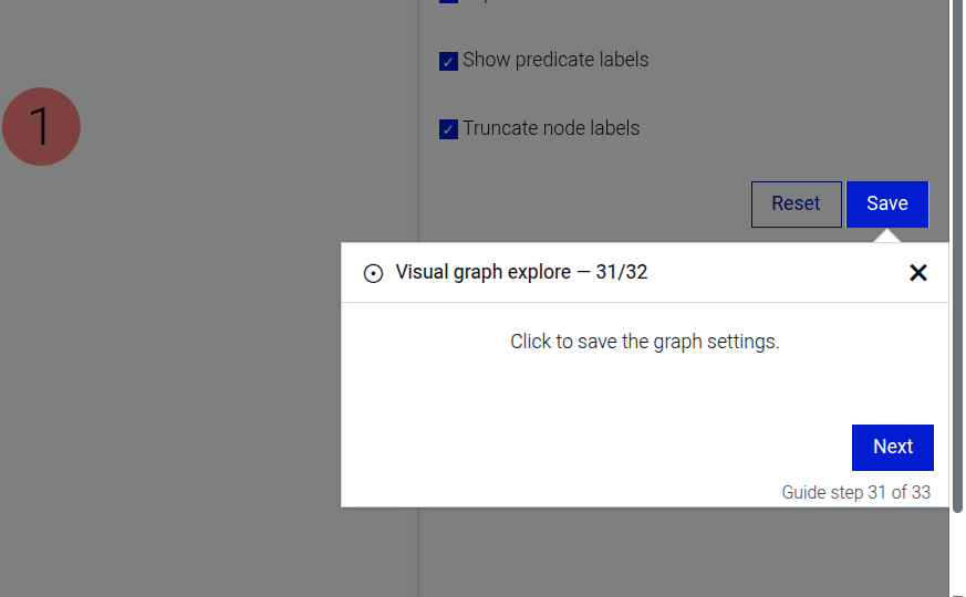
Expand a node in the visual graph (when options.expandIri is provided)
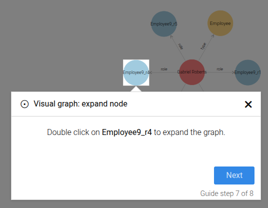
Zoom the visual graph
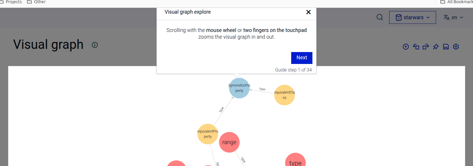
The step can be configured using the common options defined in Options.
Properties:
| Name | Type | Attributes | Description |
|---|---|---|---|
options.configDescription |
string
|
<optional> |
Optional. The description for the configuration. When provided, the description step is included. |
options.configHint |
string
|
<optional> |
Optional. The hint IRI for the configuration. When provided, the hint step is included. |
options.shareConfig |
boolean
|
<optional> |
Optional. When |
options.tabConfig |
Array.<Object>
|
<optional> |
Optional. An array of tab configuration objects. When not provided or empty, the step ends early without saving. |
options.tabConfig[].tabName |
string
|
The name of the tab to click. Must be one of |
|
options.tabConfig[].startingPoint |
string
|
<optional> |
Optional. The starting point type to select. |
options.tabConfig[].iri |
string
|
<optional> |
Optional. The IRI of the resource to search for. Must be used together with |
options.tabConfig[].searchTerm |
string
|
<optional> |
Optional. The search term used to find the resource. Must be used together with |
options.tabConfig[].query |
string
|
<optional> |
Optional. The SPARQL query to enter. Cannot be used together with |
options.tabConfig[].includeInferredData |
boolean
|
<optional> |
Optional. When provided, the include inferred data step is shown. |
options.tabConfig[].expandResultsOverOwl |
boolean
|
<optional> |
Optional. When provided, the expand results over owl:sameAs step is shown. |
options.tabConfig[].sampleQueryContent |
string
|
<optional> |
Optional. When provided, the sample query step is shown with this content. |
options.linkLimit |
number
|
<optional> |
The maximum number of links to set in the graph settings. |
options.expandIri |
string
|
<optional> |
Optional. The IRI of the node to expand in the visual graph. When provided, the expand step is included. |
options.iriLabel |
string
|
<optional> |
Optional. The label to display for the node to expand. When provided, the expand step is included. |
Example
```JSON
{
  "guideBlockName": "visual-graph-config-create",
  "options": {
    "configDescription": "A visual graph for exploring RDF data.",
    "configHint": "http://example.org/resource",
    "shareConfig": true,
    "expandIri": "https://swapi.co/resource/Human/6/",
    "iriLabel": "Leia Organa",
    "linkLimit": 20,
    "tabConfig": [
      {
           "tabName": "startingPoint",
           "startingPoint": "fixed",
           "searchTerm": "luke",
           "iri": "https://swapi.co/resource/human/1"
       },
       {
           "tabName": "graphExpansion",
           "query": "PREFIX wev: <http://weverify.eu/ontology/>\nPREFIX schema: <http://schema.org/>\nconstruct {\n    ?node ?p ?o .\n    ?s ?p ?node .\n} where {\n    values ?p {\n        schema:hasPart\n        schema:appearance\n        schema:itemReviewed\n        schema:mentionedIn\n        schema:author\n        schema:publisher\n    }\n    { ?node ?p ?o . filter not exists {?o a wev:SupportingEvidence . } }\n    union\n    { ?s ?p ?node . }\n}",
           "queryExtraContent": "The graph expansion query defines what happens when a node is expanded in the visual graph. Expanding a node loads additional resources connected to it and adds them to the graph as new nodes and edges.",
           "sampleQueryContent": "The <b>Sample queries</b>  includes example graph expansion queries. <b>Unfiltered object properties</b> shows all object property connections of a node, while <b>Filtered object properties</b> shows only selected ones.",
           "includeInferredData": true,
           "expandResultsOverOwl": true
       },
       {
           "tabName": "nodeBasics",
           "query": "PREFIX skos: <http://www.w3.org/2004/02/skos/core#>\nPREFIX : <http://data.europa.eu/949/>\nselect * {\n    ?node :opType/skos:prefLabel ?type\n    filter (lang(?type)=\"en\")\n    ?node :opName ?name; :uopid ?id\n    bind(concat(?name,\"\\n\",?type,\": \",?id) as ?label)\n}",
           "queryExtraContent": "The <b>Node basics</b> query retrieves basic properties of a node and maps them to visual attributes such as label, type, description, and rank used when rendering the node in the graph.",
           "sampleQueryContent": "The Sample queries includes ready examples of Node basics queries. Direct type only uses only the node’s type to determine its color. Direct type, label and rank also retrieves a label to display as the node name and a rank value that controls the node size."
       },
       {
           "tabName": "edgeBasics",
           "query": "PREFIX rdfs: <http://www.w3.org/2000/01/rdf-schema#>\nPREFIX skos: <http://www.w3.org/2004/02/skos/core#>\n\nSELECT ?label {\n    ?edge rdfs:label | skos:prefLabel ?label .\n}",
           "queryExtraContent": "This Edge Basics defines the text shown on the edges in the visual graph. It retrieves a label for each relationship so that the edge displays a clear name instead of the full predicate IRI.",
           "sampleQueryContent": "The Sample queries provides example queries for retrieving labels for edges. RDFS or SKOS label displays the label stored in rdfs:label or skos:prefLabel. RDFS or SKOS label in English displays the label only when it is available in English."
       },
       {
           "tabName": "nodeExtra",
           "query": "SELECT ?property ?value {\n    ?node ?property ?value .\nFILTER(isLiteral(?value))\n}",
           "queryExtraContent": "This Node extra defines the text shown on the nodes in the visual graph. It retrieves a label for each relationship so that the edge displays a clear name instead of the full predicate IRI.",
           "sampleQueryContent": "The Sample queries provides examples for retrieving node details. Datatype properties shows properties with literal values, while Image and datatype properties also includes an image URL."
       }
    ]
  }
}
```
# static visual-graph-config-create-click
This step guides the user to click on the create graph config button in the Visual Graph explore page to create a graph config.
Click on the create graph config button step
This step can be configured using the common options defined in Options.
Example
```JSON
{
  "guideBlockName": "visual-graph-config-create-click",
}
```
# static visual-graph-config-description
The visual-graph-config-description guide step prompts the user to type a description for their visual graph configuration.
Configure graph description
This step can be configured using the common options defined in Options. Additionally, the following specific option is required:
Properties:
| Name | Type | Attributes | Description |
|---|---|---|---|
options.configDescription |
string
|
<optional> |
The description of the visual graph configuration to be entered by the user. |
Example
```json
{
  "guideBlockName": "visual-graph-config-description",
  "options": {
    "configDescription": "my-config-description"
  }
}
```
# static visual-graph-config-hint
The visual-graph-config-hint guide step prompts the user to type a hint for their visual graph configuration.
Configure graph hint
This step can be configured using the common options defined in Options. Additionally, the following specific option is required:
Properties:
| Name | Type | Attributes | Description |
|---|---|---|---|
options.configHint |
string
|
<optional> |
The hint of the visual graph configuration to be entered by the user. |
Example
```json
{
  "guideBlockName": "visual-graph-config-hint",
  "options": {
    "configHint": "http://example.org/resource"
  }
}
```
# static visual-graph-config-name
The visual-graph-config-name guide step prompts the user to enter a name for their visual graph configuration.
Configure graph name
This step can be configured using the common options defined in Options.
Example
```json
{
  "guideBlockName": "visual-graph-config-name"
}
```
# static visual-graph-config-sample-query
This step highlights the sample queries section for a specific tab in the Visual Graph configuration page.
Sample queries step
This step can be configured using the common options defined in Options. Additionally, the following specific option is required:
Properties:
| Name | Type | Description |
|---|---|---|
options.tabName |
string
|
The name of the tab whose sample queries to highlight. Must be one of |
Example
```JSON
{
  "guideBlockName": "visual-graph-config-sample-query",
  "options": {
    "tabName": "startingPoint"
  }
}
```
# static visual-graph-config-save
This step guides the user to click the save button to save the visual graph configuration.
Save visual graph config step
This step can be configured using the common options defined in Options.
Example
```JSON
{
  "guideBlockName": "visual-graph-config-save",
}
```
# static visual-graph-config-select
This step guides the user to select a visual graph configuration from the list of available configurations to open and explore it.
Select visual graph config step
This step can be configured using the common options defined in Options.
Example
```JSON
{
  "guideBlockName": "visual-graph-config-select"
}
```
# static visual-graph-config-share
This step guides the user to check the share visual graph configuration checkbox to make the config available to other users
Share visual graph config step
This step can be configured using the common options defined in Options.
Example
```JSON
{
  "guideBlockName": "visual-graph-config-share",
}
```
# static visual-graph-config-starting-point
This step guides the user to select a starting point option in the Visual Graph config page.
The starting point type is determined by the startingPoint option, which can be one of:
search- Start with a search box
fixed- Start with a fixed node
query- Start with graph query results
This step can be configured using the common options defined in Options. Additionally, the following specific option is required:
Properties:
| Name | Type | Description |
|---|---|---|
options.startingPoint |
string
|
The type of starting point to select. Must be one of |
Example
```JSON
{
  "guideBlockName": "visual-graph-config-starting-point",
  "options": {
    "startingPoint": "search"
  }
}
```
# static visual-graph-config-starting-point-intro
The visual-graph-config-starting-point-intro step displays a dialog that introduces the starting point section
of the Visual Graph configuration.
This step can be configured using the common options defined in Options.
Example
```JSON
{
  "guideBlockName": "visual-graph-config-starting-point-intro"
}
```
# static visual-graph-expand
The visual-graph-expand guide step that explains how to expand a node in the Visual Graph by double-clicking it.
This step can be configured using the common options defined in Options. Additionally, the following specific option is available:
Options:
Properties:
| Name | Type | Attributes | Description |
|---|---|---|---|
options.iri |
string
|
<optional> |
The IRI used to build the element selector for the node and in the translations. |
Example
```json
{
  "guideBlockName": "visual-graph-expand",
  "options": {
    "iri": "http://example.org/resource",
    "iriLabel": "my resource"
  }
}
```
# static visual-graph-intro
The visual-graph-intro
guide step highlights the graph visualization and explains how the start node connects to other nodes.
This step can be configured using the common options defined in Options. Additionally, the following specific option is available:
Properties:
| Name | Type | Attributes | Description |
|---|---|---|---|
options.iri |
string
|
<optional> |
The label of the start IRI shown in the visualization. |
Example
```JSON
{
  "guideBlockName": "visual-graph-intro",
  "options": {
    "iri": "http://example.com/my-start-node"
    "iriLabel": "My start node"
  }
}
```
# static visual-graph-link-focus
The visual-graph-link-focus guide step explains the link between two nodes in the Visual Graph.
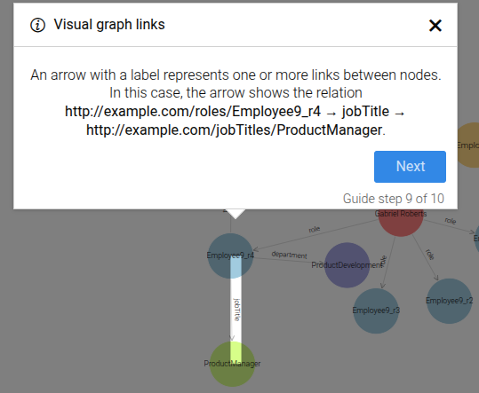
This step can be configured using the common options defined in Options. Additionally, the following specific options are available:
Properties:
| Name | Type | Attributes | Description |
|---|---|---|---|
options.fromIri |
string
|
<optional> |
The source IRI. |
options.toIri |
string
|
<optional> |
The target IRI. |
options.iriLabel |
string
|
<optional> |
Label for predicate. |
options.fromIriLabel |
string
|
<optional> |
Label for source node. |
options.toIriLabel |
string
|
<optional> |
Label for target node. |
Example
```json
{
  "guideBlockName": "visual-graph-link-focus",
  "options": {
    "fromIri": "http://www.w3.org/TR/2003/PR-owl-guide-20031209/wine#Wine",
    "fromIriLabel": "Wine",
    "toIri": "http://www.w3.org/TR/2003/PR-owl-guide-20031209/food#PotableLiquid",
    "toIriLabel": "Potable Liquid",
    "iriLabel": "type"
  }
}
# static visual-graph-node-focus
The visual-graph-node-focus guide step explains RDF resources in the Visual Graph.
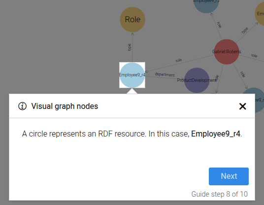
This step can be configured using the common options defined in Options. Additionally, the following specific option is available:
Properties:
| Name | Type | Attributes | Description |
|---|---|---|---|
options.iri |
string
|
<optional> |
The IRI used in this step. |
options.iriLabel |
string
|
<optional> |
Label for predicate. |
Example
```json
{
  "guideBlockName": "visual-graph-node-focus",
  "options": {
    "iri": "http://example.org/resource",
    "iriLabel": "my resource"
  }
}
```
# static visual-graph-properties
The visual-graph-properties guide demonstrates how to open and read node properties in the Visual Graph.
The guide consists of the following steps:
- Click a node to open the properties side panel.
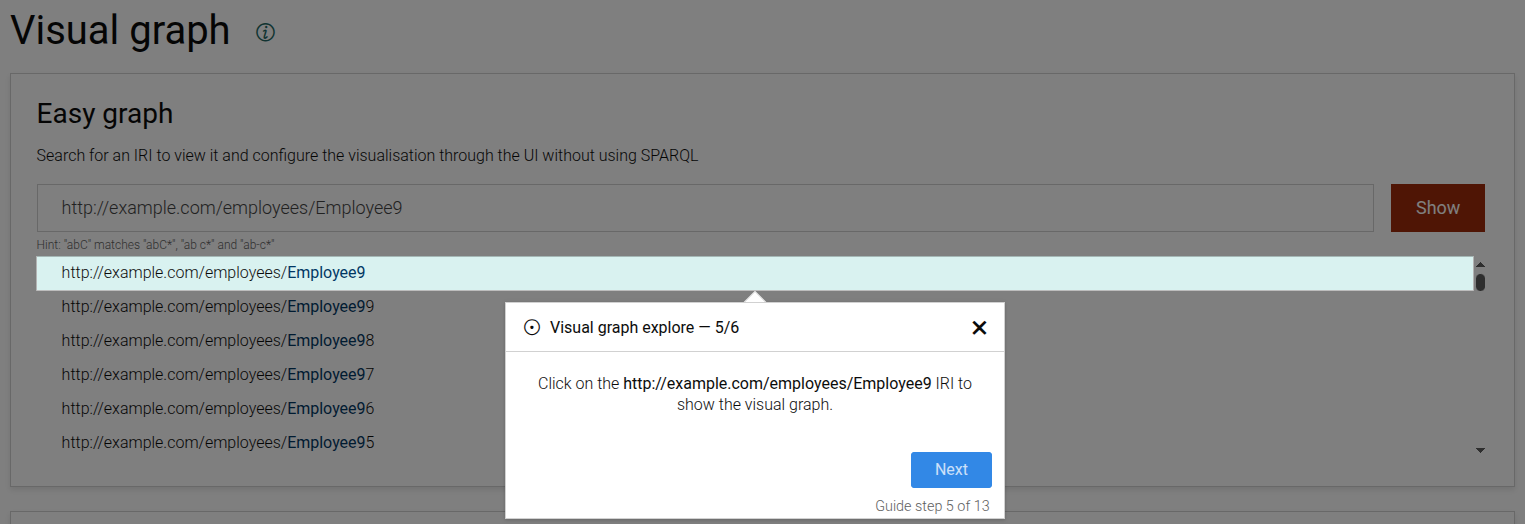
- Read the properties in the side panel.
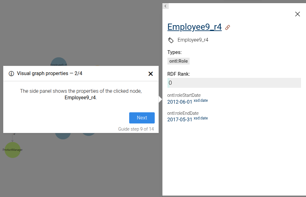
- Focus specific property sections (e.g. types or a particular property).
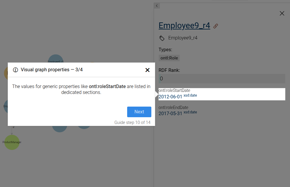
- Close the side panel.
This guide can be configured using the common options defined in Options.
Common / additional options used by the contained steps:
Properties:
| Name | Type | Attributes | Description |
|---|---|---|---|
options.iri |
string
|
<optional> |
The IRI used to target nodes in the visual graph. |
options.iriLabel |
string
|
<optional> |
The label of the IRI shown in the dialogs. |
options.focusProperties |
Array
|
<optional> |
Array describing focus properties displayed in properties steps. |
Example
```JSON
{
  "guideBlockName": "visual-graph-properties",
  "options": {
    "iri": "http://example.org/resource",
    "iriLabel": "Example resource",
    "focusProperties": ["ontl:roleStartDate"]
  }
}
```
# static visual-graph-search-rdf-resources-input
The visual-graph-search-rdf-resources-input step guides the user to enter an IRI in the Easy graph search input
This step can be configured using the common options defined in Options.
Properties:
| Name | Type | Attributes | Description |
|---|---|---|---|
options.easyGraphInputText |
string
|
<optional> |
The text to be entered in the Easy graph text input. |
# static visual-graph-search-rdf-resources-input-autocomplete-item
The visual-graph-search-rdf-resources-input-autocomplete-item step triggers the autocomplete item for a discovered RDF resource in the Visual Graph search input.
This step can be configured using the common options defined in Options. Additionally, the following specific option is available:
Properties:
| Name | Type | Attributes | Description |
|---|---|---|---|
options.iri |
string
|
<optional> |
The IRI displayed in the autocomplete item. |
# static visual-graph-set-maximum-links
The visual-graph-set-maximum-links guide step prompts the user to enter the maximum number of links to show
in the visual graph settings.
Set maximum links
This step can be configured using the common options defined in Options. Additionally, the following specific option is required:
Properties:
| Name | Type | Attributes | Description |
|---|---|---|---|
options.linkLimit |
number
|
<optional> |
The maximum number of links to show. |
Example
```json
{
  "guideBlockName": "visual-graph-set-maximum-links",
  "options": {
    "linkLimit": 20
  }
}
```
# static visual-graph-settings-click
This step guides the user to click on the graph settings button to open the visual graph settings.
Click on graph settings button step
This step can be configured using the common options defined in Options.
Example
```JSON
{
  "guideBlockName": "visual-graph-settings-click",
}
```
# static visual-graph-settings-save
This step guides the user to click the save button to save the graph settings.
Save graph settings step
This step can be configured using the common options defined in Options.
Example
```JSON
{
  "guideBlockName": "visual-graph-settings-save",
}
```
# static visual-graph-zoom
This step guides the user to zoom in and out of the visual graph using the mouse wheel or touchpad.
Visual graph zoom step
This step can be configured using the common options defined in Options.
Example
```JSON
{
  "guideBlockName": "visual-graph-zoom",
}
```
# static visualise-sparql-query
Composite step that guides the user through visualizing the results of a SPARQL query. Included steps are:
Copy SPARQL query to the editor
Run the query
Press the "Visual" button to visualize the results
This step can be configured using the common options defined in Options. Additionally, it requires:
Properties:
| Name | Type | Attributes | Description |
|---|---|---|---|
query |
string
|
The SPARQL query to be visualized. |
|
queryExtraContent |
string
|
object
|
<optional> |
If this option is present, an additional dialog will be displayed as the last step with the passed content, localized by language. |
Example
```JSON
{
 "guideBlockName": "visualise-sparql-query",
 "options": {
  "query": "SELECT ?s ?p ?o WHERE {?s ?p ?o} LIMIT 10",
  "queryExtraContent": {
    "en": "The query selects RDF statements whose <i>subject</i> is the movie <b>Pirates of the Caribbean At World's End</b> (identified by the IRI <b>imdb:title/PiratesoftheCaribbeanAtWorldsEnd</b>). Note that we need to escape the / in the shortened IRI."
  }
 }
}
```
# static wait-for-element-to-hide
Waits for a specific element to become hidden and then immediately advances to the next step.
This step can be configured using the common options defined in Options. Additionally, it supports:
Properties:
| Name | Type | Attributes | Default | Description |
|---|---|---|---|---|
options.elementSelectorToHide |
string
|
CSS selector of the element that must become hidden before advancing. |
||
options.timeToWait |
number
|
<optional> |
2 | Max seconds to wait before aborting the guide. |
Example
```JSON
{
  "guideBlockName": "wait-for-element-to-hide",
  "options": {
    "elementSelectorToHide": "#loading",
    "timeToWait": 5
  }
}
```
# static wait-for-element-to-show
Waits for a specific element to become visible and then immediately advances to the next step.
This step can be configured using the common options defined in Options. Additionally, it supports:
Properties:
| Name | Type | Attributes | Default | Description |
|---|---|---|---|---|
options.elementSelectorToShow |
string
|
CSS selector of the element that must appear before advancing. |
||
options.timeToWait |
number
|
<optional> |
2 | Max seconds to wait before aborting the guide. |
Example
```JSON
{
  "guideBlockName": "wait-for-element-to-show",
  "options": {
    "elementSelectorToShow": "#loaded-panel",
    "timeToWait": 5
  }
}
```
# static welcome
The Welcome step produces two steps:
-
The first step onboards users on how to interact with the guide dialogs. It explains the basic concepts, provides hints, and describes the overall purpose of the guide.
-
The second step shows the description for the specific guide being run. The content is passed through the option
translatedGuideDescription.
The Welcome step can be configured using the common options defined in Options.
Example
```JSON
{
  "guideBlockName": "welcome"
}
```